About BrandCrock GmbH
BrandCrock GmbH is a one-stop software solution provider for all your business needs, offering solutions to more than 15 countries worldwide. We create sales-oriented corporate websites, web-based applications, and web services. We are stationed in Munich, Germany, with other offices in Karachi and Chennai. BrandCrock GmbH is one of Germany’s leading and trusted offshore and outsourcing software solution providers for web designing and application development. Since 2015 we have been in information technology and software development, providing reliable and cost-effective solutions to individuals, business owners, start-ups, small to medium-sized companies (SMEs), online retailers, production companies, and Software and Design Agencies. BrandCrock is fulfilling a greater demand for software development at a reasonable cost for anyone interested in our professional skills, especially in the European and German markets. We have passionate teams and multi-talented individuals who are highly committed to their work. At BrandCrock, we achieve robust, reliable, high-quality IT solutions by practicing industry-proven methods cum standards in software development, project management, and quality assurance methodologies. For further information, please refer to our website www.brandcrock.com
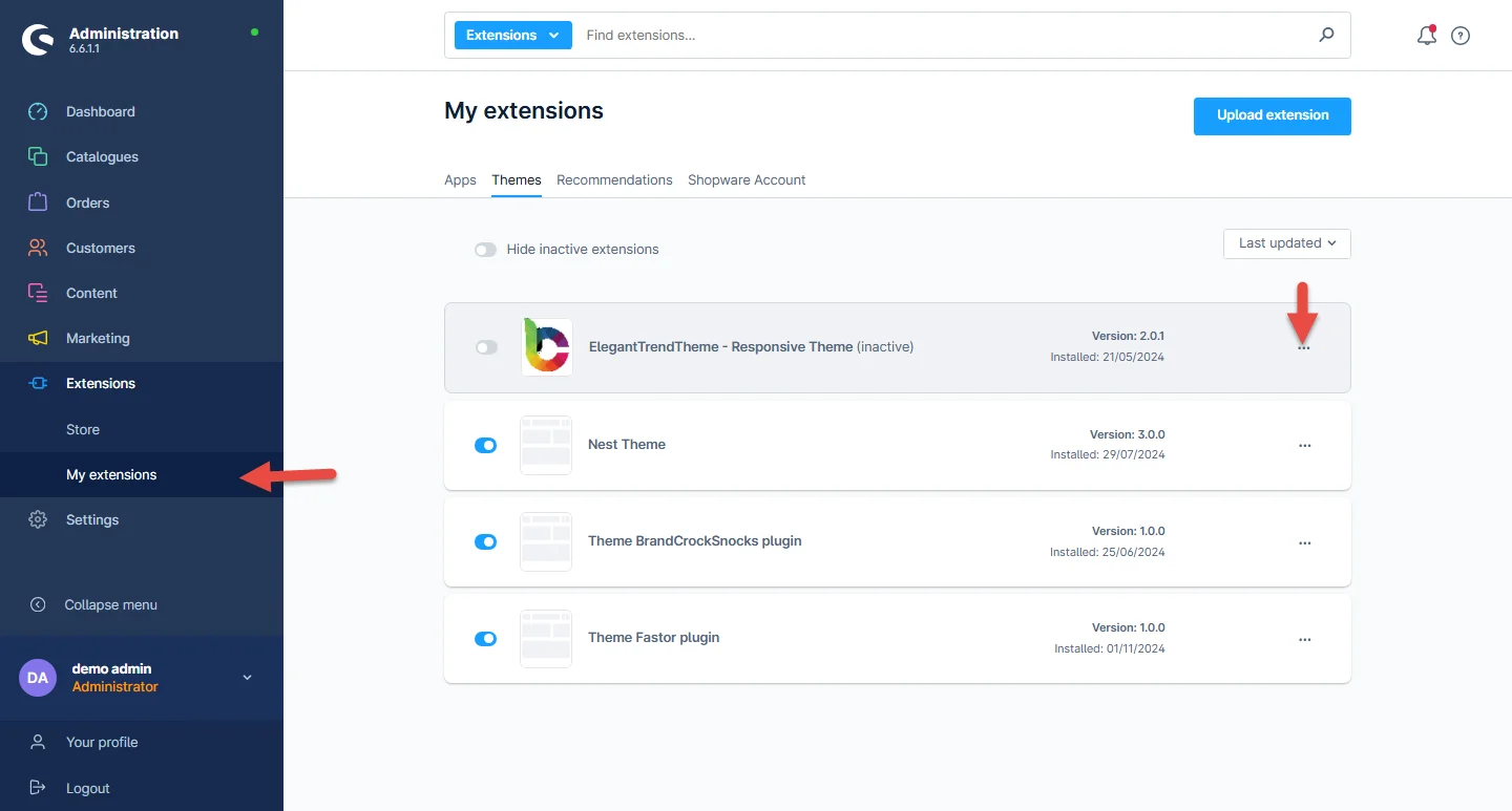
Step 1: Log in to the shop backend, after downloading the ElegantTheme from the store, navigate to Extensions > My extensions > Themes. Click on the install button at the theme listed there.
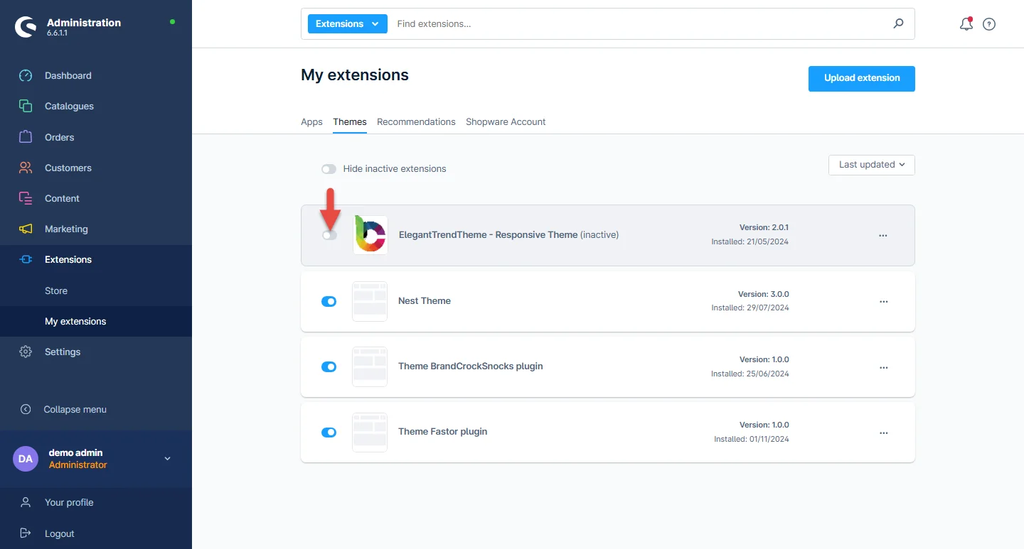
Step 2: Next, click the enable switch to activate the Elegant theme.
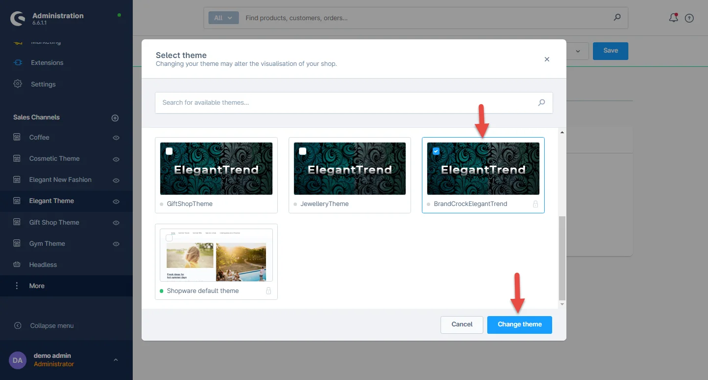
Step 3: The Shopware theme is selected by default, to access Navigate to Elegant > Theme, then click the default theme.
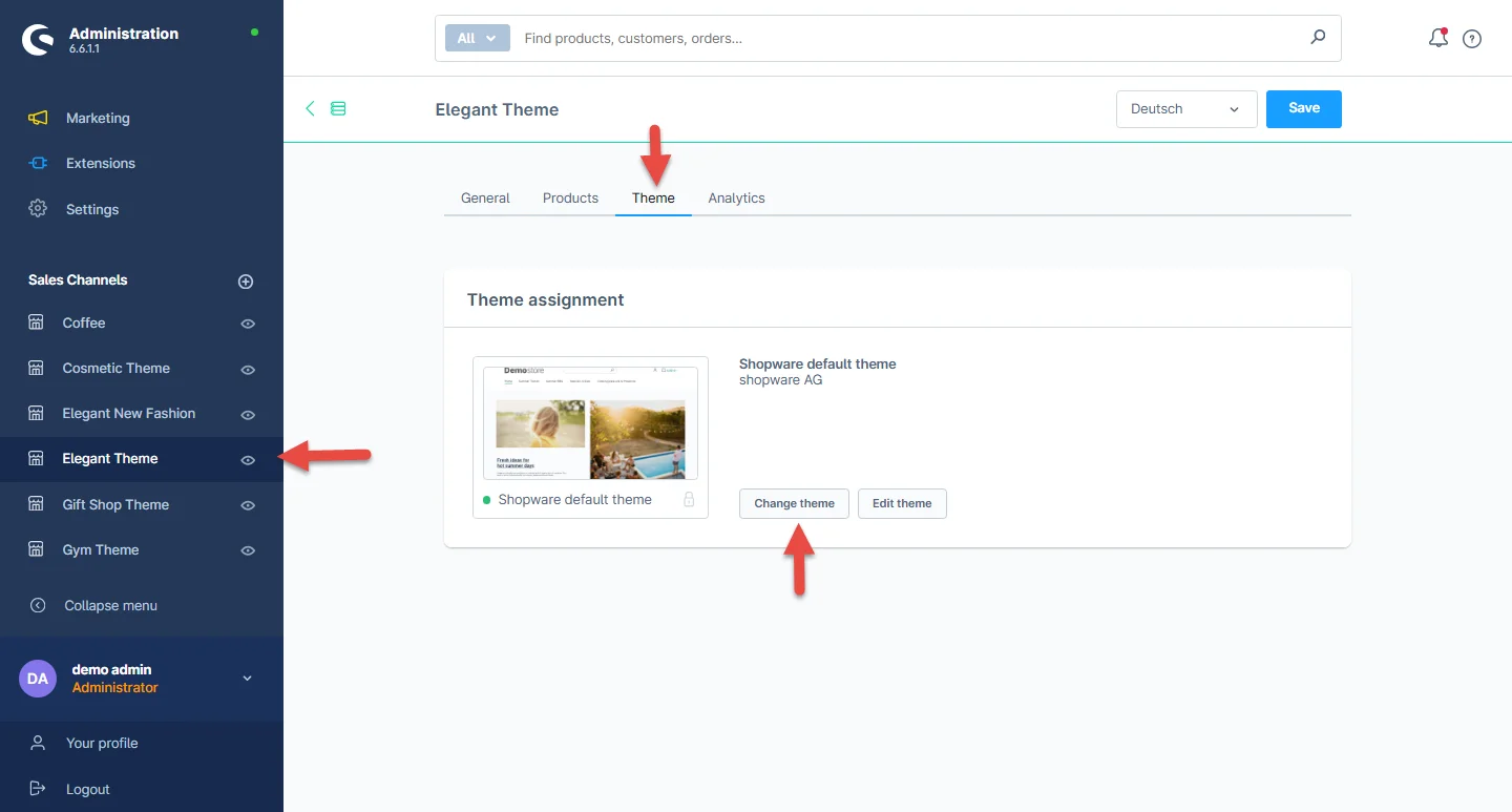
Step 4: After clicking the default theme, you can select the Elegant theme and then click the save button.
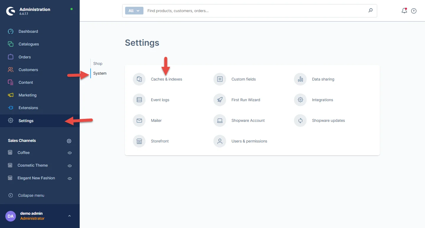
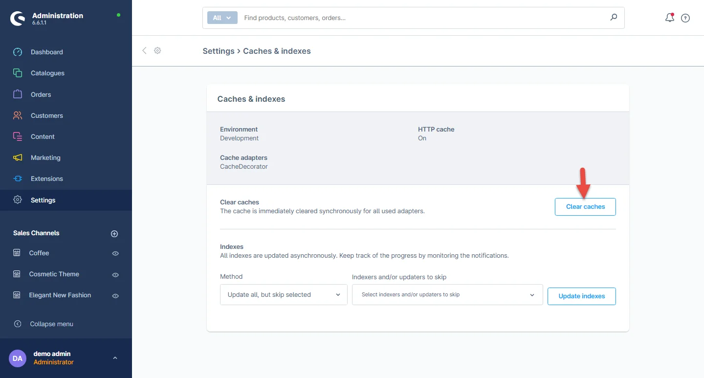
Step 5: Once the Elegant Theme is activated, Shop Cache must be empty. Navigate to Settings > System > Caches.
Theme Uninstallation
To uninstall the theme, you need to deactivate it first. It’s a two-step process defined below.
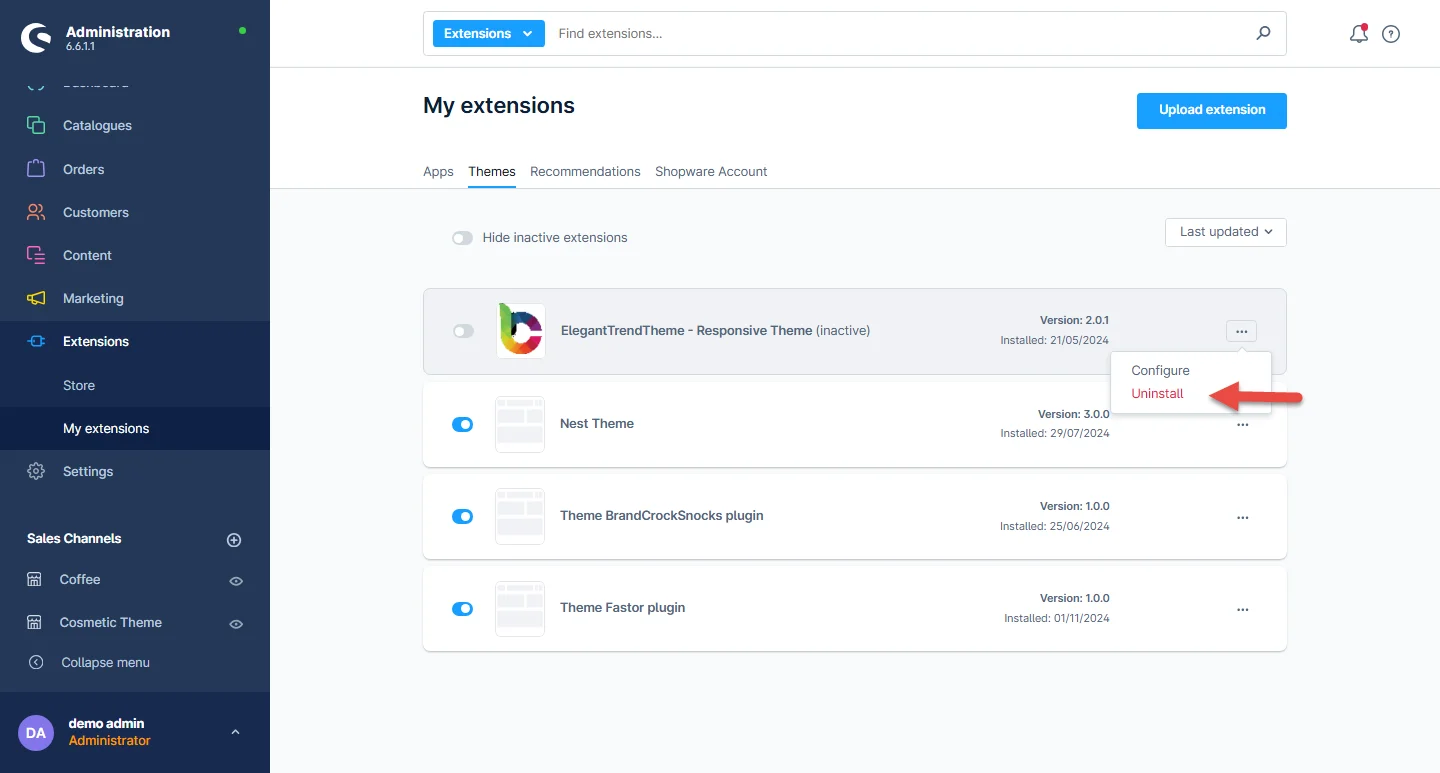
Step 1: To deactivate the theme, navigate to Extensions > My extensions and click the disable switch to deactivate the Elegant theme as shown below.

Step 2: Next, to uninstall the Elegant theme, navigate to My Extension and click Uninstall as shown below.
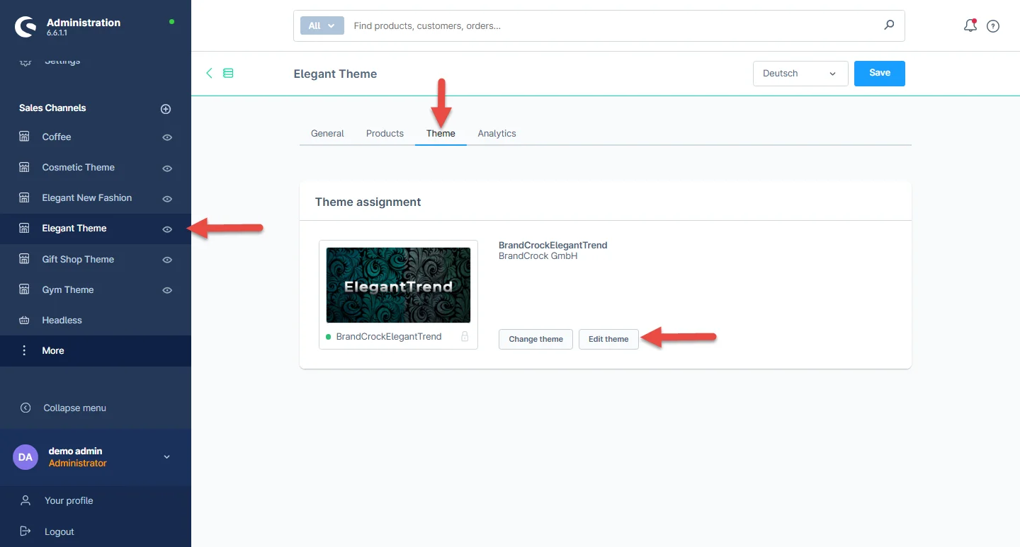
General Theme Settings
1- After successful installation of the Elegant theme, navigate to Elegant -> Theme -> Edit Theme.
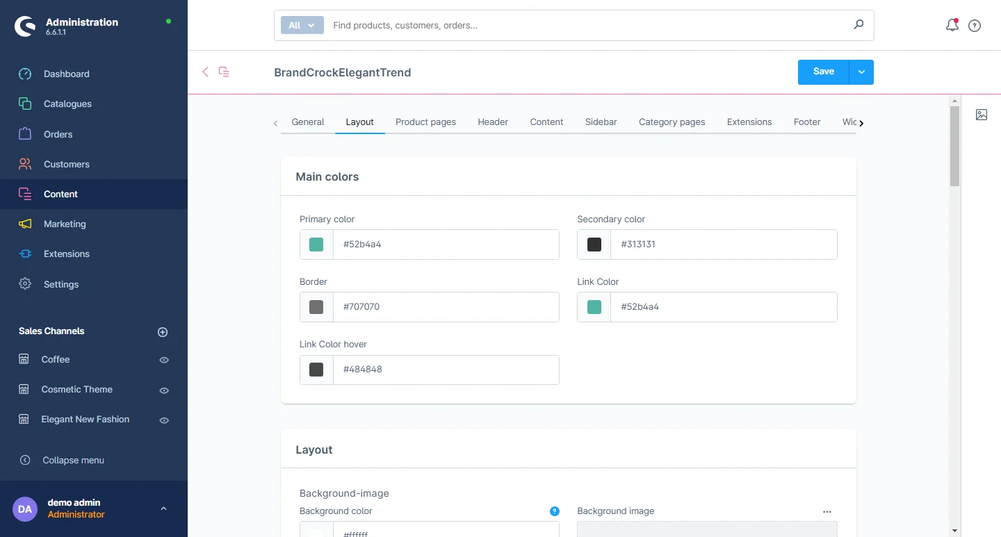
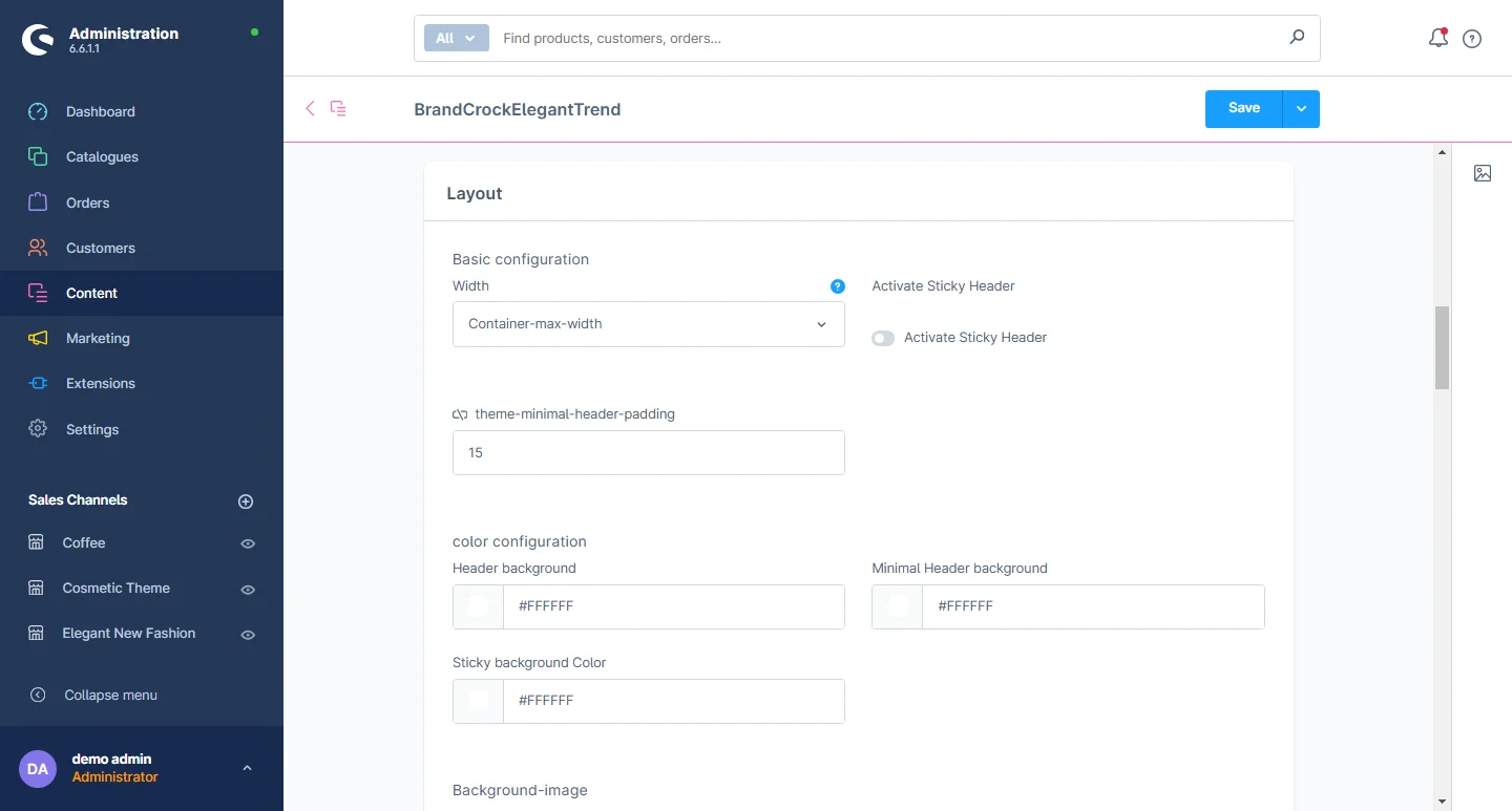
2- Go to the Layout Tab: Select the general theme configuration from here.
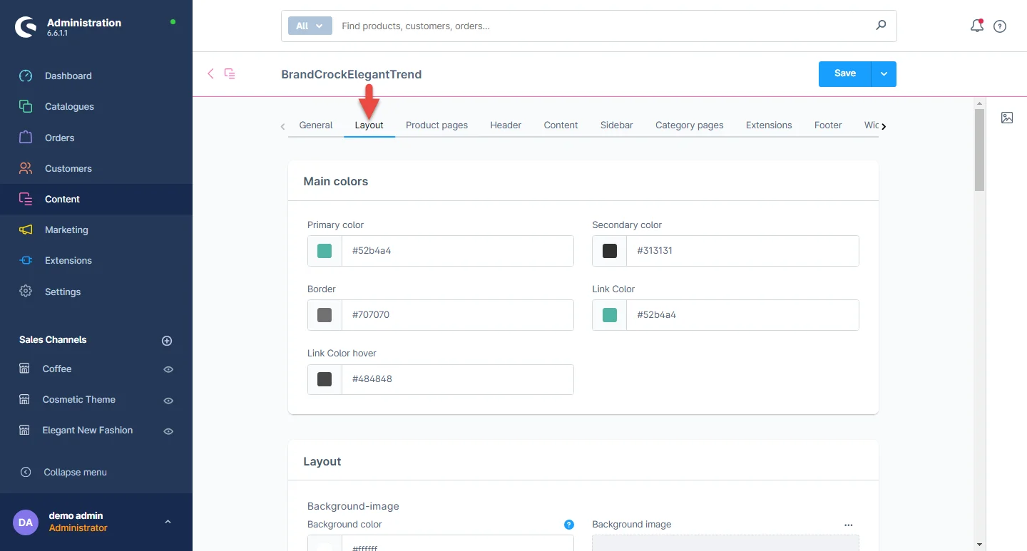
3- Theme Colors: Customize the primary and secondary colors, frame, background, link, and hover URL colors according to your preference for your theme.
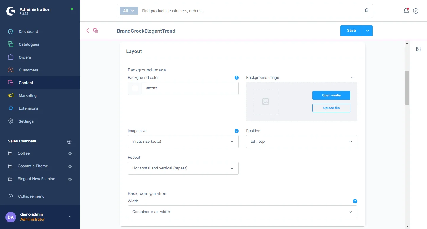
4- General Layout: Customize the theme's general layout background color, background image, image-size, position and container max-width.
5- Status Notification/Messages Color: Customize Success, Notice, information, and Error message color.
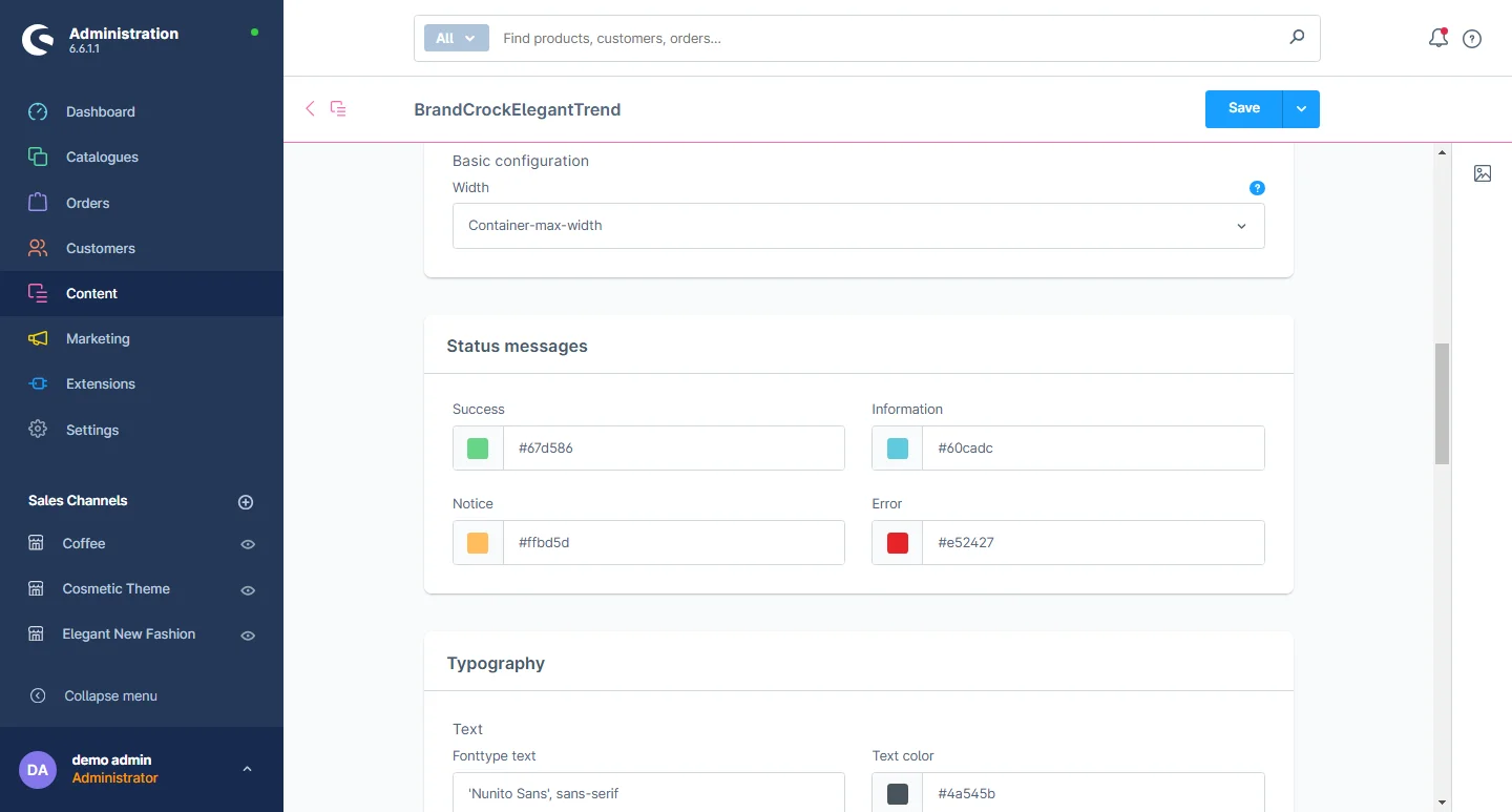
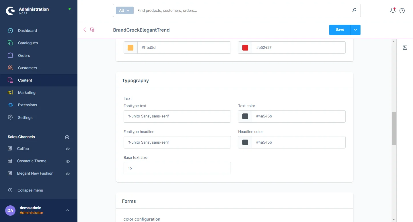
6- General typography: Here you can change the font text size, text color, font heading and color, as well as the base text size.
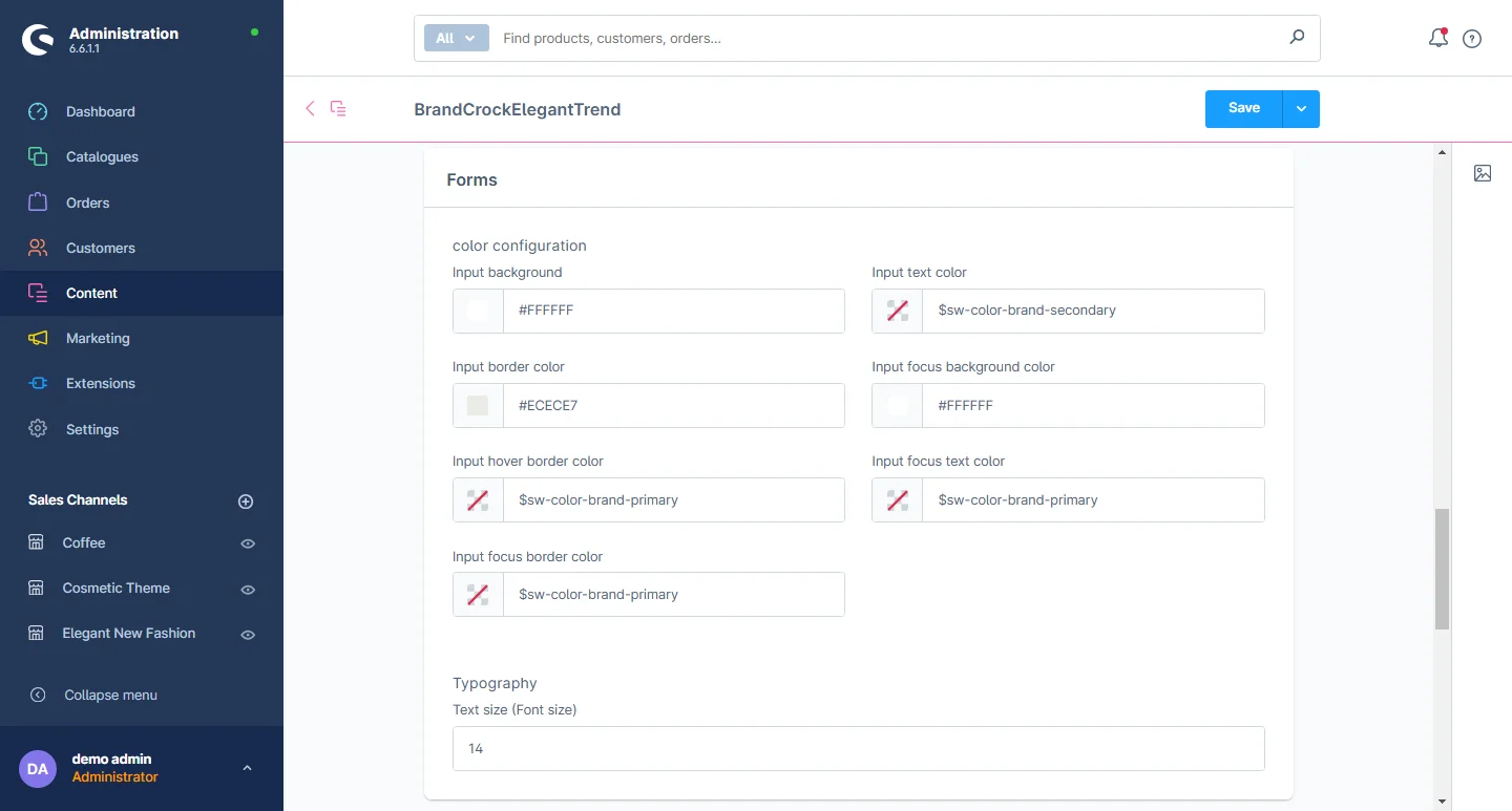
7- Forms: Change the form input text color, border color, input background color, placeholder color, and font size of text.
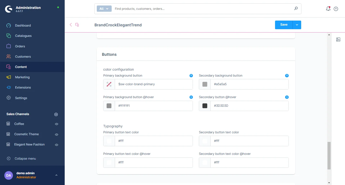
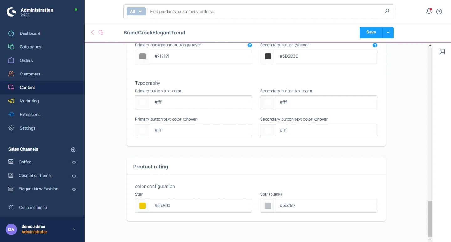
8- Buttons: Change the general primary and scondary button's backgroung color.
9- Product Rating: Change the product rating background color.
Header Configuration
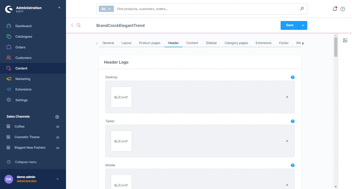
1- Go to the Header Tab and select the header configuration.
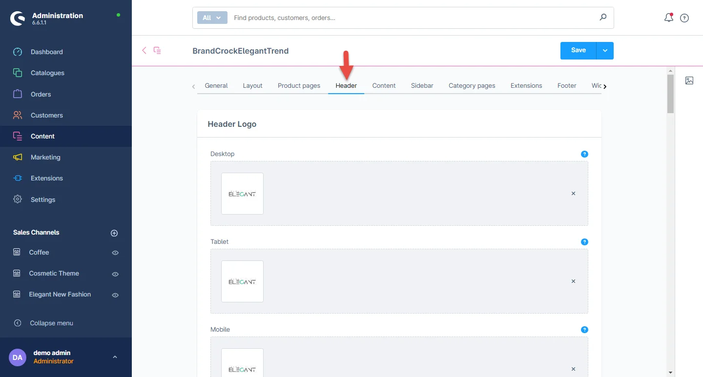
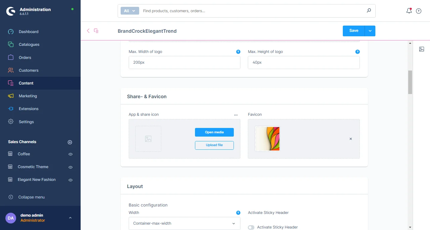
2- Logo Configuration: You can upload the logo on different resolutions for desktop, tablet, and mobile.
3- Full width header: You can choose your preferred container and the max width of the header.
4- Header Style & Sticky: There are various styles included in the header like header background color and header box-shadow. You can also choose to enable or disable the sticky header and alter the color of sticky background.
5- Header Icons: You can change the icon color and the icon on the mouse hover color.

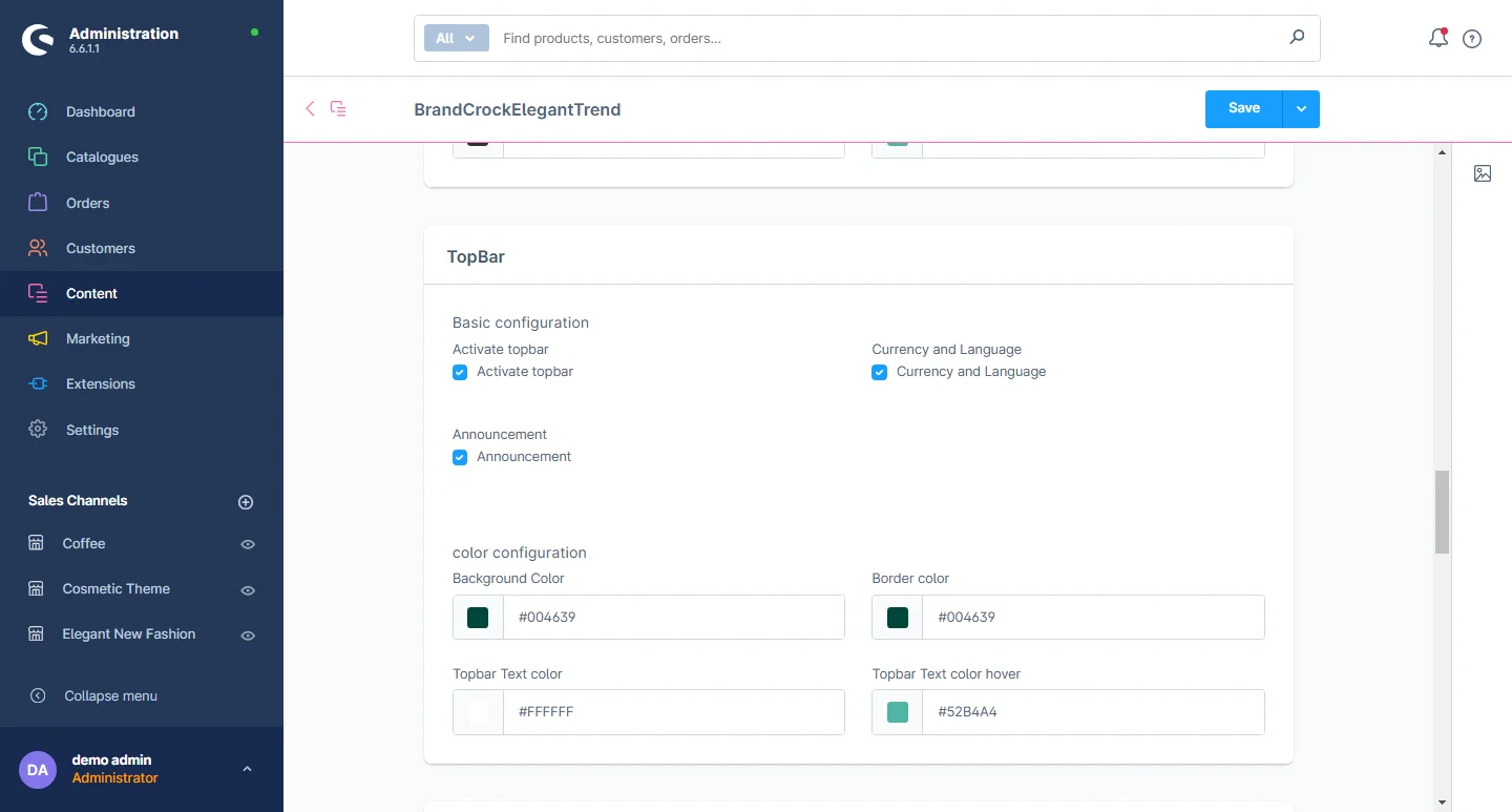
6- Top Bar: You can change the Background color, border color, Top bar text color, and top bar text hover color.
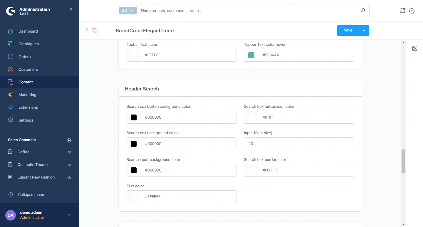
7- Search: Includes background color in the search field, background color of the search box as well as the background color of the search box button, border color of the search field, text font size, and text color.
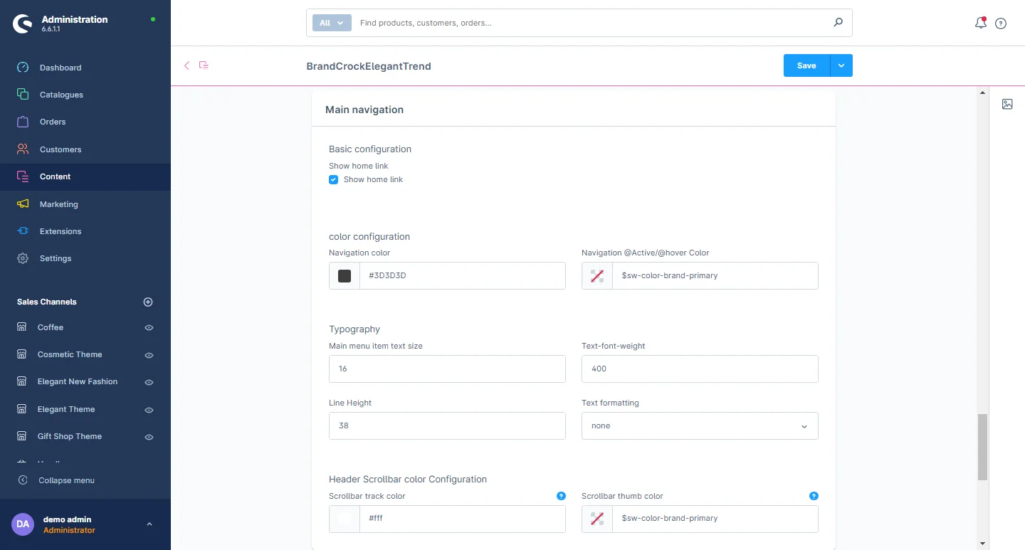
8- Navigation: You can change the background color of active items in the main menu, the color text of the main menu, the main menu hover text color, the font size of the main menu, text font-weight, and row height b/w both menus.
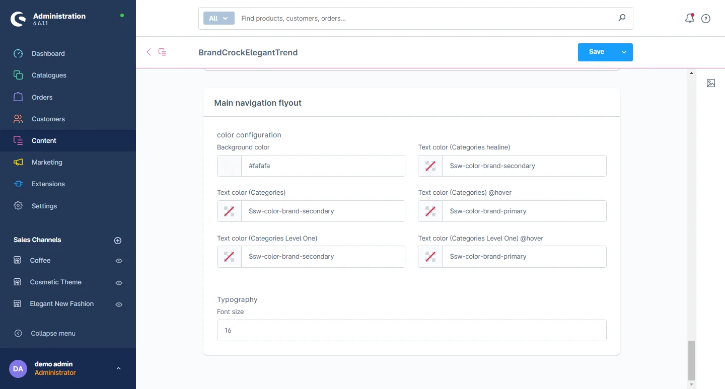
9- Flyout Menu: You can change the background of the main menu drop-down and the menu color, font size of the main drop-down, and font size of the main category.
Content
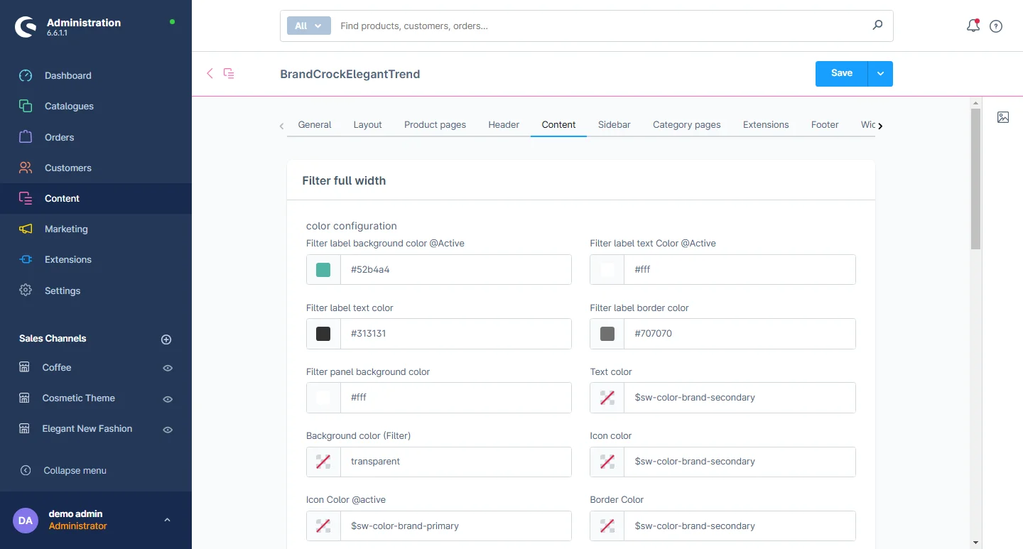
1- Go to the Content Tab and select the content configuration.
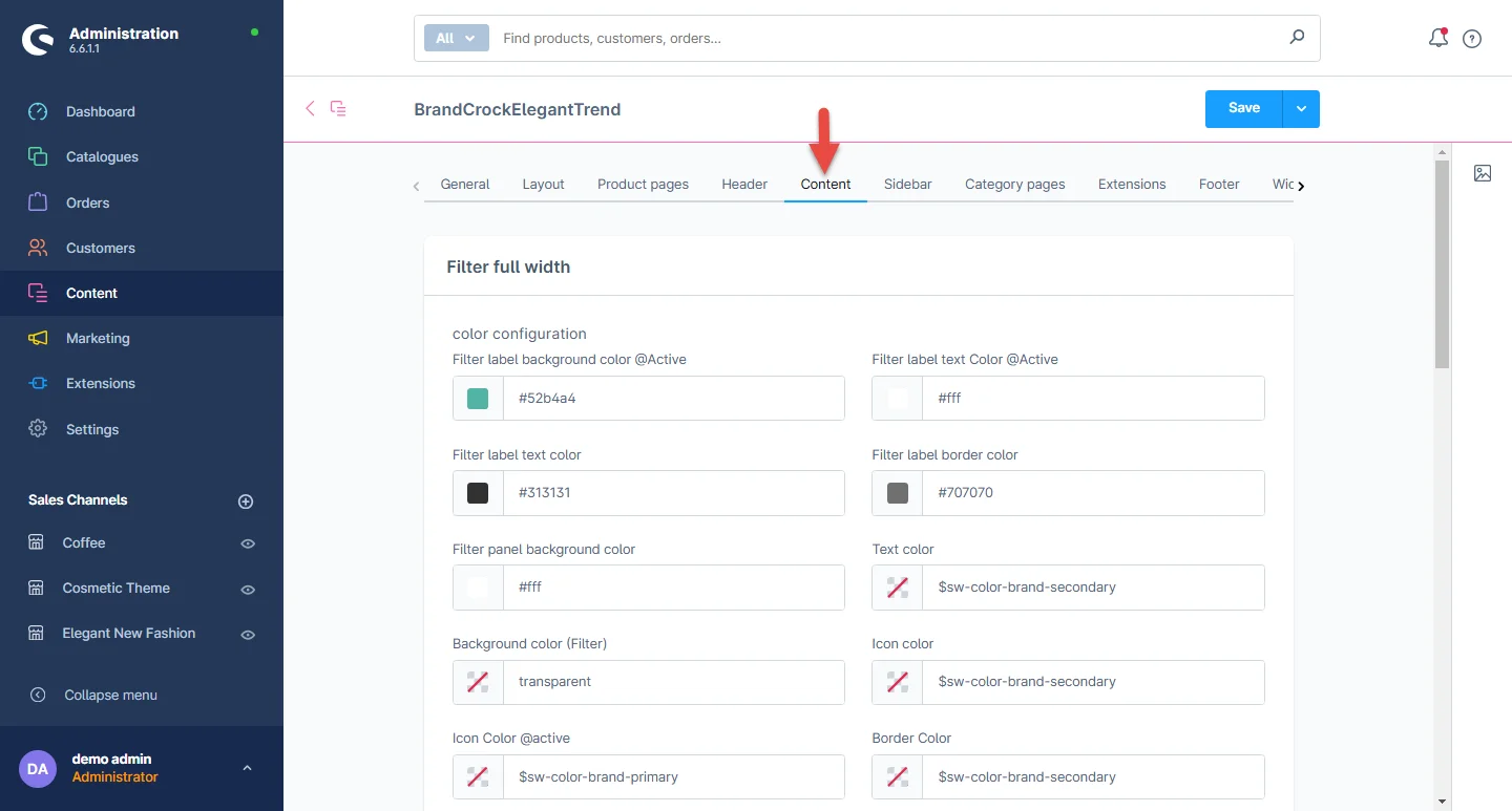
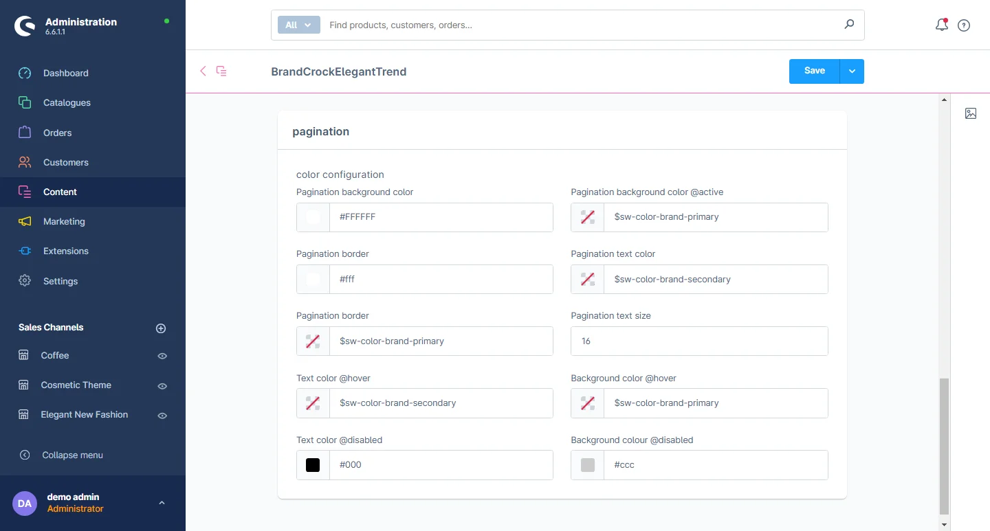
2- Basic layout settings: You can change the text color, background color, and border radius of the filters in the listing layout. Similarly, you can adjust the background color, border radius, and hover colors for both the breadcrumb and pagination elements.
3- Breadcrumbs: You can change the text color, link color on hover, link color when active, and icon color.
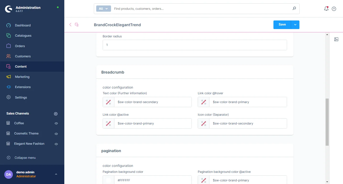
4- Pagination: You can change the text color, border color, background color, text color on hover, text color when active, border color when active, background color when active, text color when disabled, and background color when disabled.
Product List Configuration
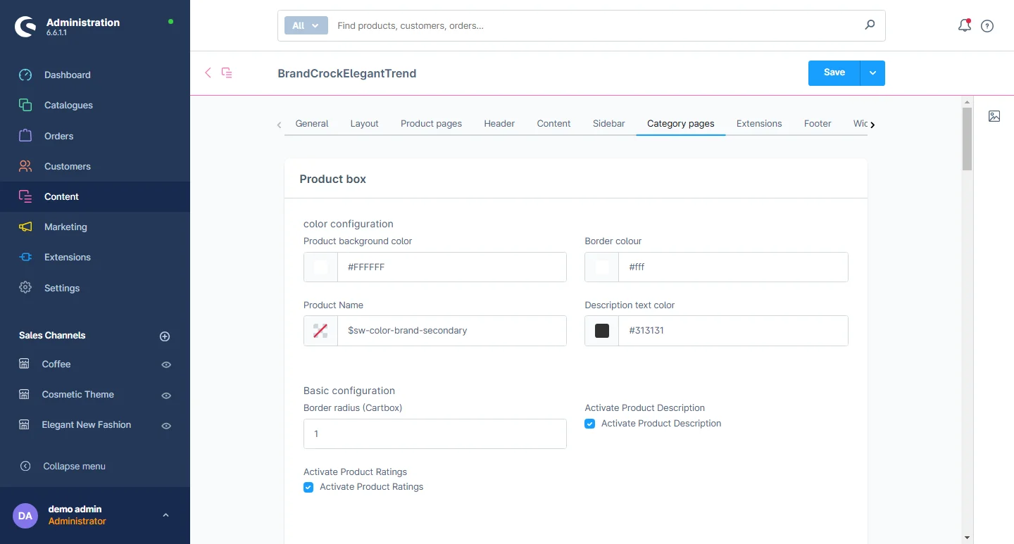
1- Go to the product list tab and select the product list configuration.
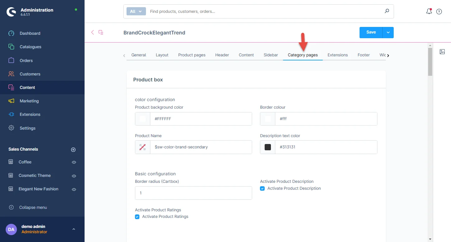
2- Product Cart Section: In this section, you have the option to customize the background color, image background, product frame background, button color, mouse hover color, and button icon color.
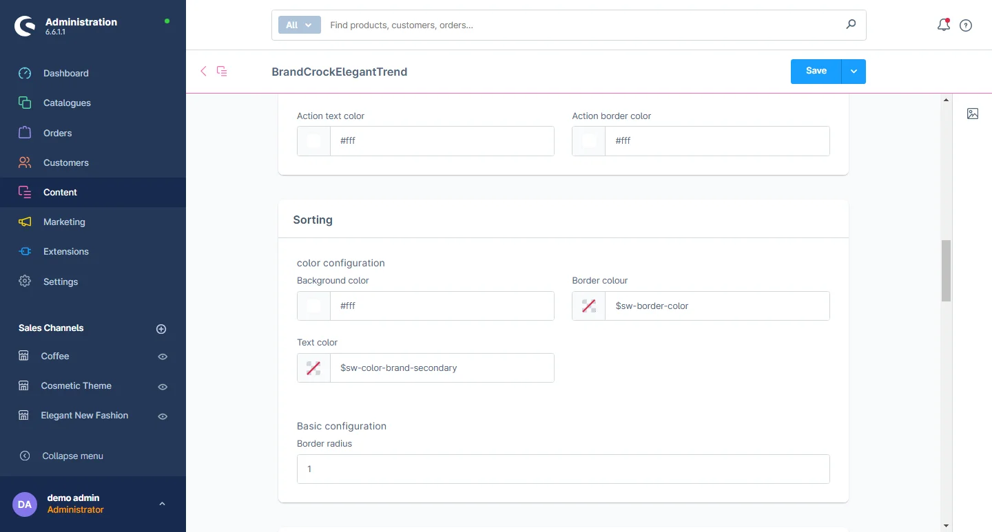
3- Sorting: You can select the background and text color.
4- Switch Listing view: Go to Categories after the Catalogues. Visit Layouts to modify the listing view.
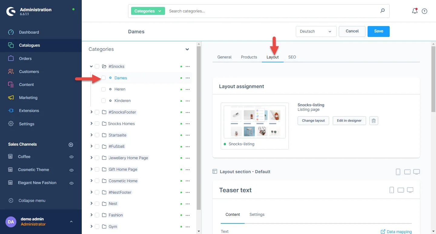
5- Switch Listing view: Select the listing view under the Content tab.
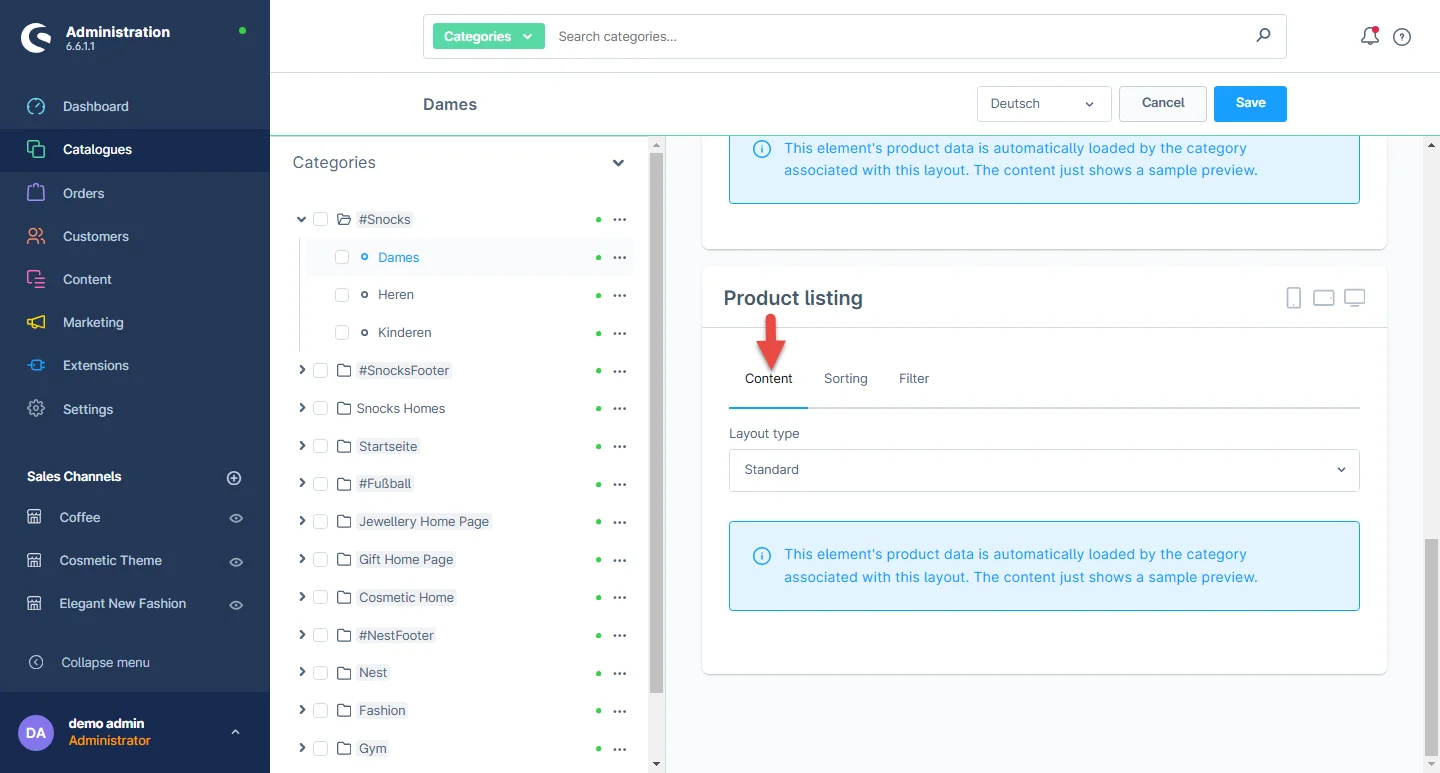
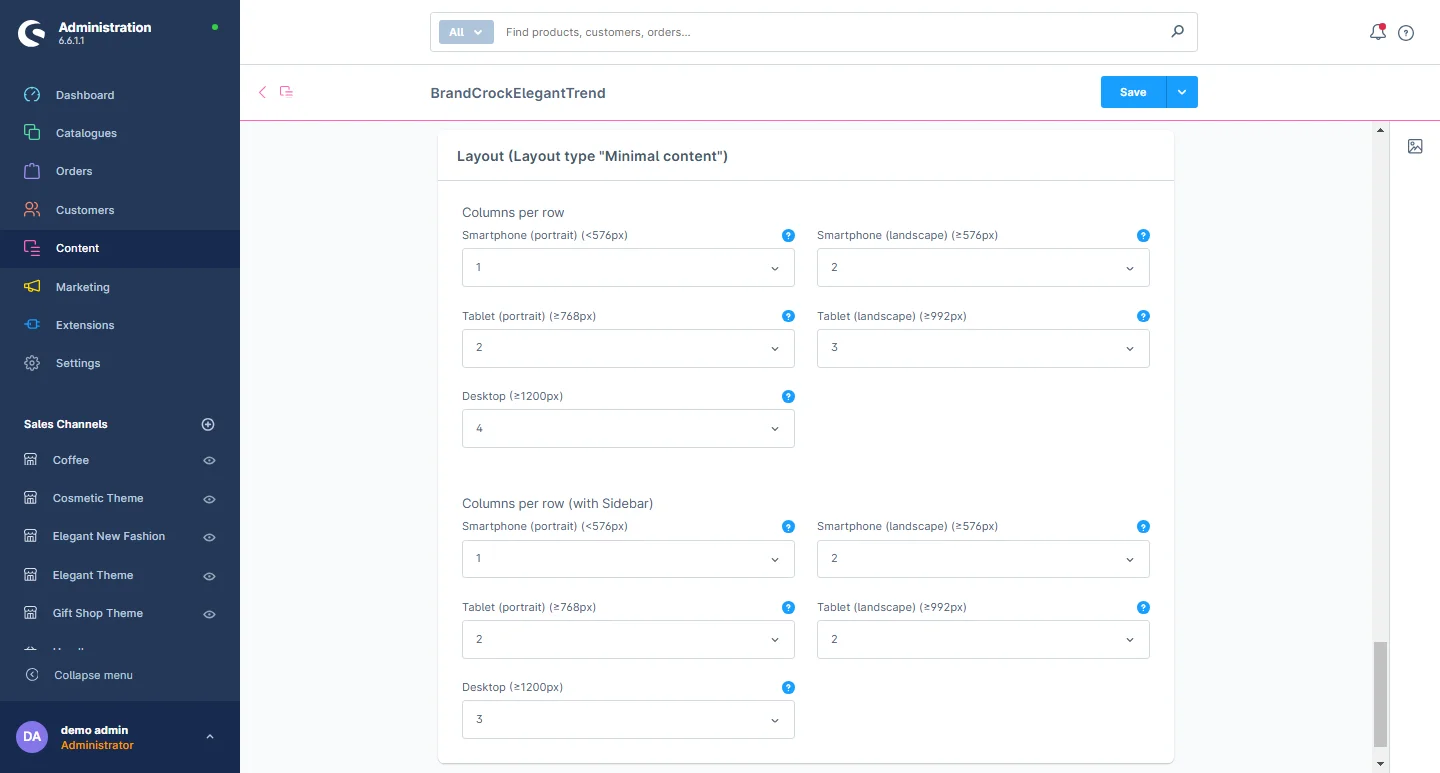
6- Listing Layout settings: You can select the listing layout and adjust the columns per row based on devices and the sidebar listing settings.
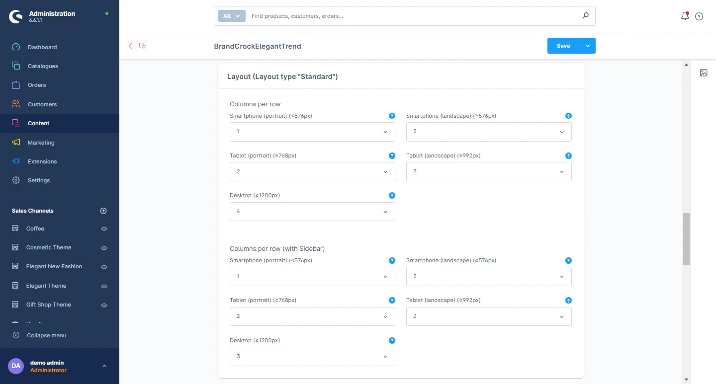
7- Listing Layout settings: You can select the listing layout and adjust the columns per row based on devices and the sidebar listing settings.
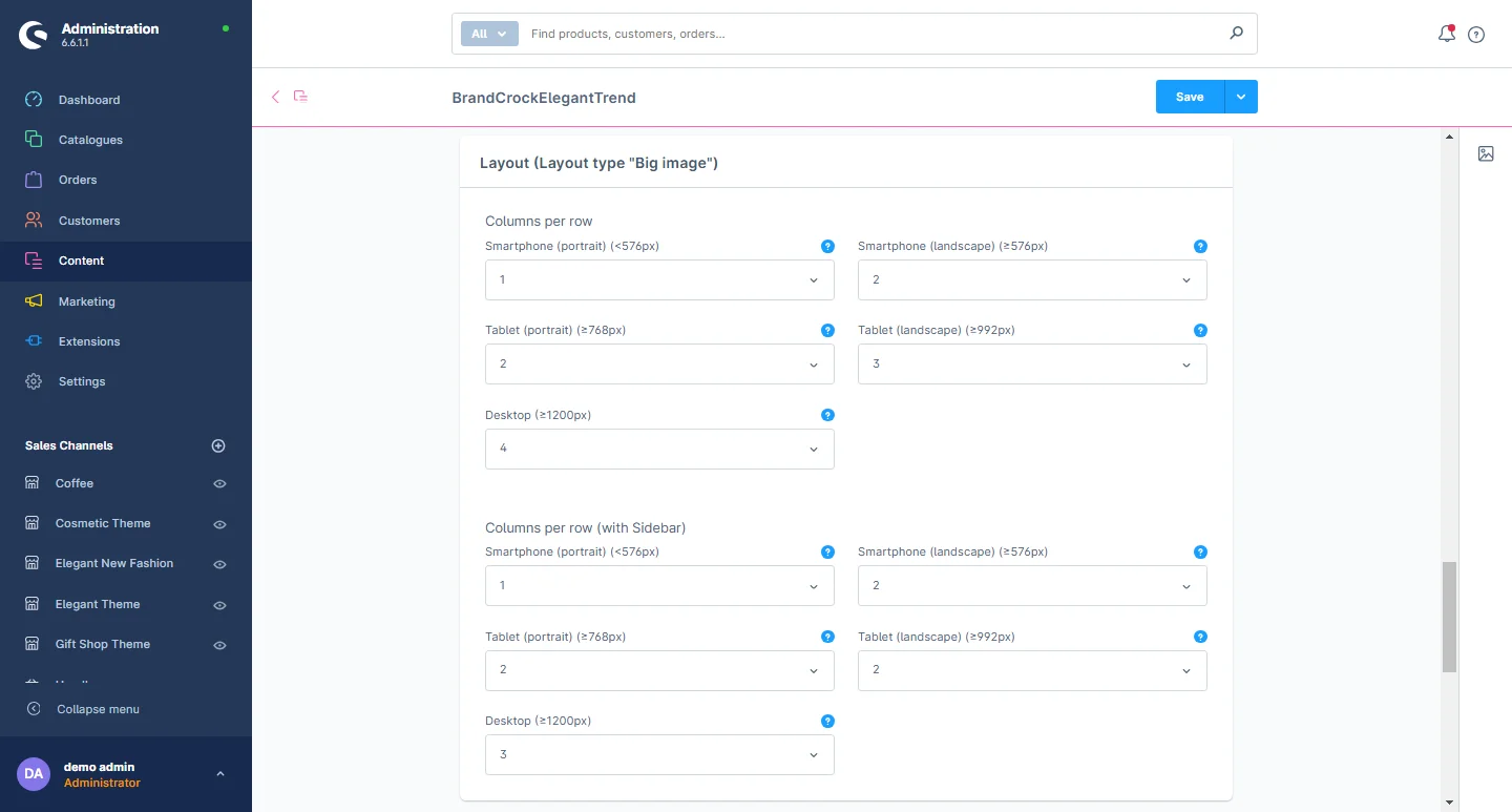
8- Listing Layout settings: You can select the listing layout and adjust the columns per row based on devices and the sidebar listing settings.
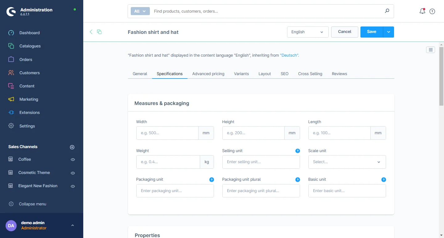
Product Detail Configuration
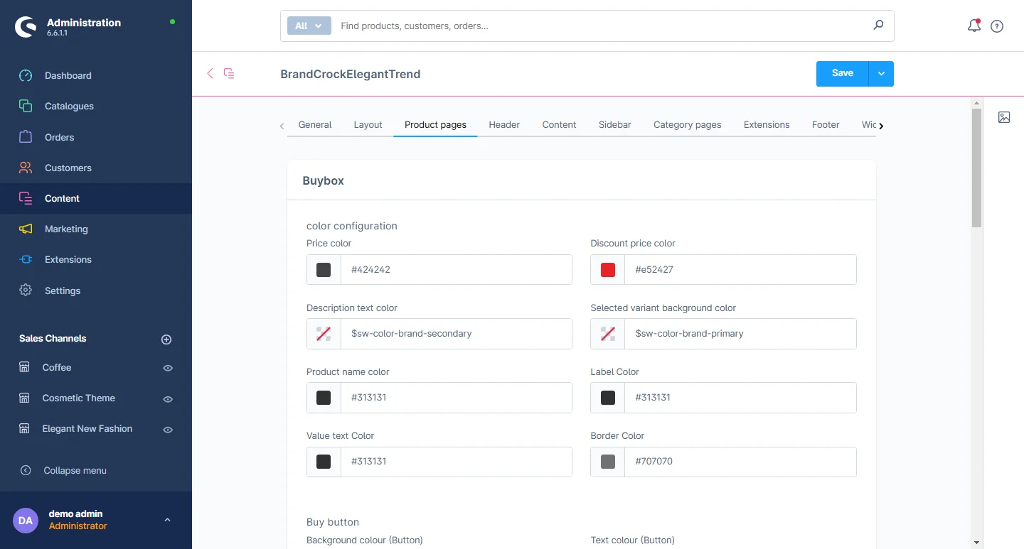
1- Open the product detail tab: Select the product detail configuration from here.

2- Product Section: You can configure the product box by adjusting the background color, border color, border radius, and the color settings for the buy button.
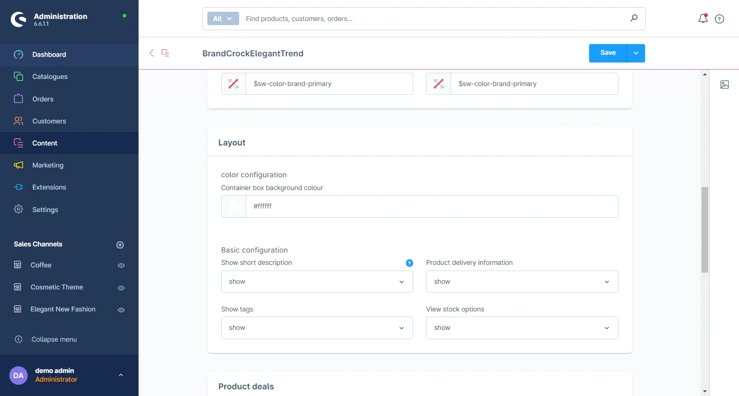
3- Product layout: You can customize the background color, images, and basic layout settings of the product layout.
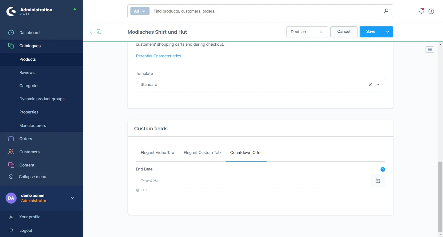
4- Product deals: You can customize the text and date color.

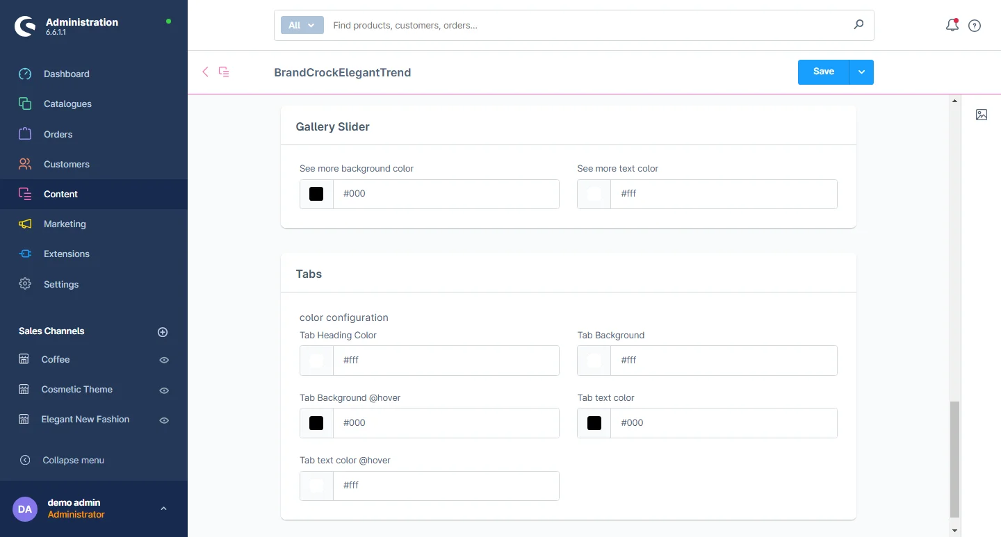
5- Gallery Slider: You can customize the background color and text color.
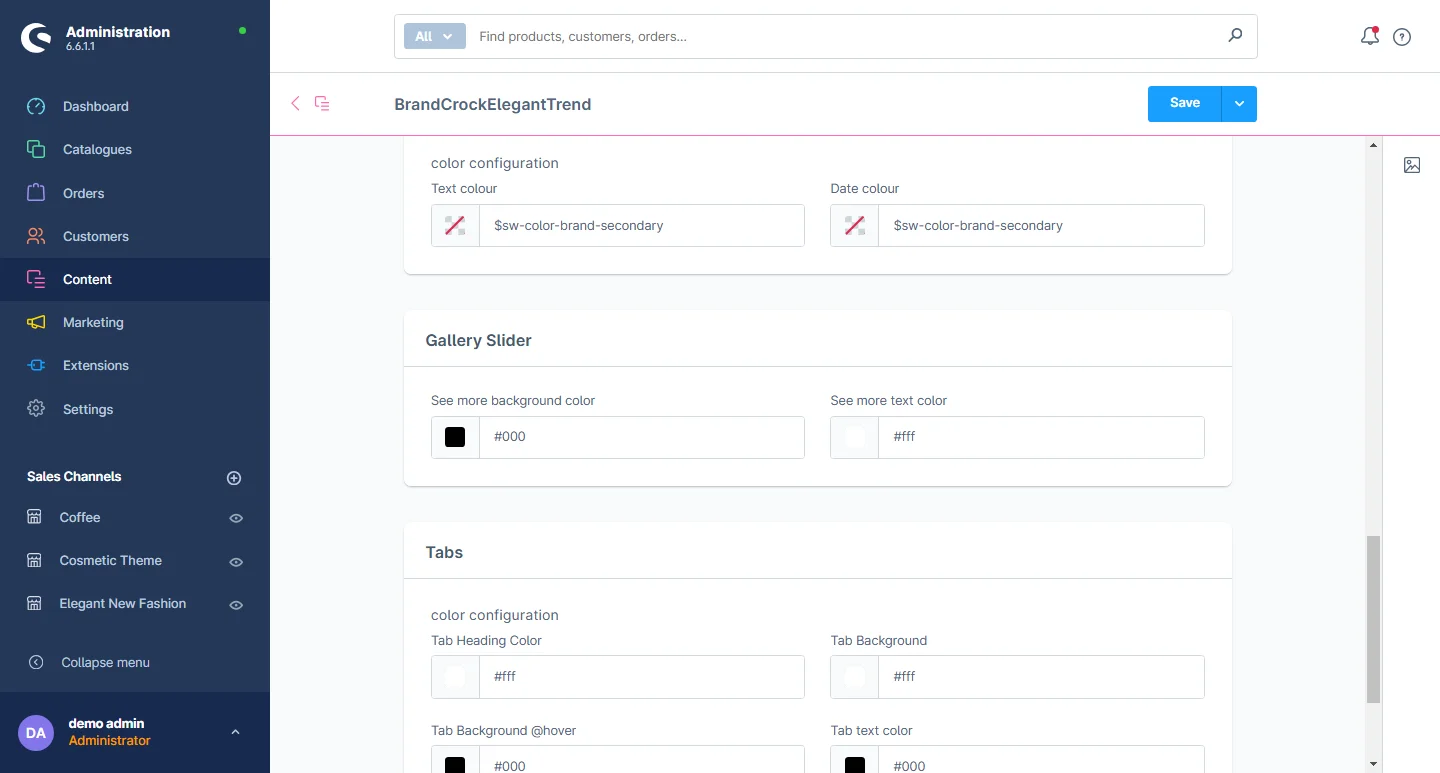
6- Tabs: You can change the heading color, tab background color, tab background color on hover, tab text color and the tab text color on hover.
7- Multiple tabs: Select the specification tabs by going to a particular product.
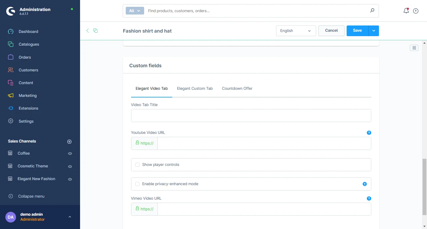
8- Video Tab: You can add the video title, video link URL of Youtube and Vimeo, also activate or deactivate player controls of video and privacy enhanced mode.
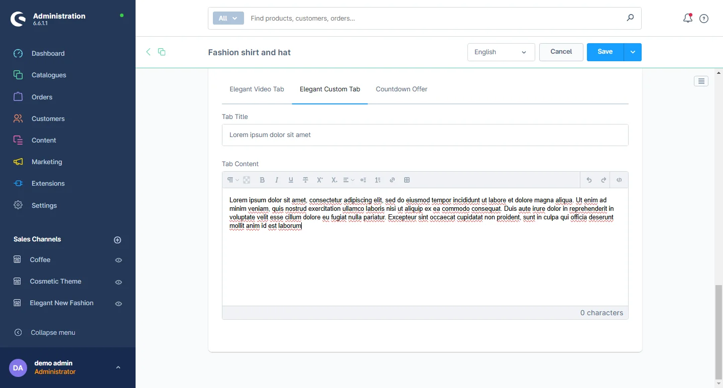
9- Custom Tab: You can add the title and description here.
10- Countdown Offer Tab: You can edit the end date of how long the offer on the product will last.
Footer Configuration
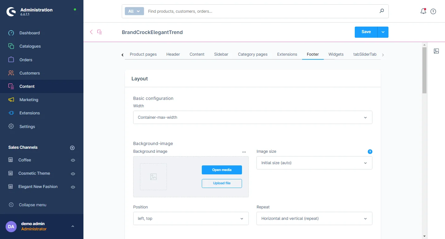
1- Open the Footer tab: Select the footer configuration from here.
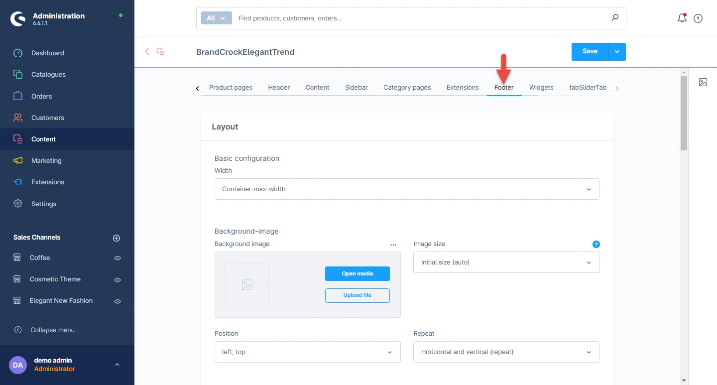
2- Layout: You can choose between a full-width or maximum-width container layout. You also have the flexibility to enable or disable the copyright footer and service menu. Additionally, you can modify the background image, adjusting its dimensions, position, and repetition. You can customize the font size, text and heading styles, line width for headings, and text formatting for headings to suit your preferences.
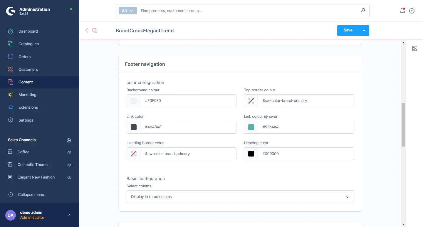
3- Footer Navigation: You can change the footer background color, link color, mouse hover link color, frame box color, and text size of the link.
4- Footer Copyright: You can change font size, line height, and color.
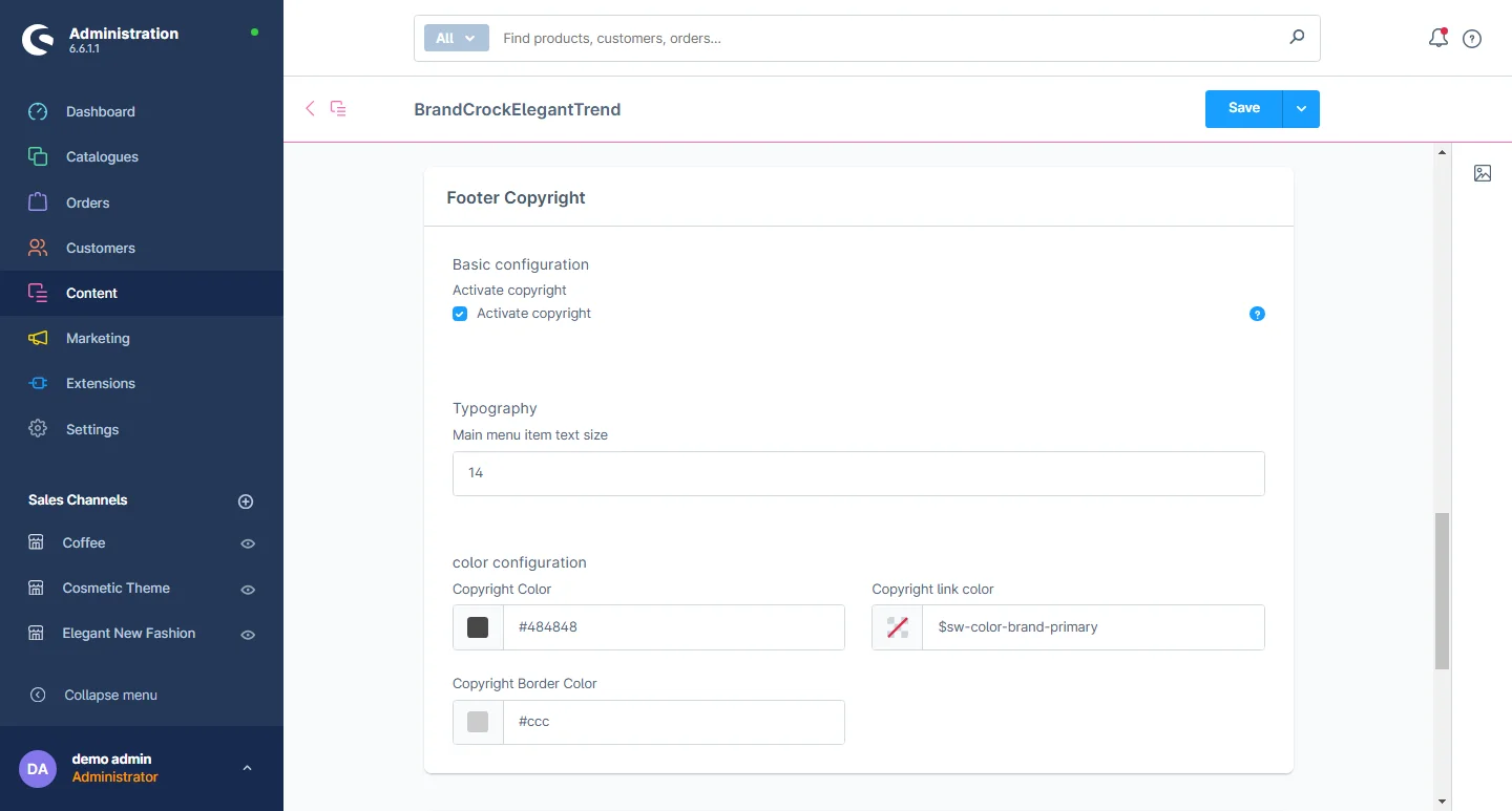
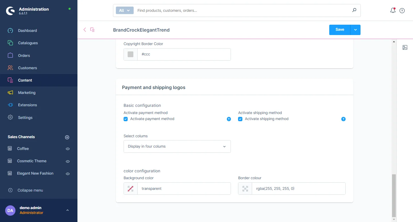
5- Shipping and payment method: You can enable or disable the shipping and payment method logos as needed.
How to create the shopping world
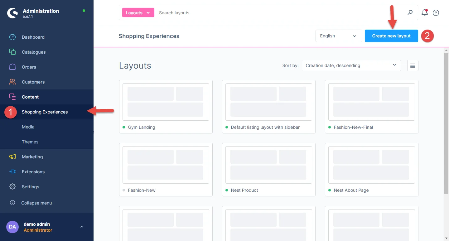
1- In the administration dashboard, go to Shopping Experience and click the Create new layout button.
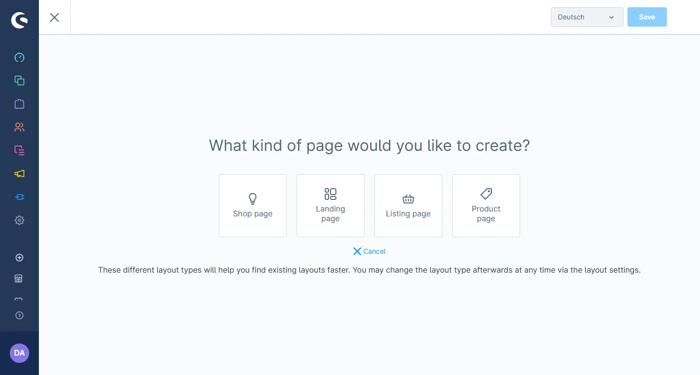
2- Select Landing page or any other layout type of your choice.
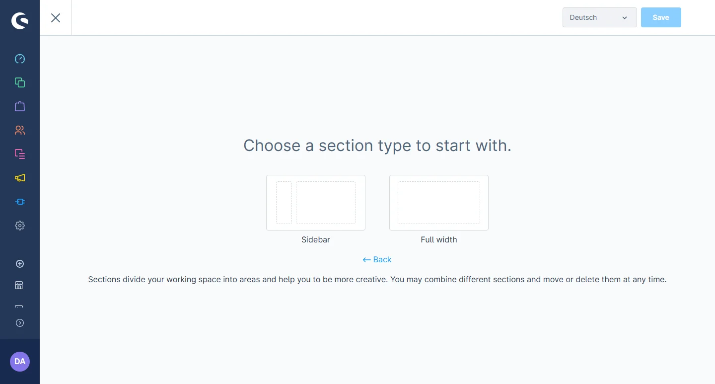
3- Select the desired section type.
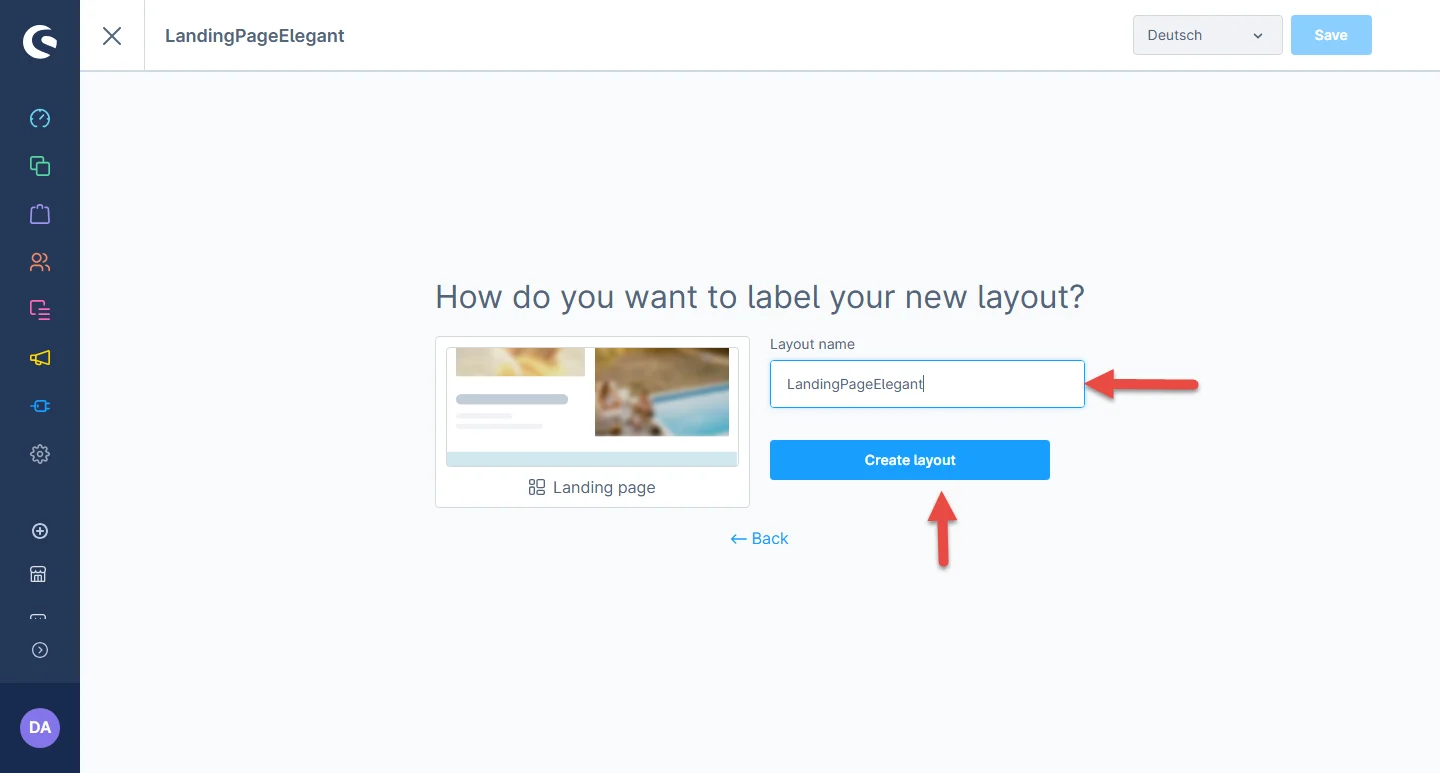
4- Now set the layout name and click on the Create Layout button.
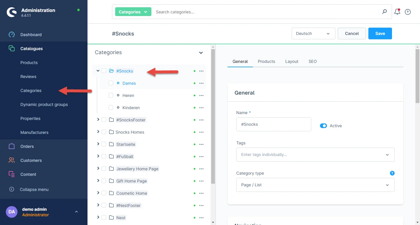
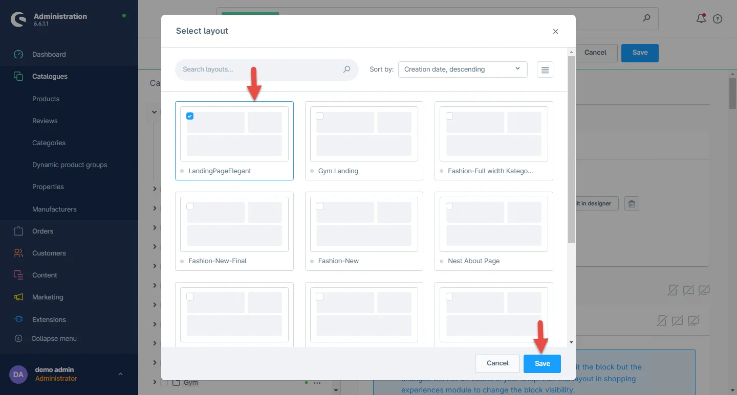
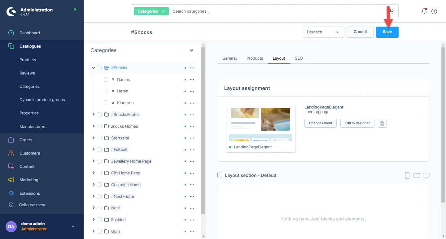
5- After creating your layout, go to Catalogues -> Categories and click on the category you need to assign the previously created layout.
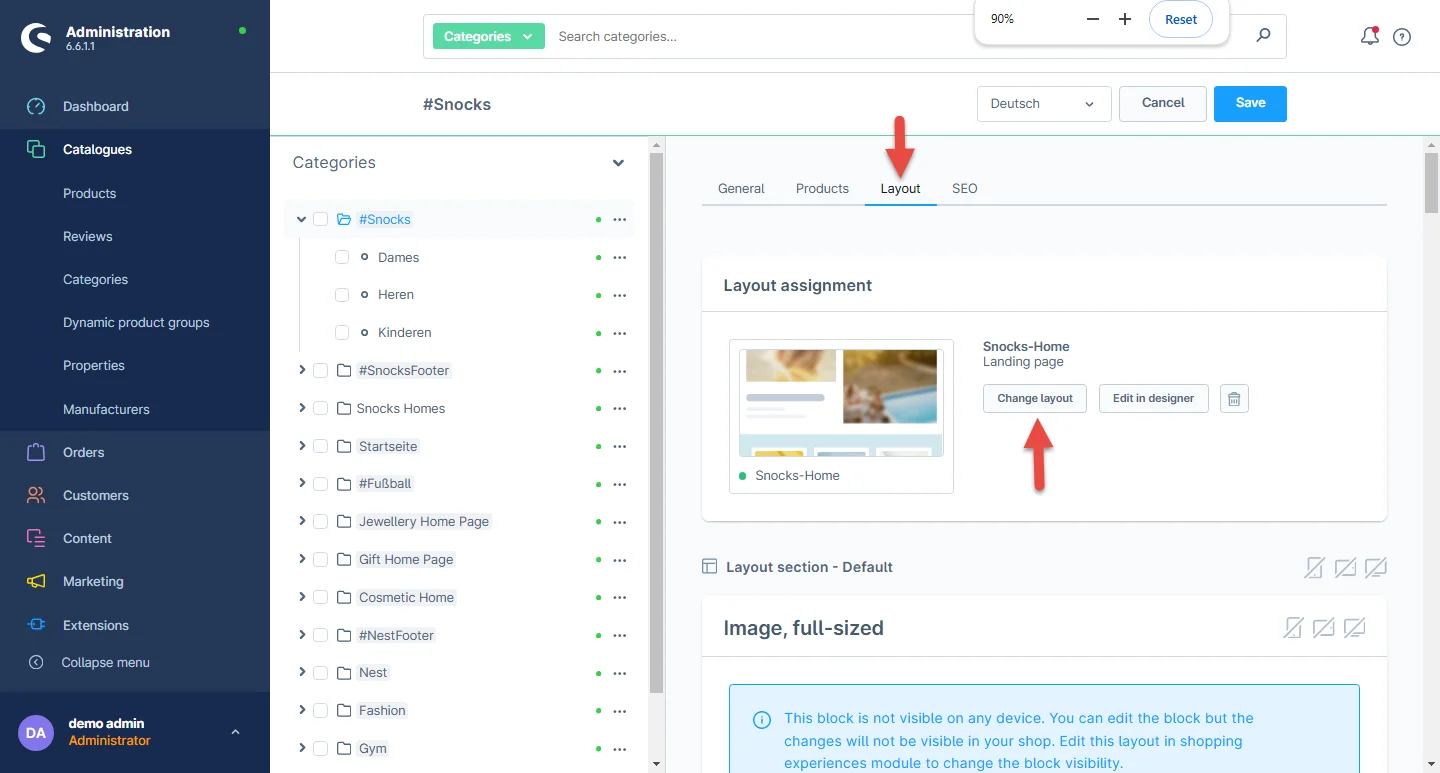
6- Now select the layout tab and click on the change layout button.
7- Select the recently created layout and hit the save button. You can also search the layout name if it is not initially visible.
8- After assigning the layout now you can save the category settings.
Deal Section Configuration
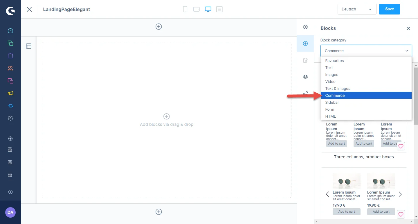
1- Shopping Experience: navigate to the block category and select the dropdown menu for the Commerce option.
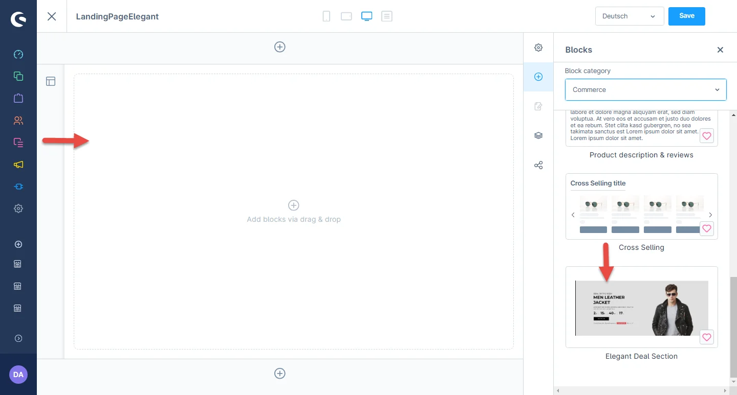
2- Now drag the deal banner widget to the desired location on the left side of the CMS section.
3- After dropping the widget, click the settings icon to open element configurations.
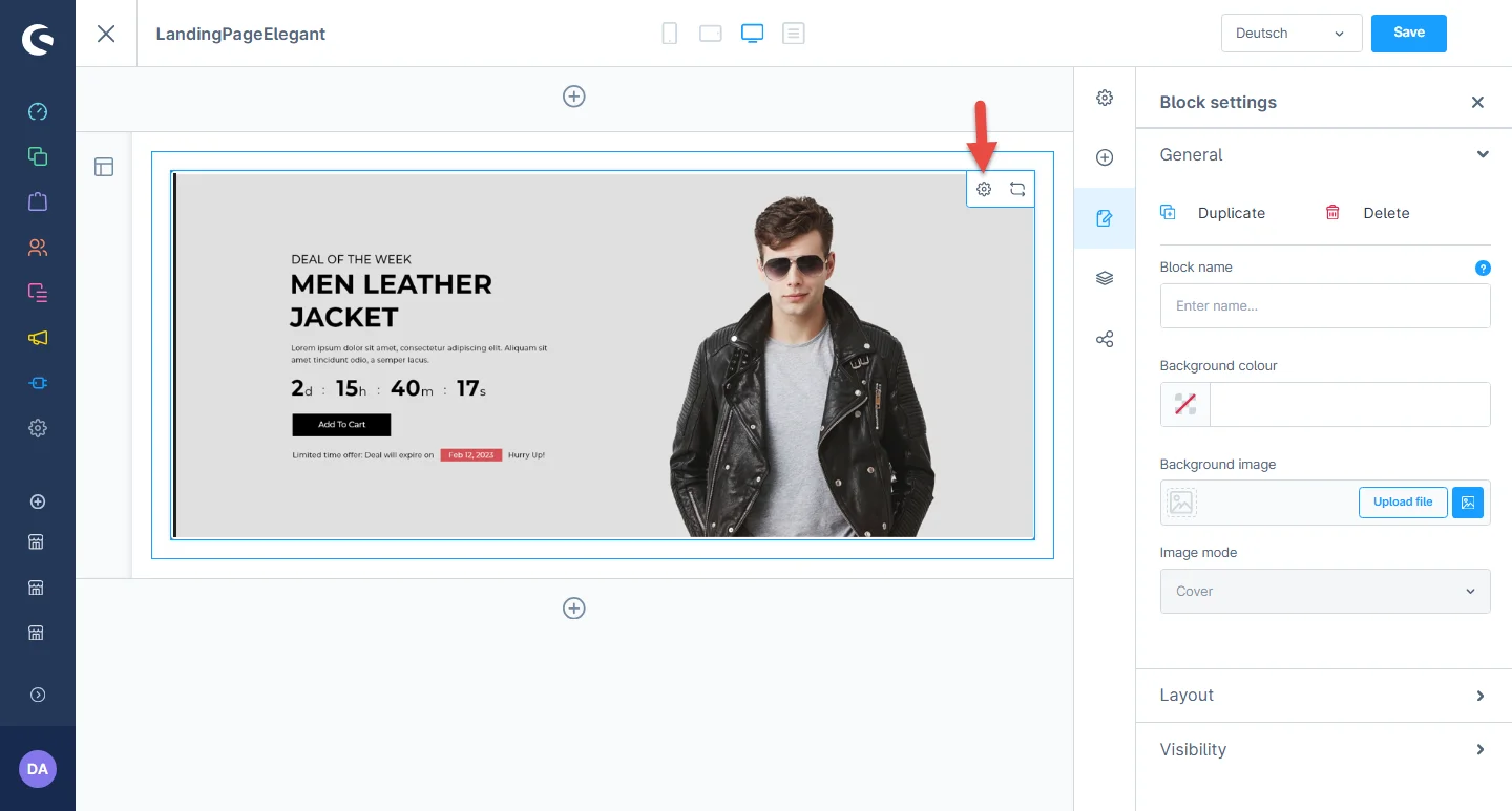
4- In the element configuration, you can add background color, label color, deal heading, and select products for the deal section.
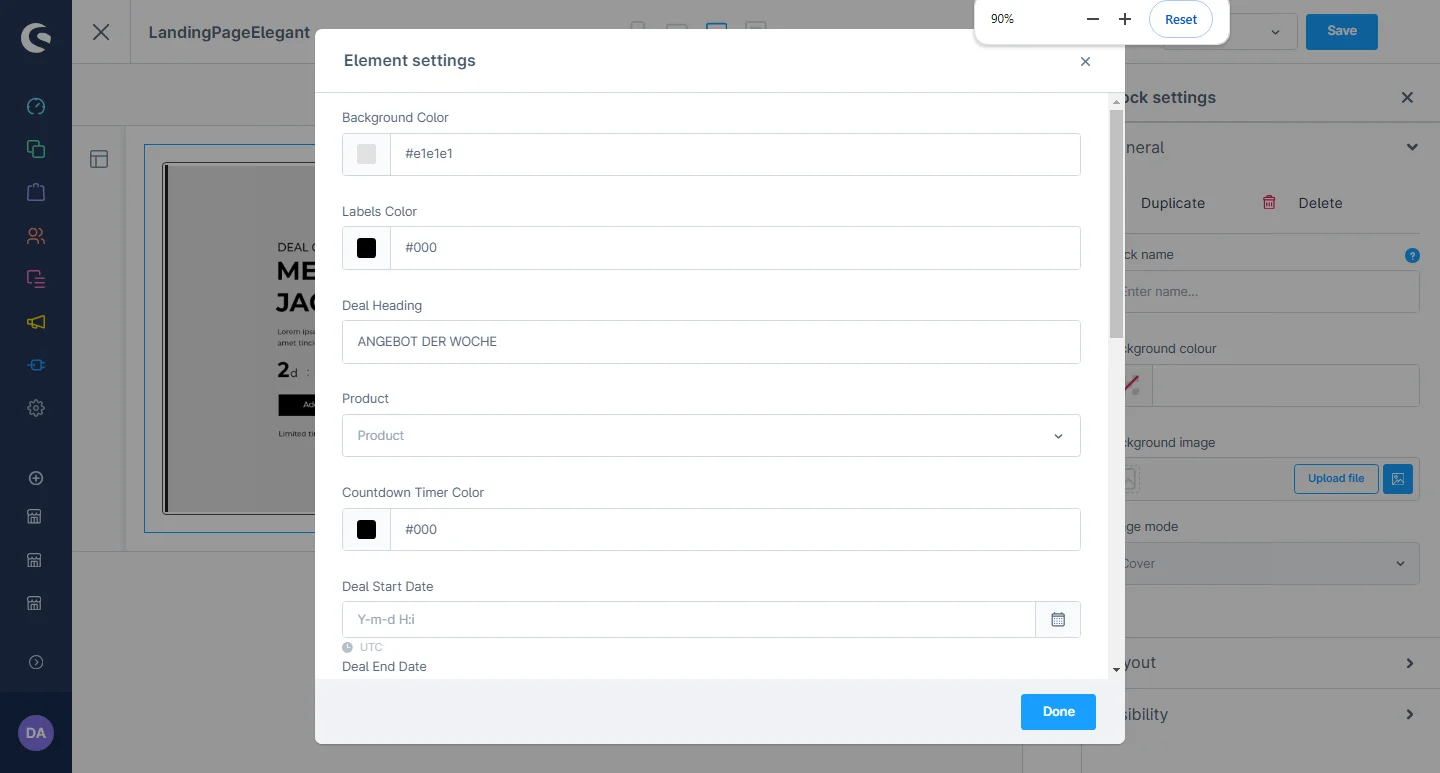
5- You can change the countdown timer color, description, set start and end dates for the deal section.

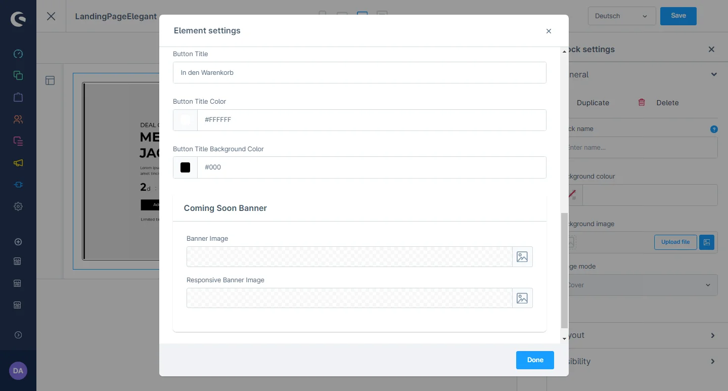
6- After that, you can change the button title and color. If the countdown is closed, you can upload a banner from the backend.
After saving the CMS page configurations, this block will be visible in the storefront at the respective layout.
Reviews slider Configuration
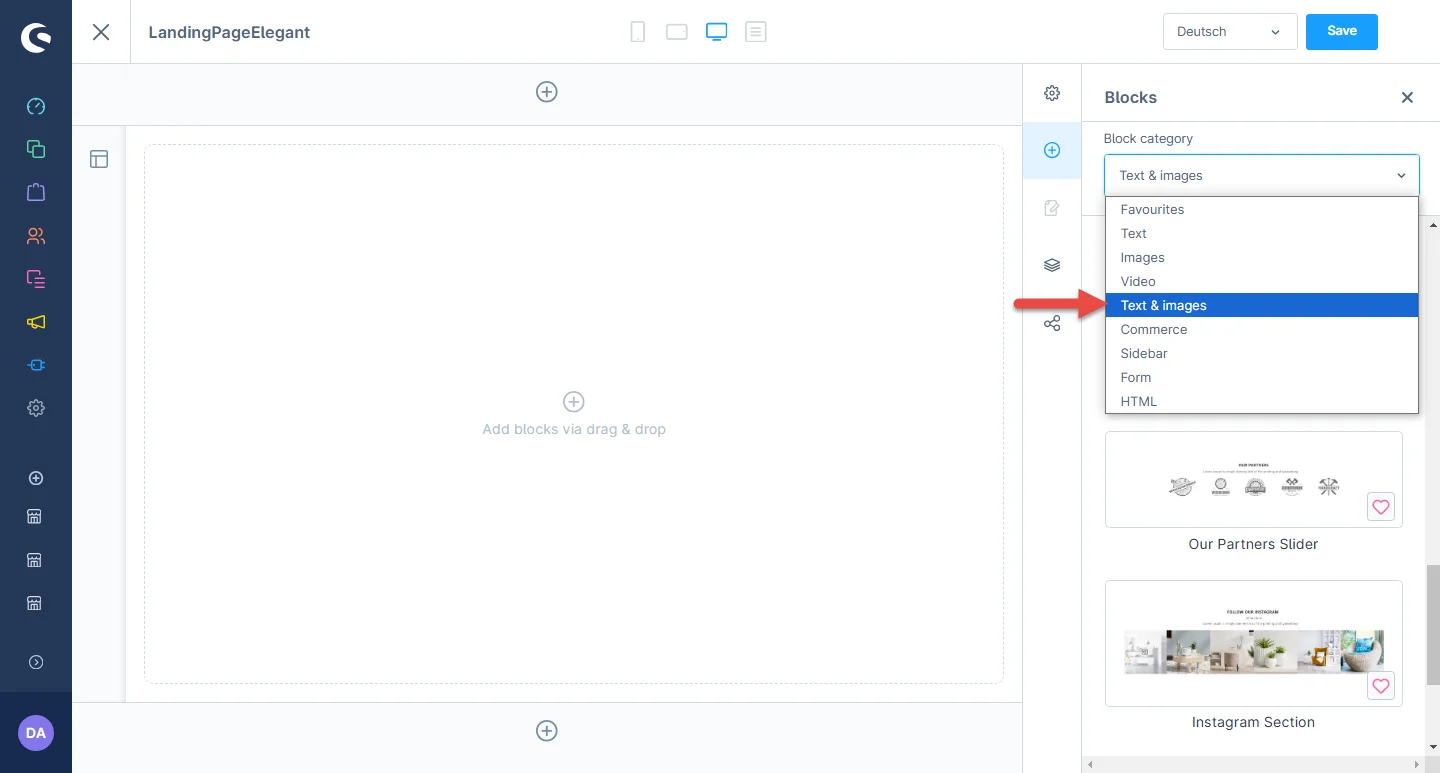
1- Shopping Experience: navigate to the block category and select the dropdown menu for the Text and Images option.
2- Now drag the review widget to the desired location on the left side of the CMS section.
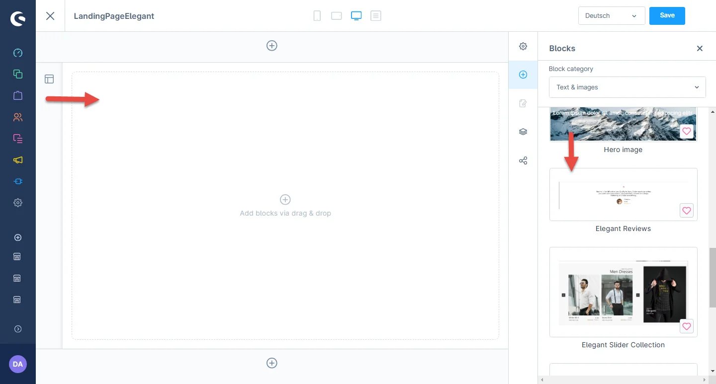
3- After dropping the widget, click on the settings icon to open the element’s configurations.
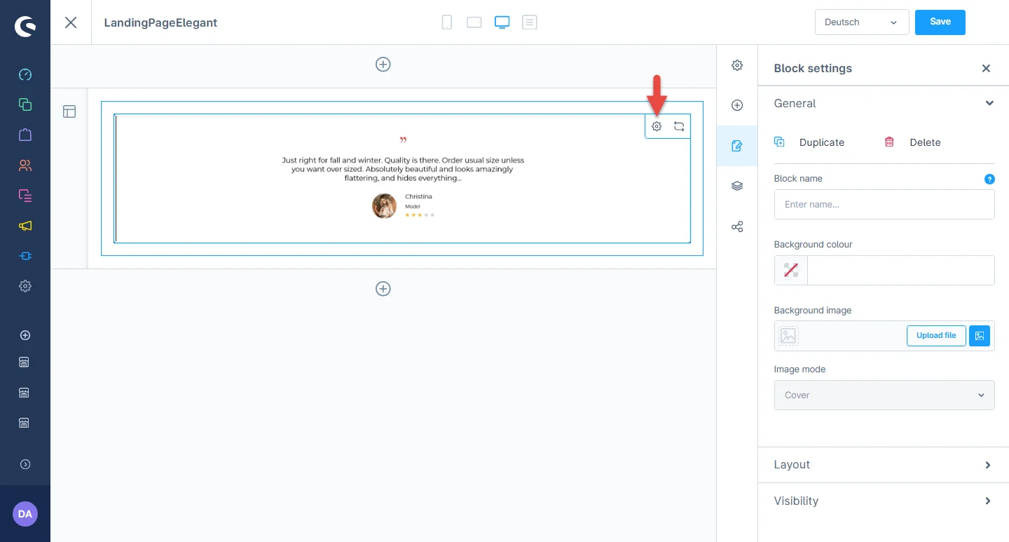
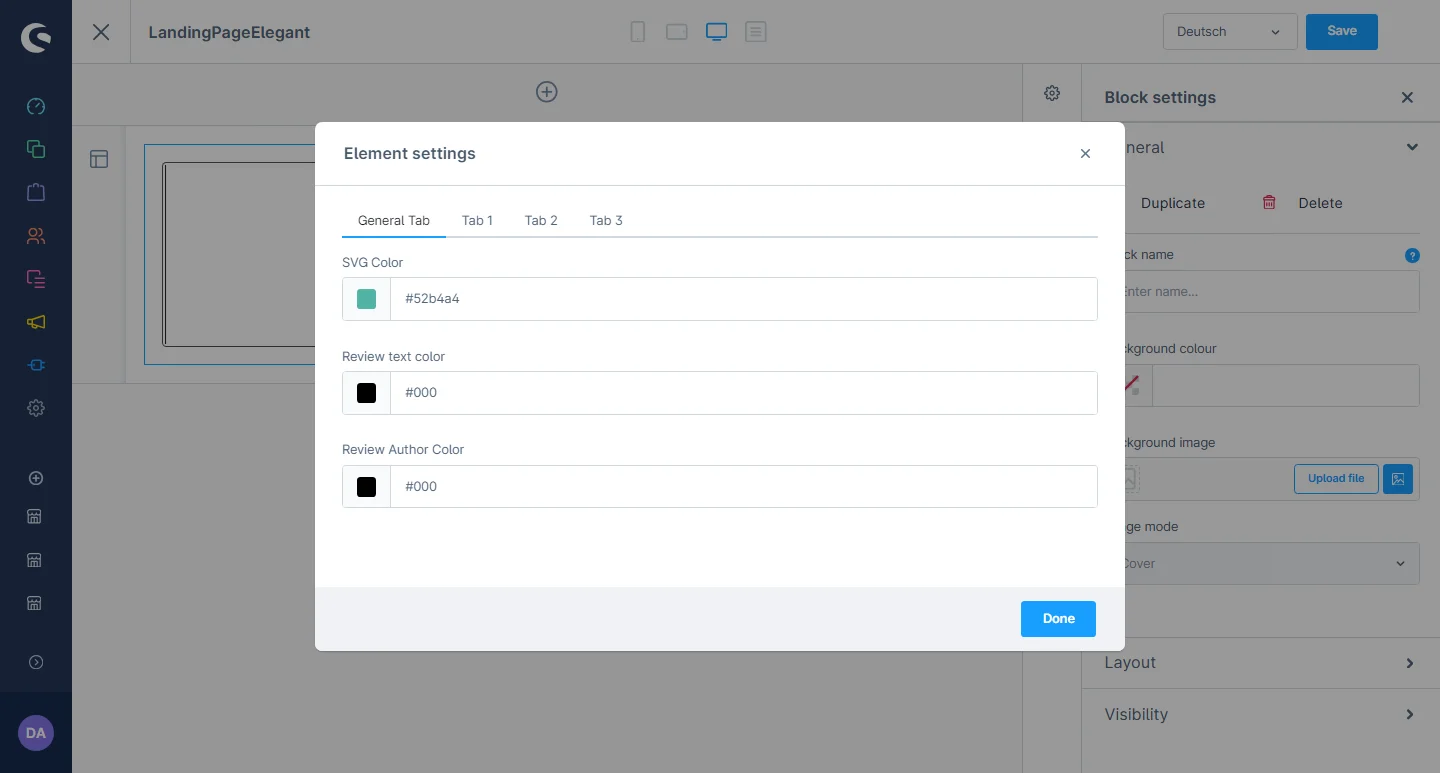
4- In element configurations, you can change the SVG color, review text, and author text color.
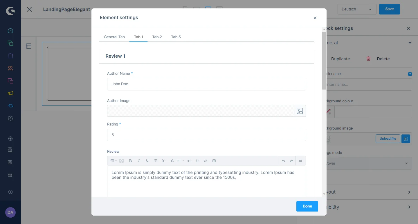
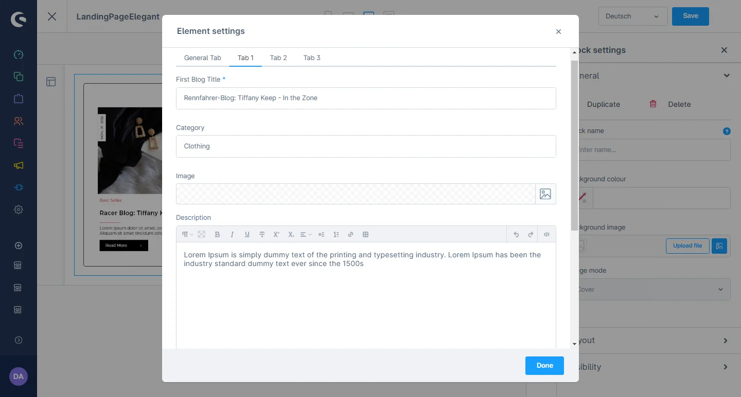
5- After that, you can change the main heading, category ,image and blog description.You can set the author name,author image,rating and description
After saving the CMS page configurations, this block will be visible in the storefront at the respective layout.
Product Slider Collection Configuration
1- Shopping Experience: navigate to the block category and select the dropdown menu for the Text and Images option.

2- Now drag the product widget to the desired location on the left side of the CMS section.
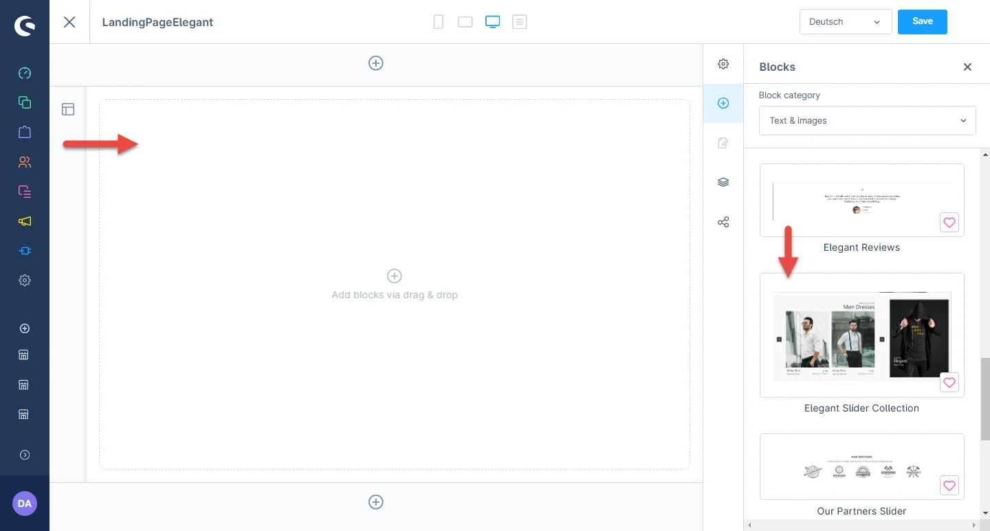
3- After dropping the widget, click on the settings icon to open the element’s configurations.
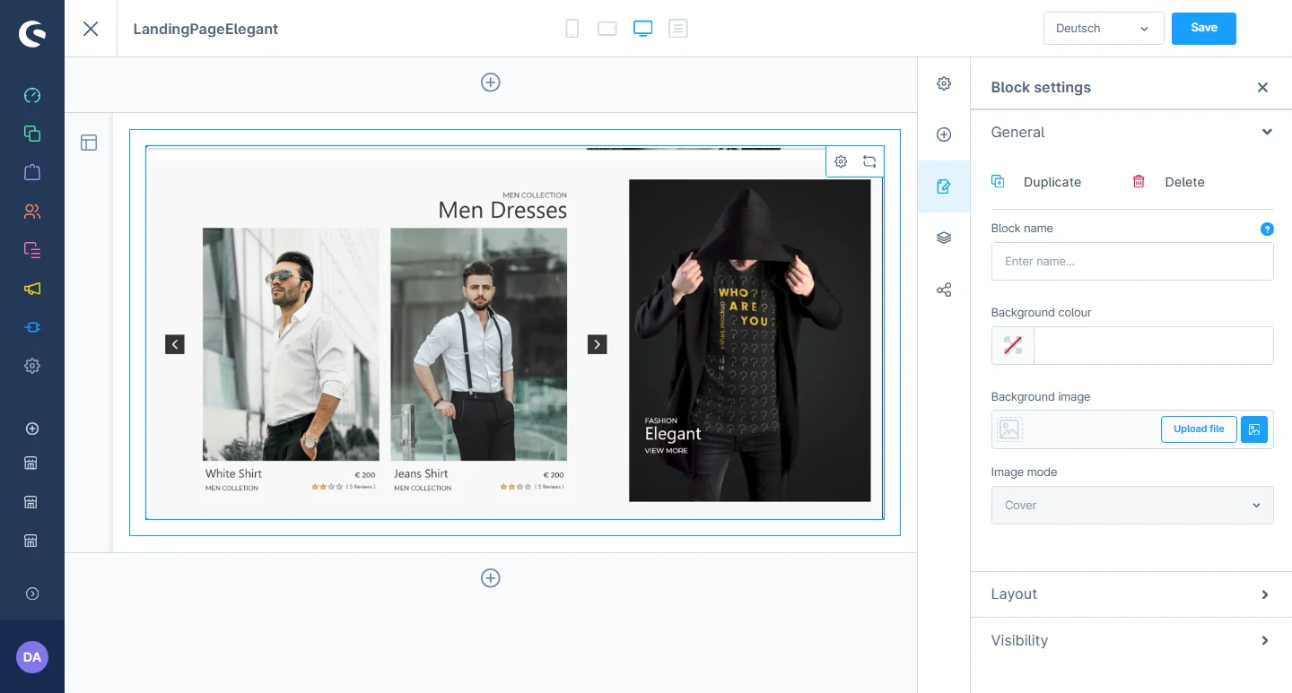
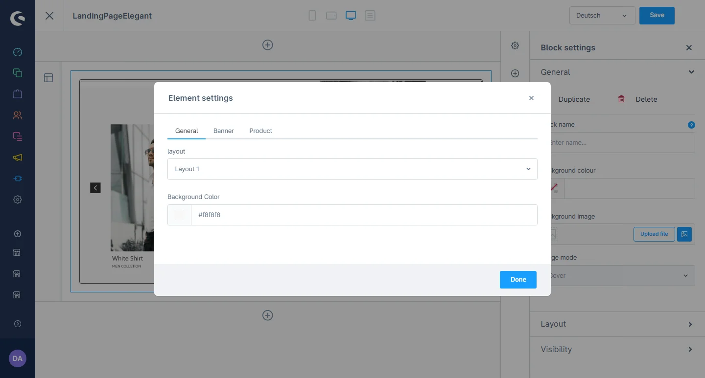
4- In element configurations, you can go to the General tab to set the desired layout and select a background color.
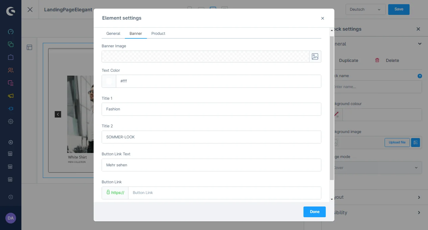
5- After that, you can go to the “banner” tab where you can change the banner image, text color, title, button color, and button text.
6- You can set the text color, heading, and can select the desired product.
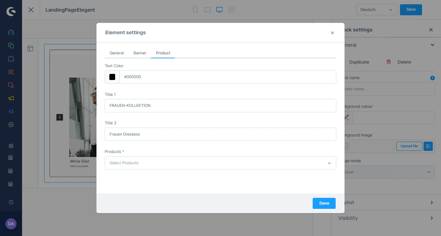
After saving the CMS page configurations, this block will be visible in the storefront at the respective layout.
Instagram Element
1- Shopping Experience: navigate to the block category and select the dropdown menu for the Text and Images option.

2- Now drag the instagram element widget to the desired location on the left side of the CMS section.
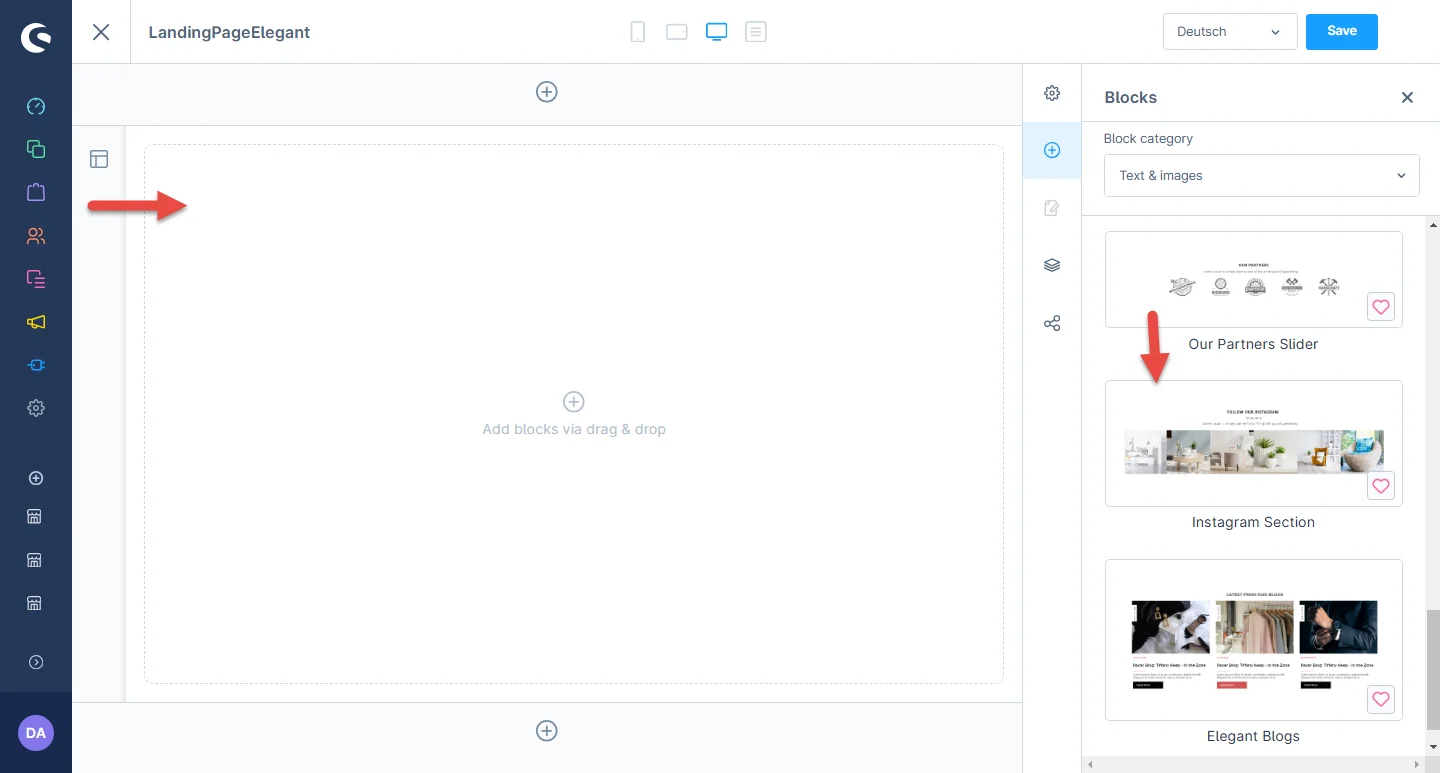
3- After dropping the widget, click on the settings icon to open the element’s configurations.
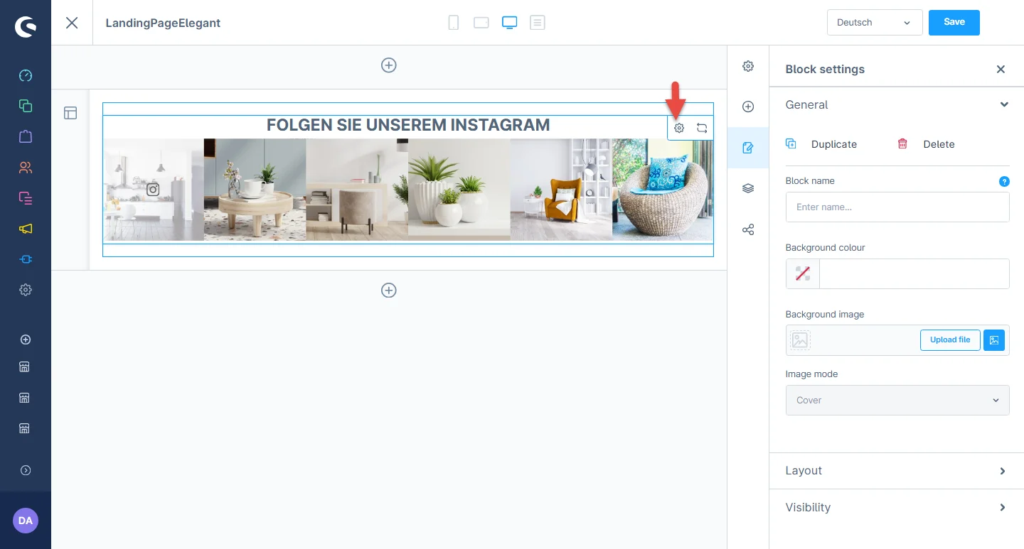
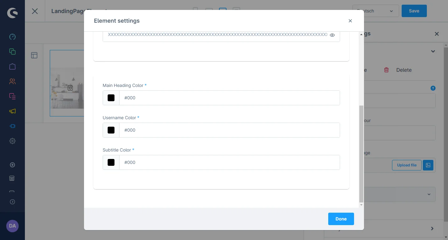
4- In element configurations, you can add the title, subtitle ,user name and access token id.
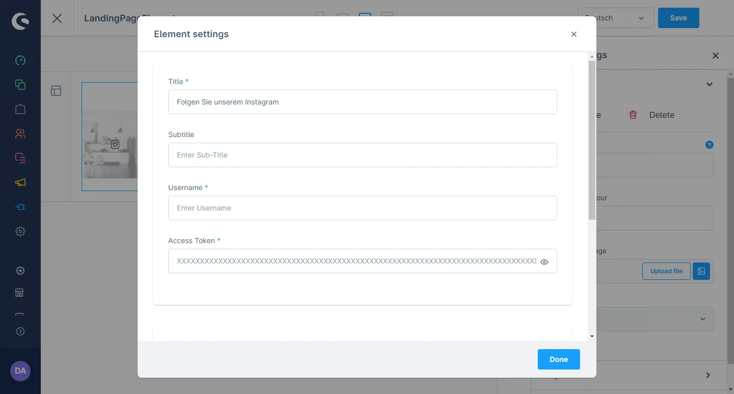
5- After that, you can add the main heading, user name and subtitle color.
After saving the CMS page configurations, this block will be visible in the storefront at the respective layout.
Fashion Teaser Configuration
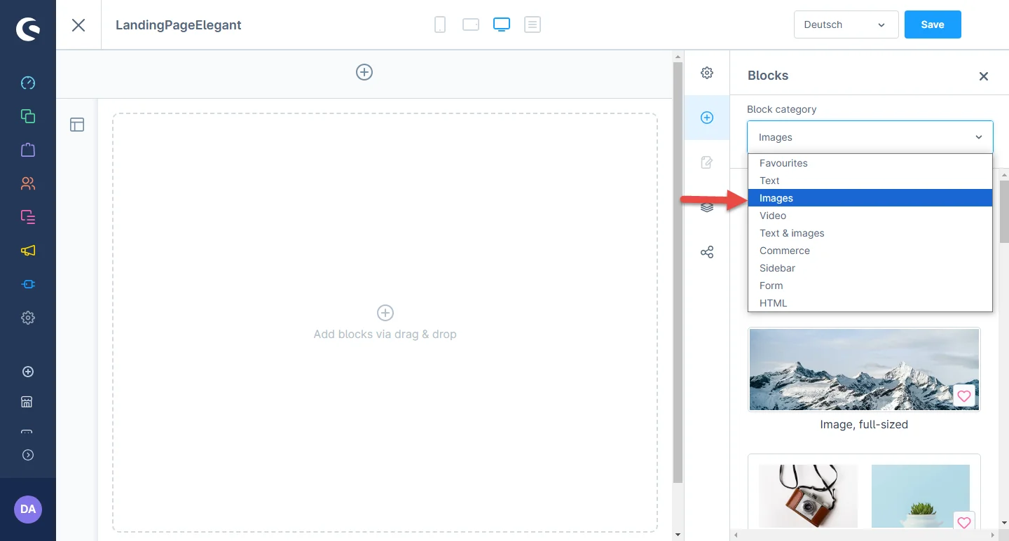
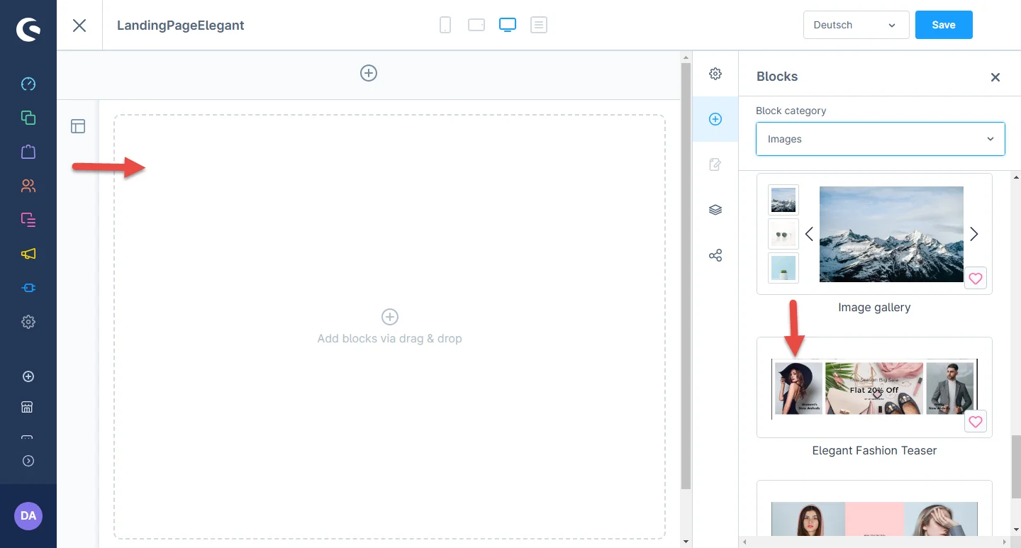
1- Shopping Experience: navigate to the block category and select the dropdown menu for the Images option.
2- Now drag the fashion teaser element widget to the desired location on the left side of the CMS section.
3- After dropping the widget, click on the settings icon to open the element’s configurations.
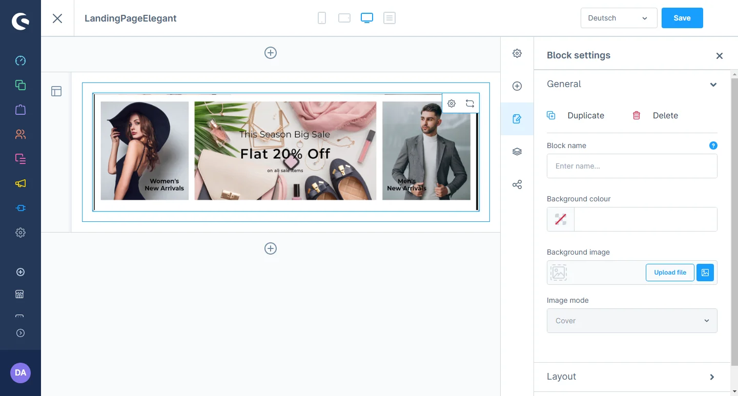
4- In element configurations, you can add an image, text color, text, and link.
5- Then, go to the tab 2 and add an image, text color, text, discount text, discount percentage, discount detail, and link.
After saving the configurations of the CMS page, this block will be visible in the storefront at the respective layout.
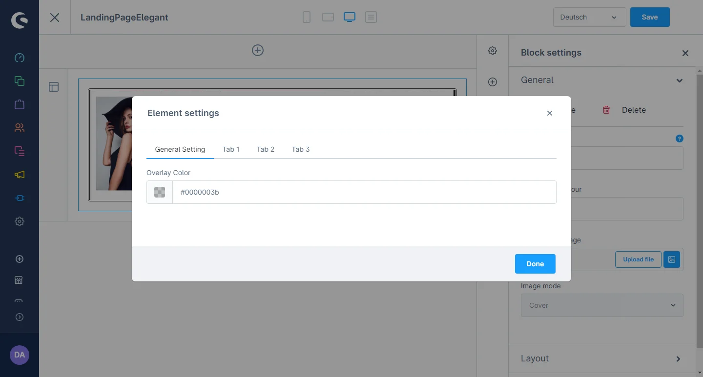
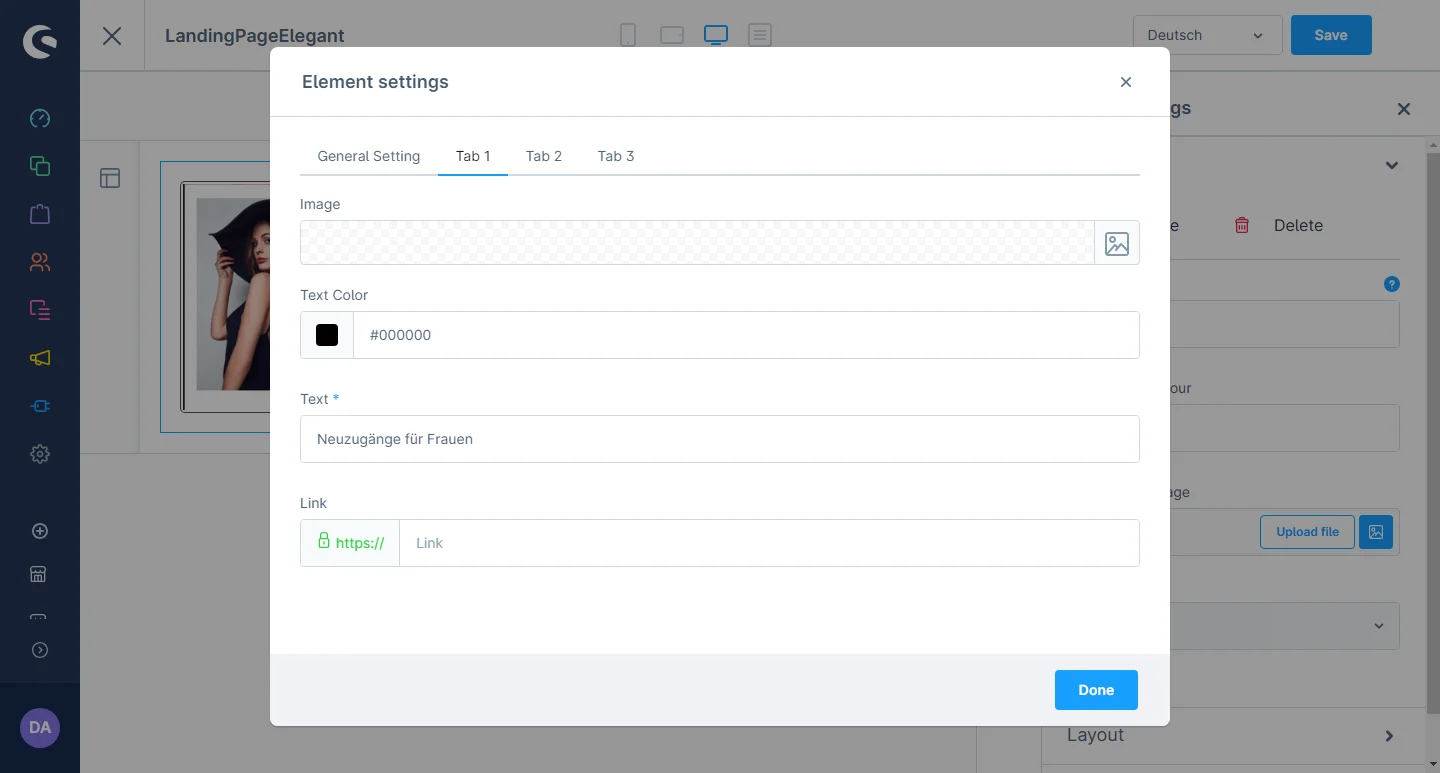
Main Slider Element Configuration
1- Shopping Experience: navigate to the block category and select the dropdown menu for the Images option.

2- Now drag the slider element widget to the desired location on the left side of the CMS section.
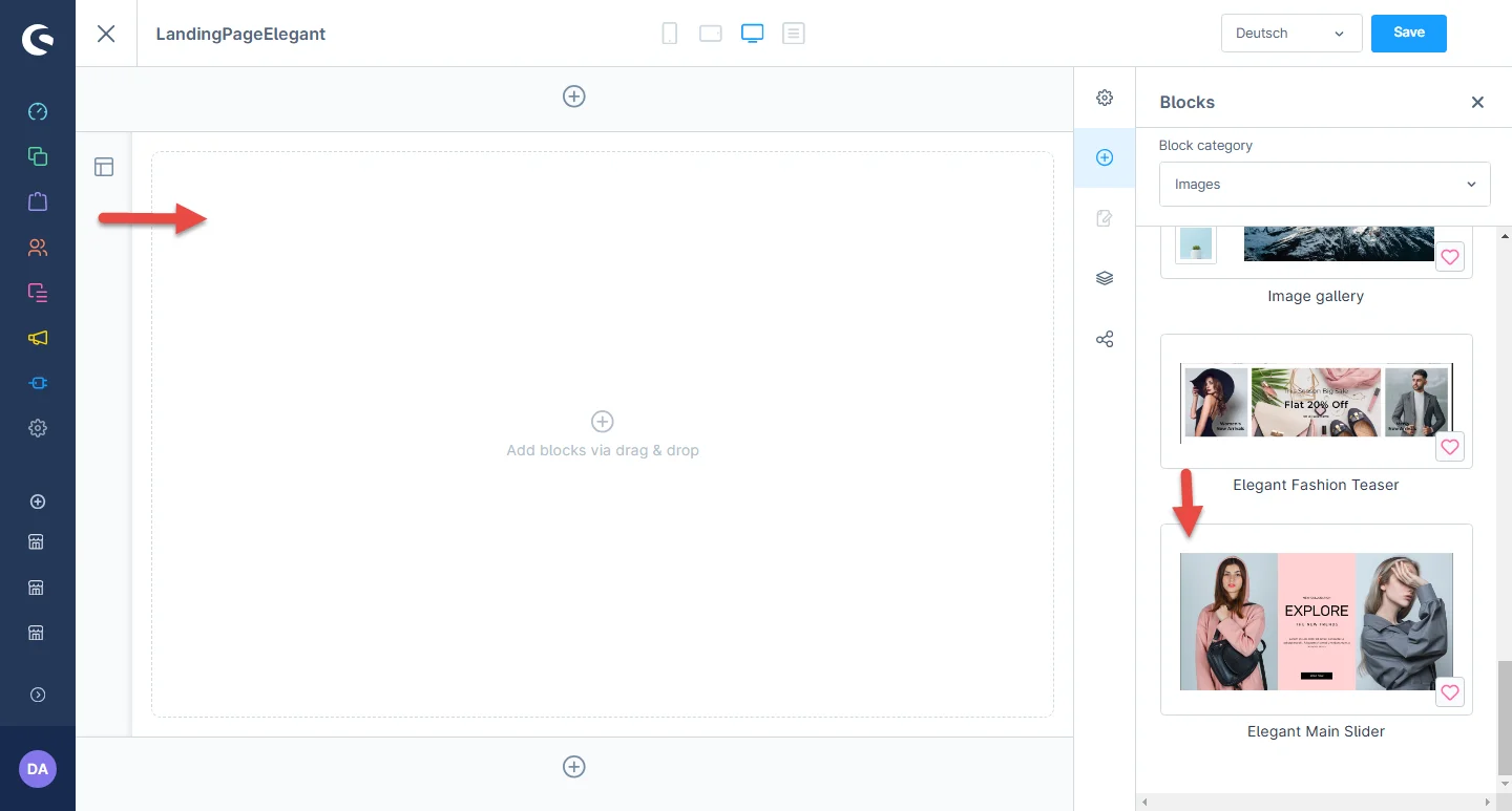
3- After dropping the widget, click on the settings icon to open the element configurations.
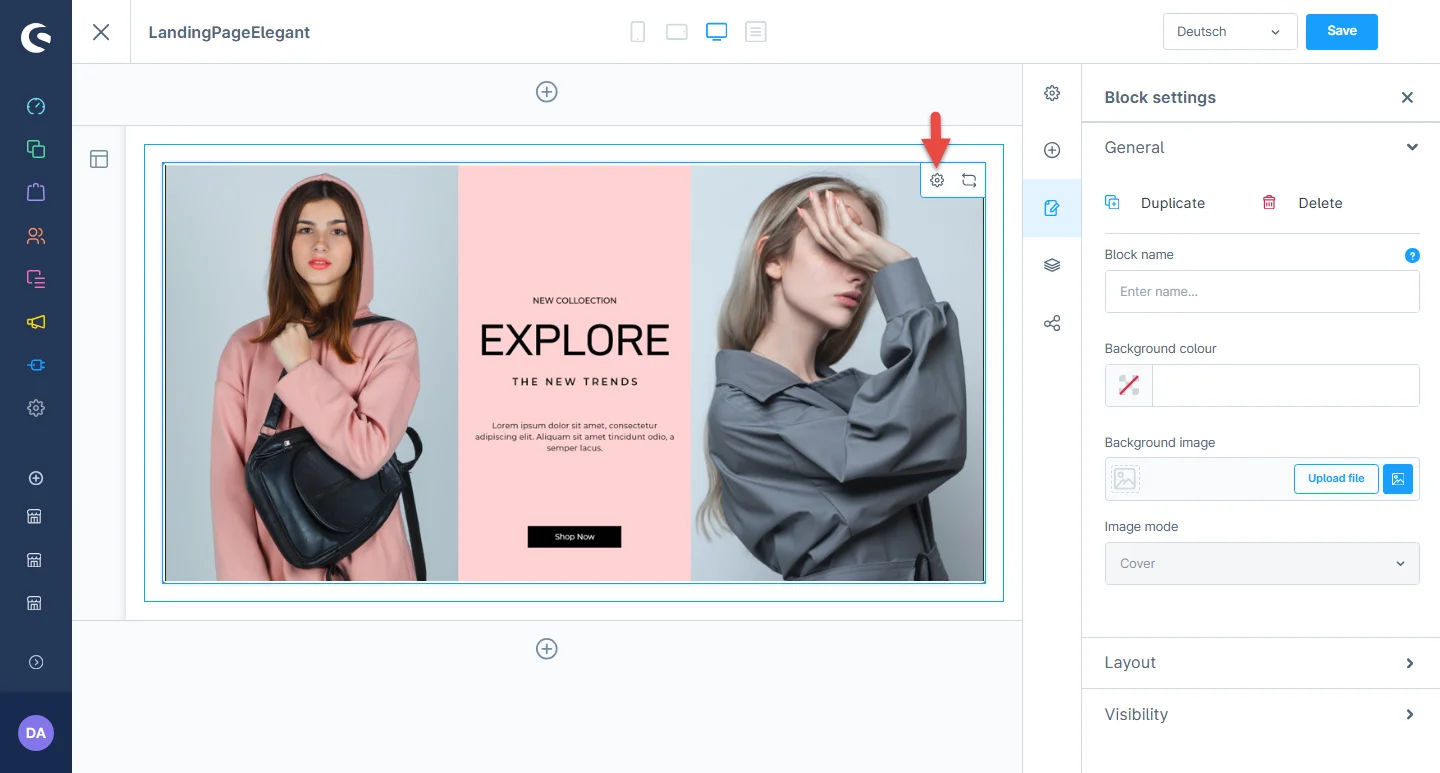
4- In element configurations, you can add the left and right image and text, center background color, and text color.
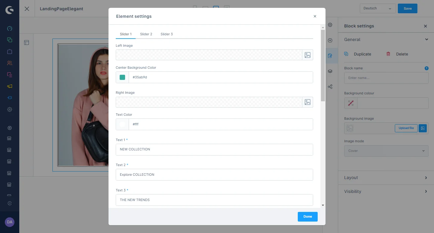
5- After that, you can add the description, button text, link, button background color, font color and button hover color.
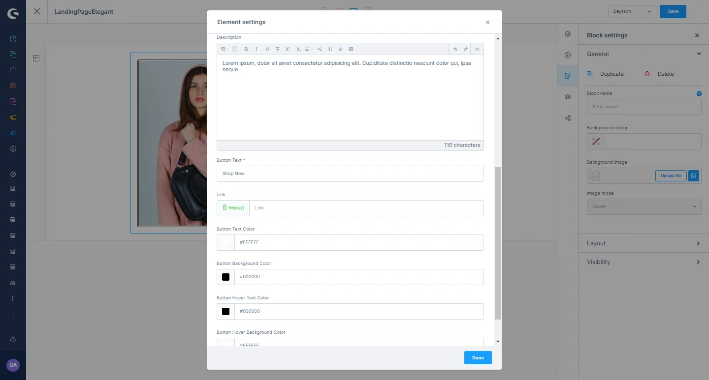
After saving the CMS page configurations, this block will be visible in the storefront at the respective layout.
Manufacturer Slider Element
1- Shopping Experience: navigate to the block category and select the dropdown menu for the Text and Images option.

2- Now drag the manufacturer banner widget to the desired location on the left side of the CMS section.
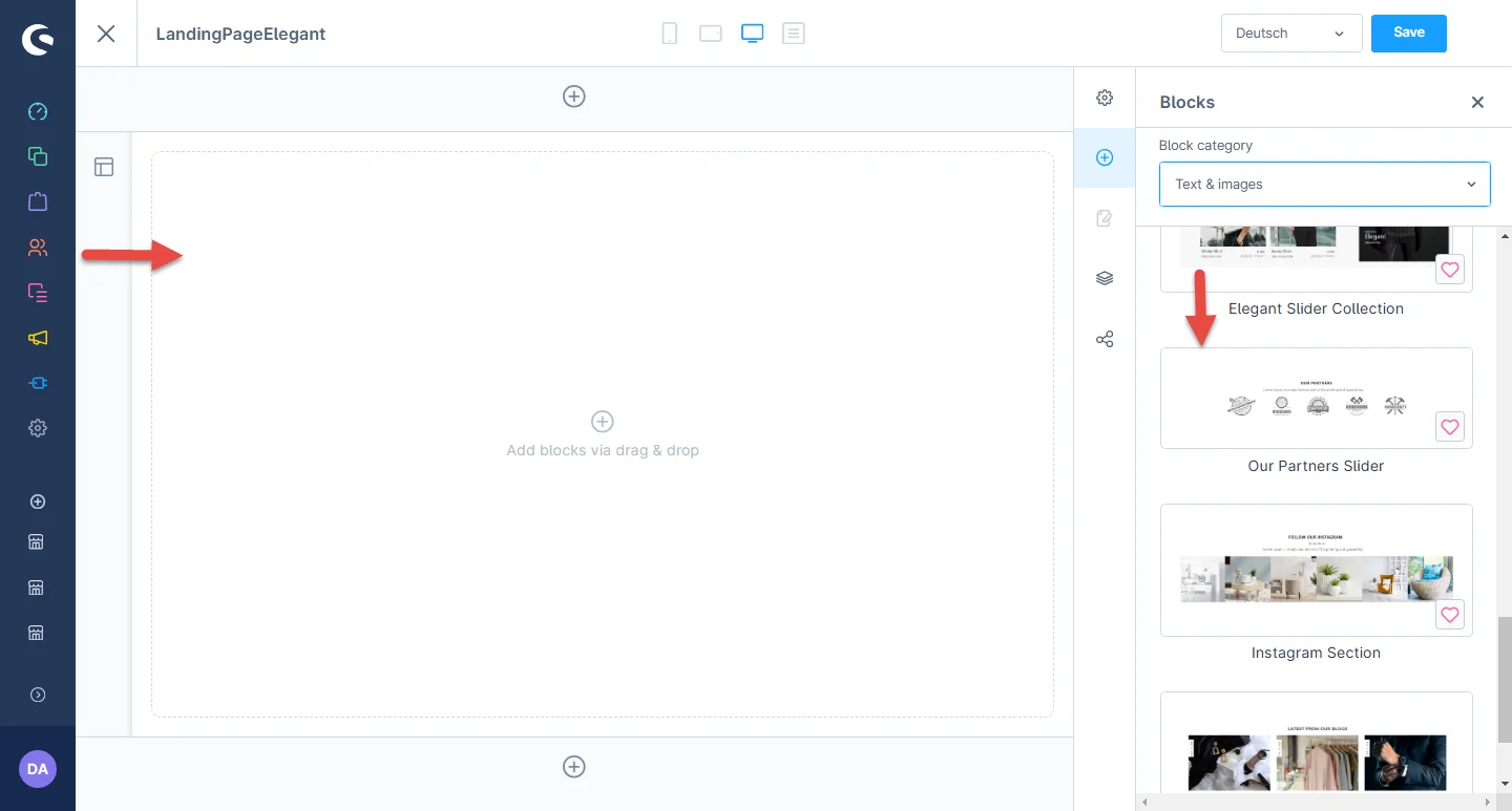
3- After dropping the widget, click on the settings icon to open the element’s configurations.
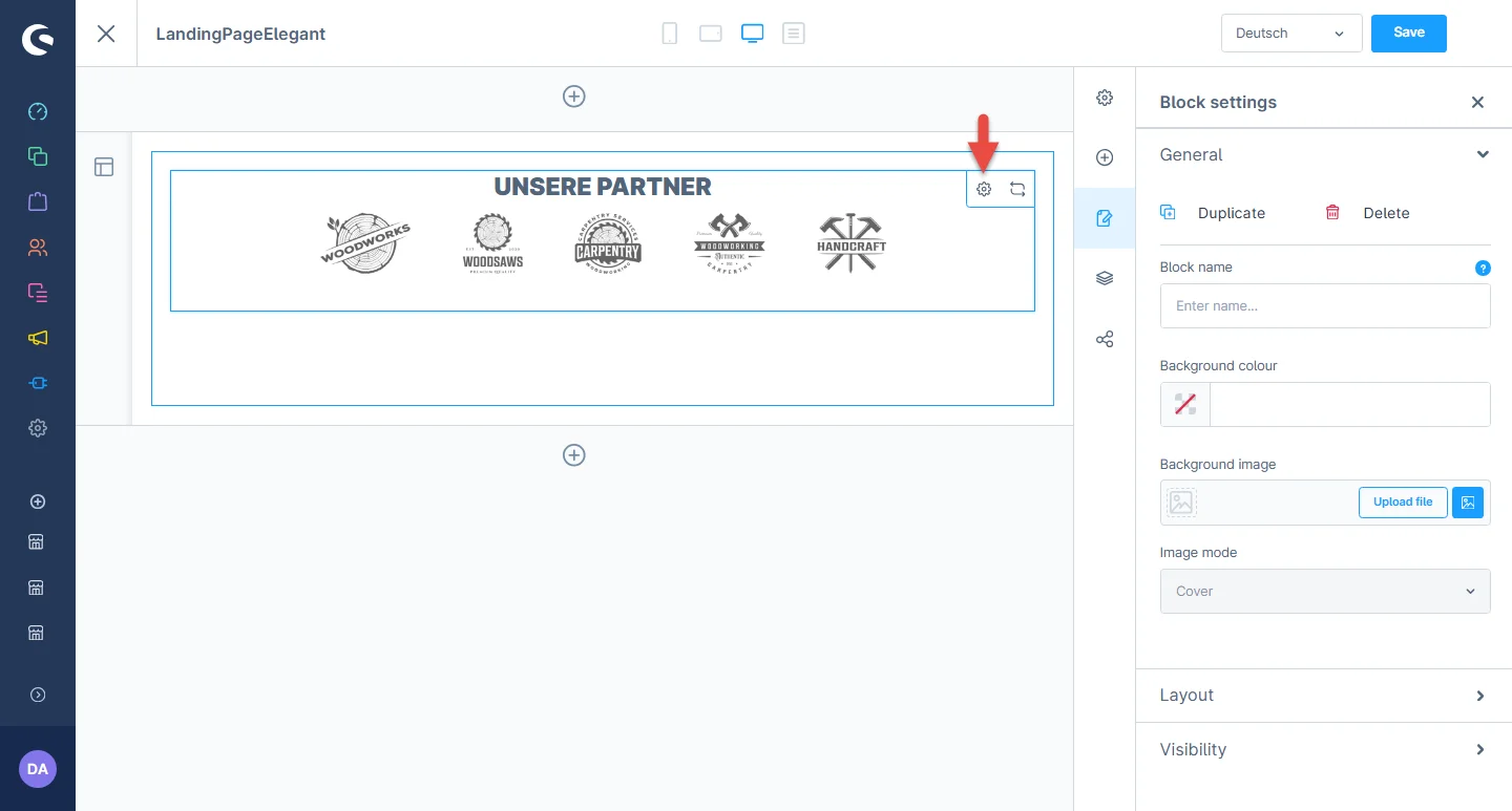
4- In element configurations, you can add the title, description, select the partner heading and description color.
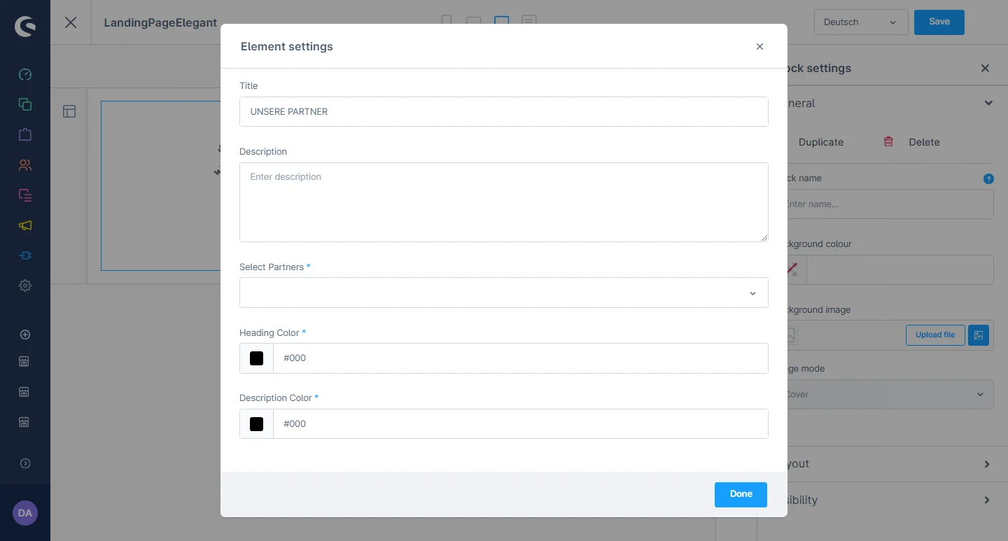
After saving the CMS page configurations, this block will be visible in the storefront at the respective layout.
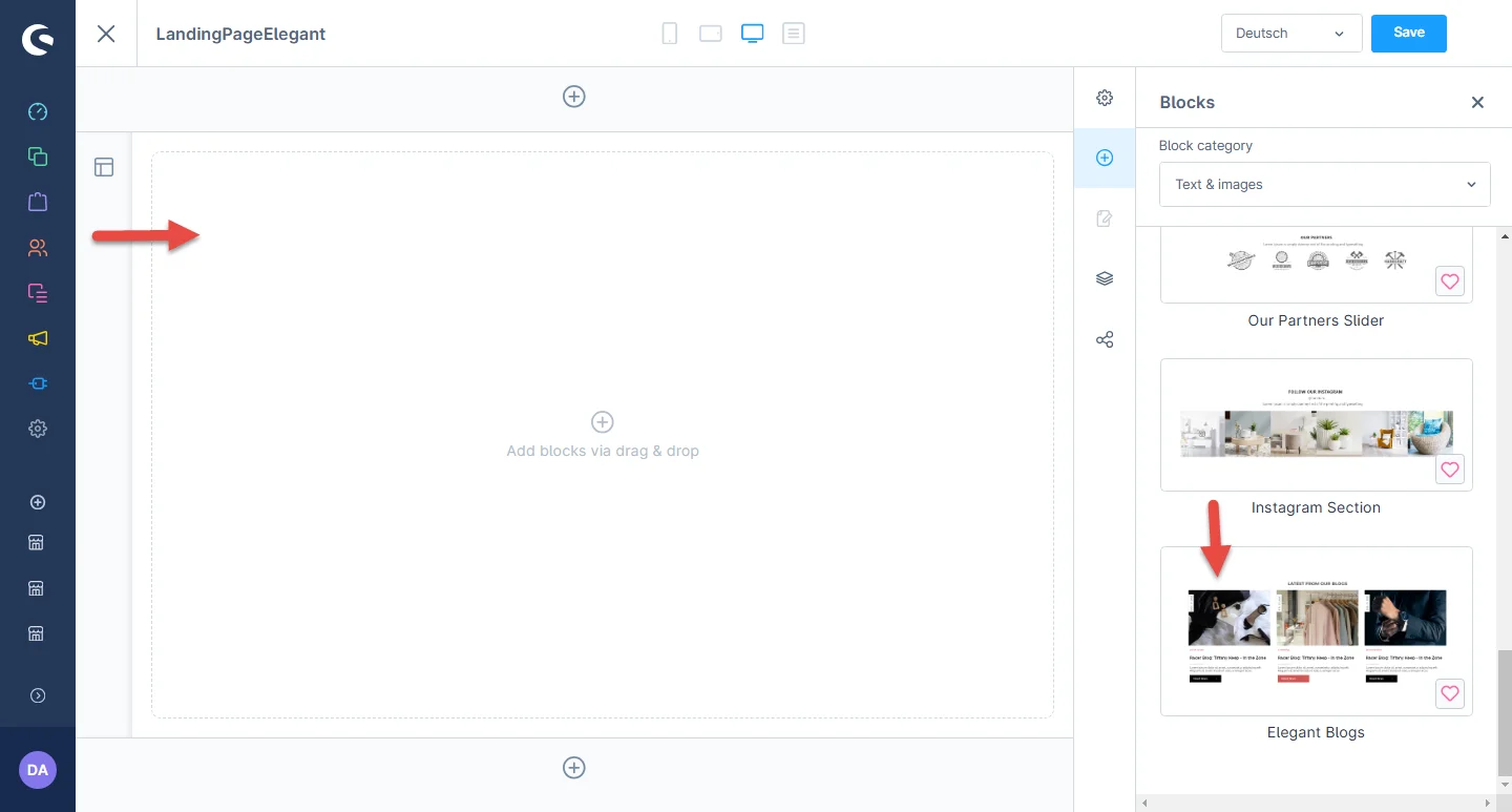
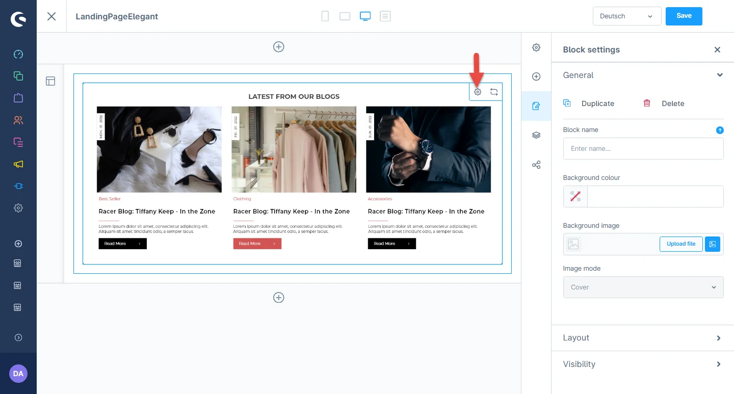
Blog Configuration
1- Shopping Experience: navigate to the block category and select the dropdown menu for the Text and Images option.

2- Now drag the blog widget to the desired location on the left side of the CMS section.
3- After dropping the widget, click on the settings icon to open the element’s configurations.
4- In element configurations, you can add the title, blog color, button text, and background color.
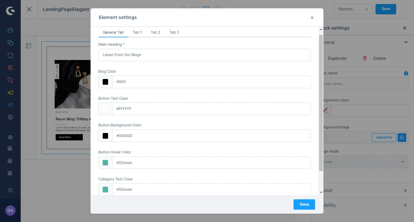
5- After that, you can change the main heading, category, image, and blog description. You can also set the date, link, and button link.
After saving the CMS page configurations, this block will be visible in the storefront at the respective layout.
Extensions Configuration
1- Go to the Extension tab and select the Extension configuration.
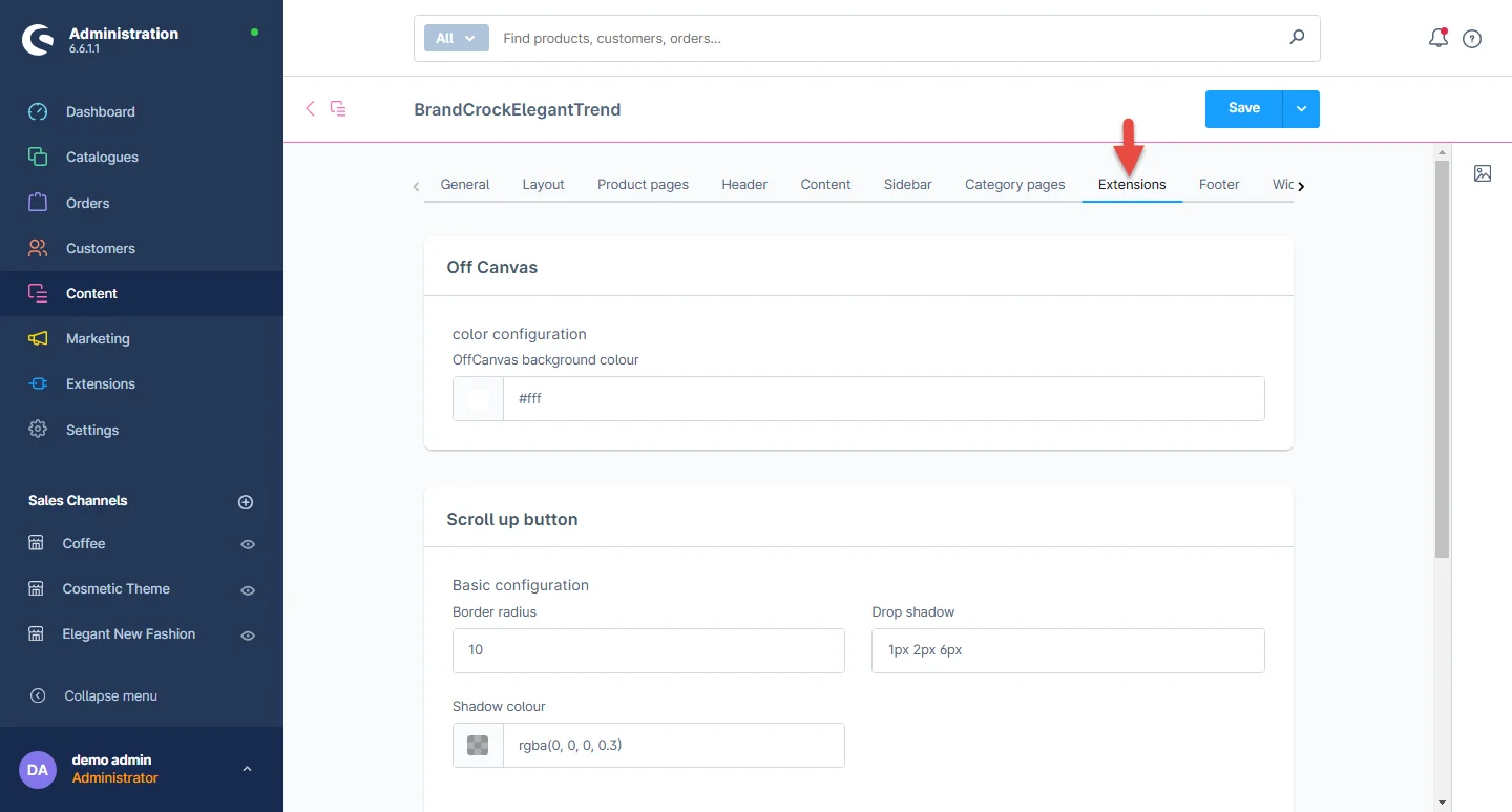
2- Off Canvas: You can change the background color of the off canvas.

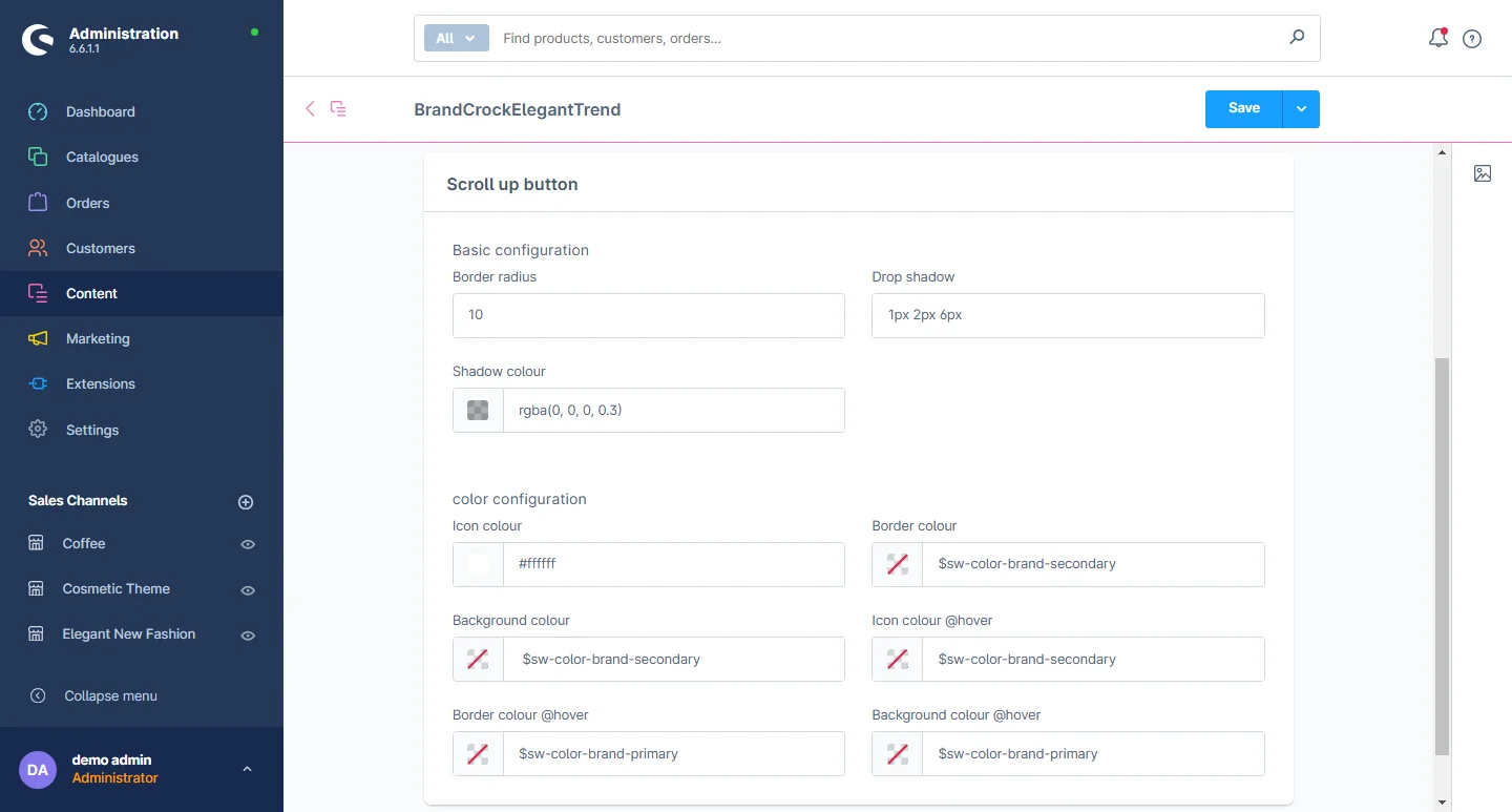
3- Scroll Up Button: You can change the background Scroll-Up button color, mouse hover color, button icon color, shadow color and hover icon color.
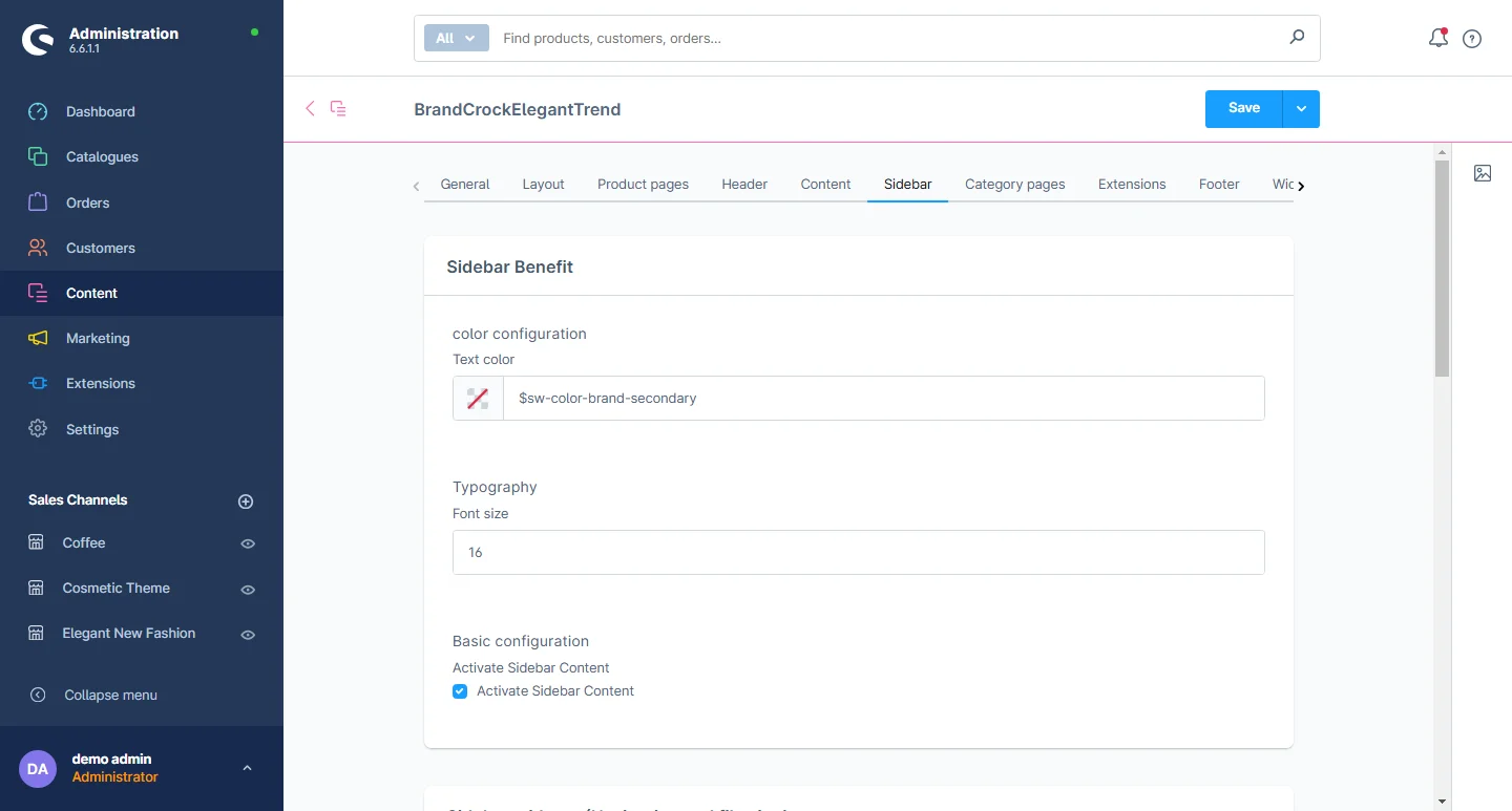
Sidebar Configuration
1- Go to the Sidebar tab and select the sidebar configuration
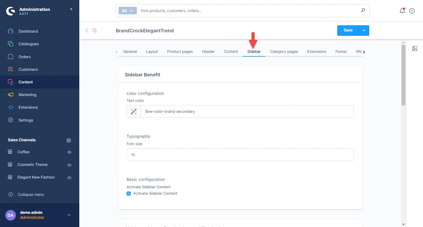
2- Sidebar Benefit: You can change the text color, font size and activate the sidebar content.
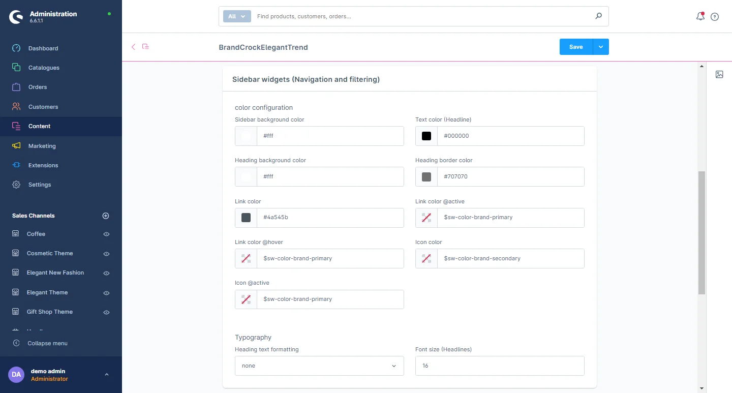
3- Sidebar layout: You can change the sidebar background color, link color, mouse hover link color, frame box color, and text size of the link.
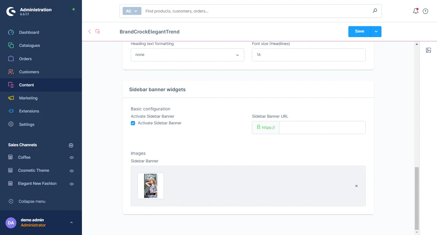
4- Sidebar Widgets: You can activate the sidebar banner and also change the banner image and URL.
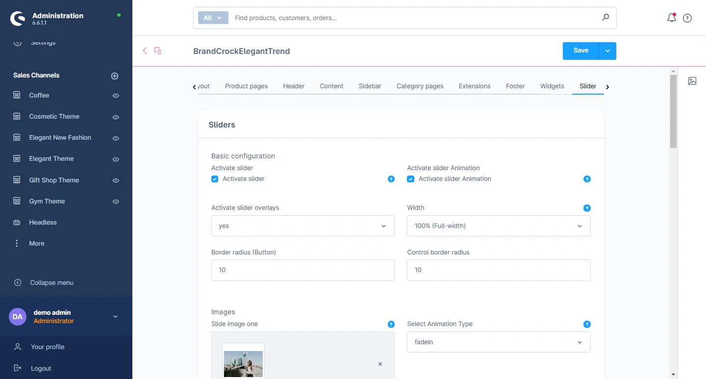
Slider Configuration
1- Go to the Slider tab and select the slider configuration.
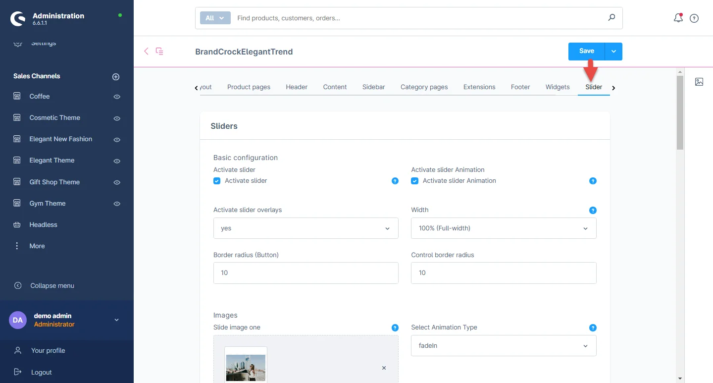
2- Slider: You can activate the slider content, overlay and animation while also can change the border radius, slider image, animation type, headline color, headline font size, headline font weight, text size and font weight, button text size and button font weight, caption background color for desktop and mobile screens.
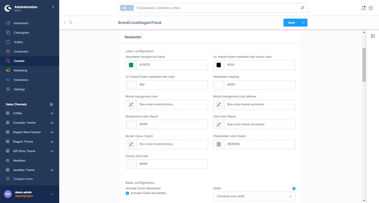
Widgets Configuration
1- Go to the Widget tab and select the widget configuration.
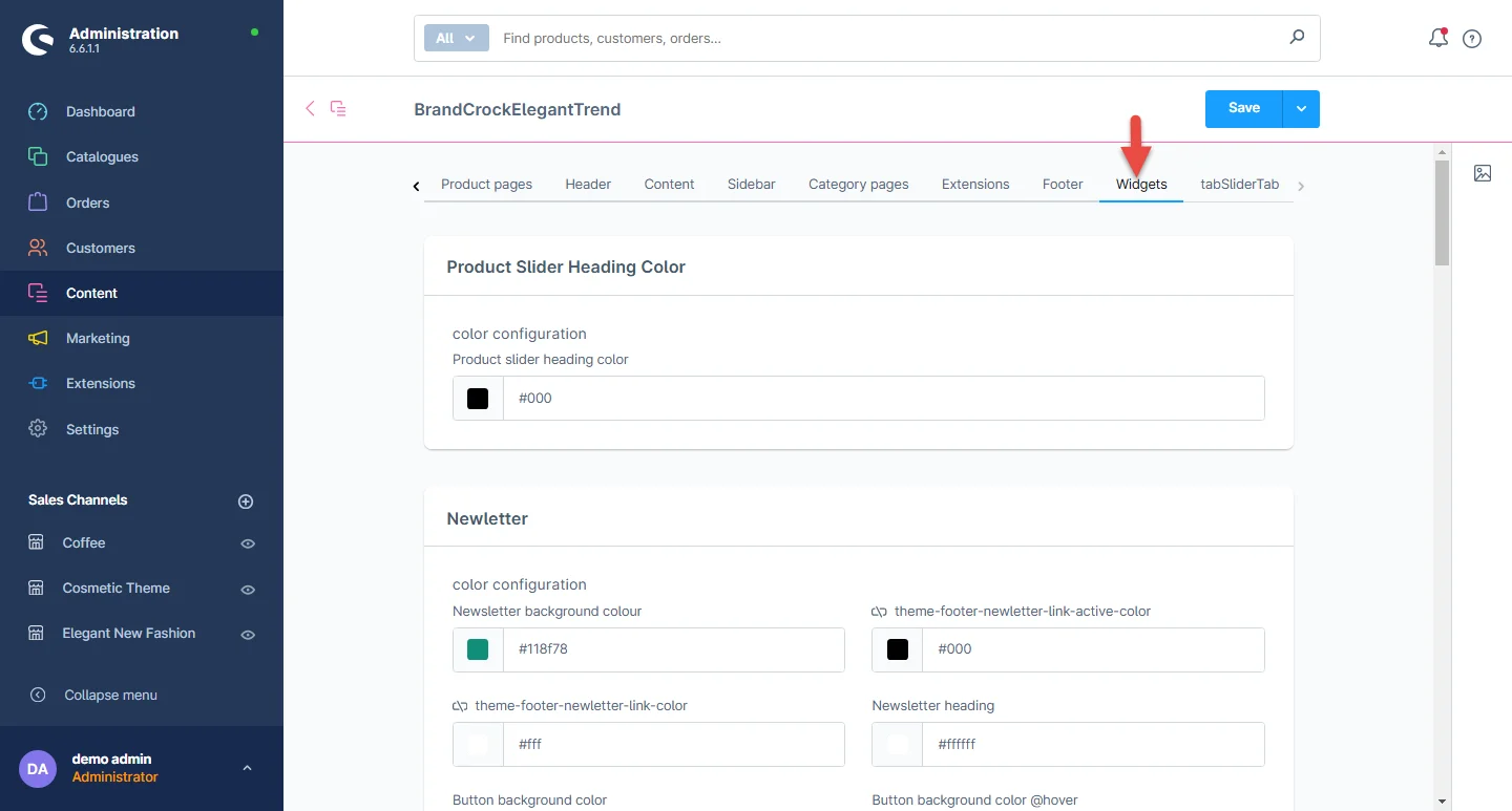
2- Product Slider Heading: You can change the product slider heading color.
3- Newsletter: You can select the two types of newsletter single line and double line, and change the label color and button background color, check the active and inactive box.
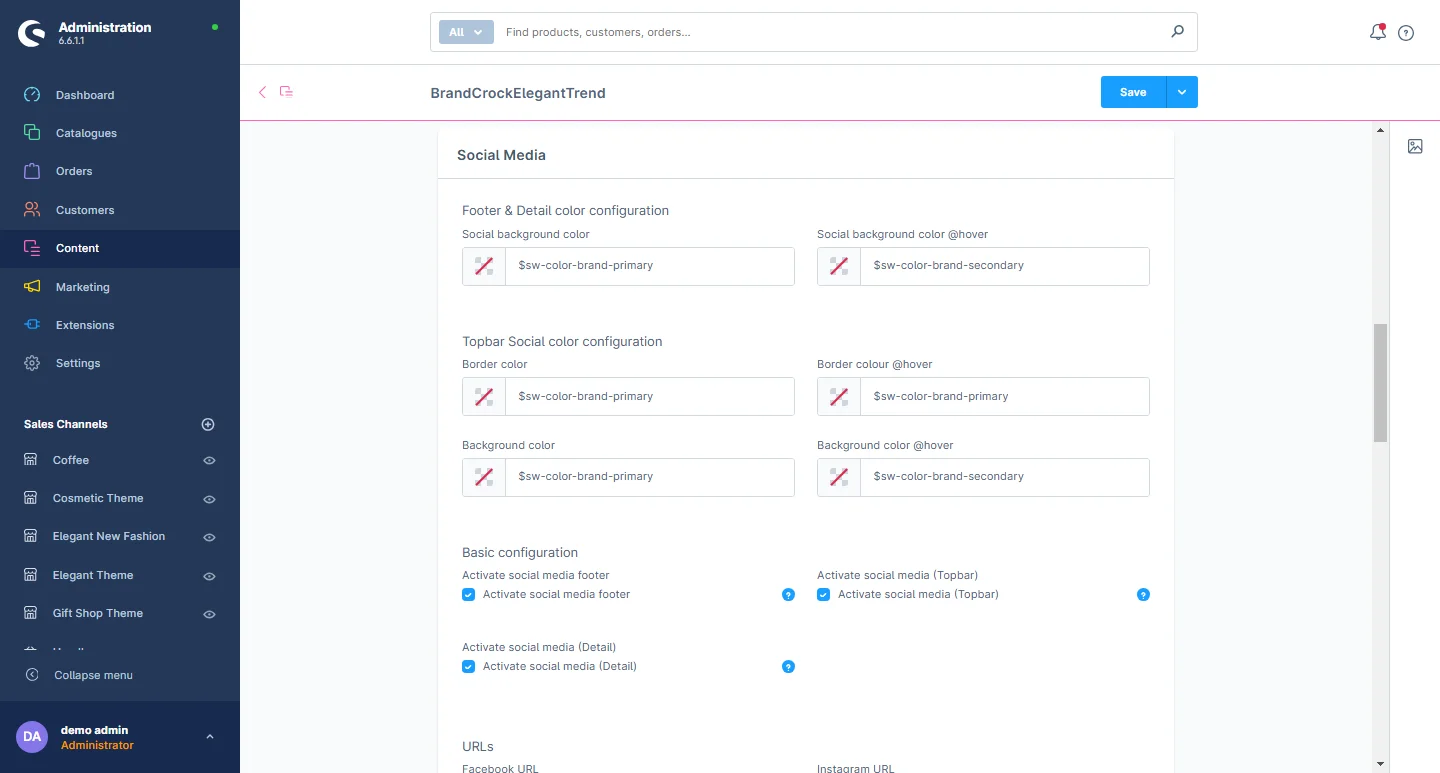
4- Social icon: Add the social media links and check the active and inactive box.
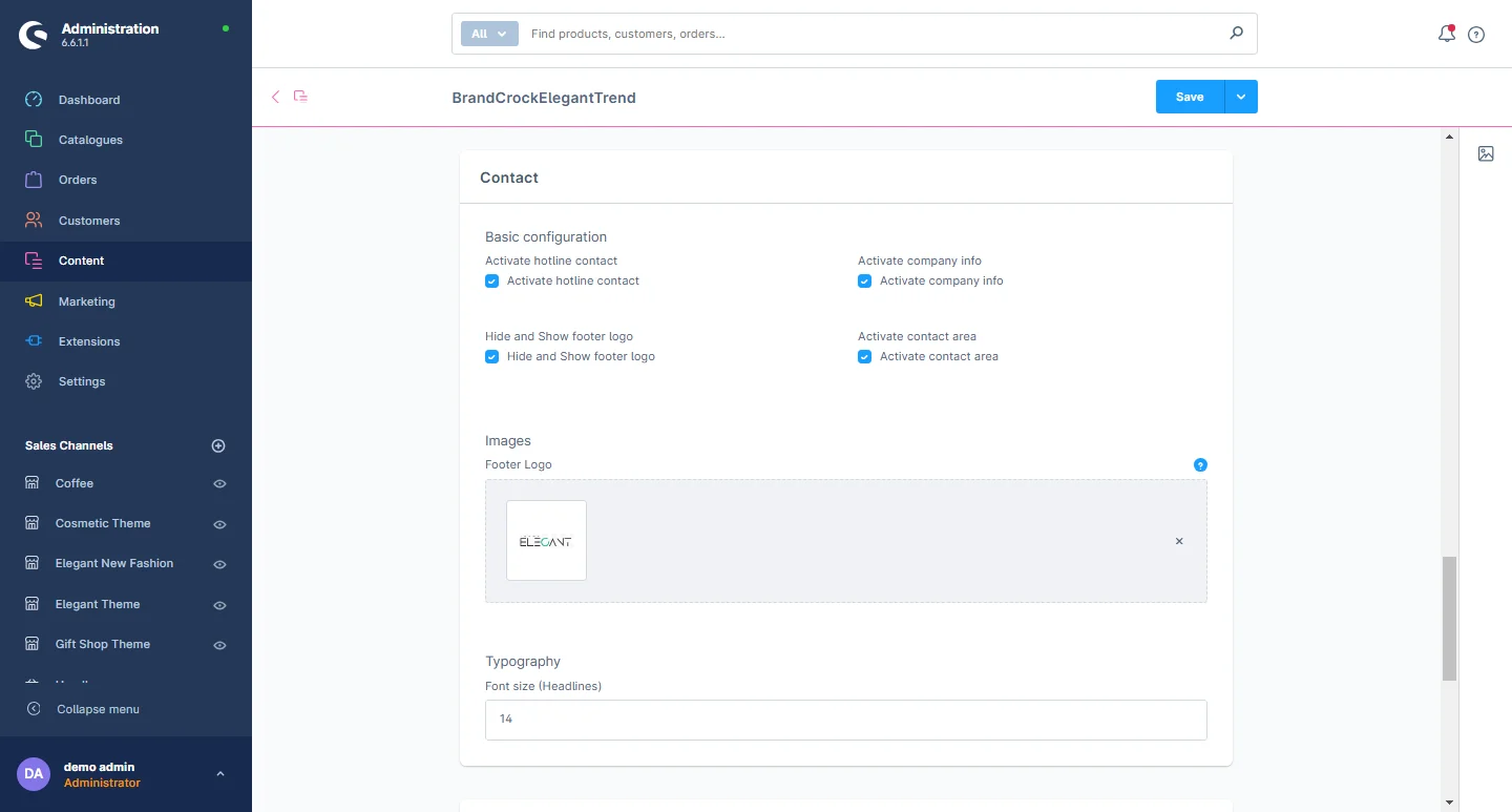
5- Contact: You can change the footer logo, background color, text color, text hover color, icon color, and adjust the font size to suit your preferences.
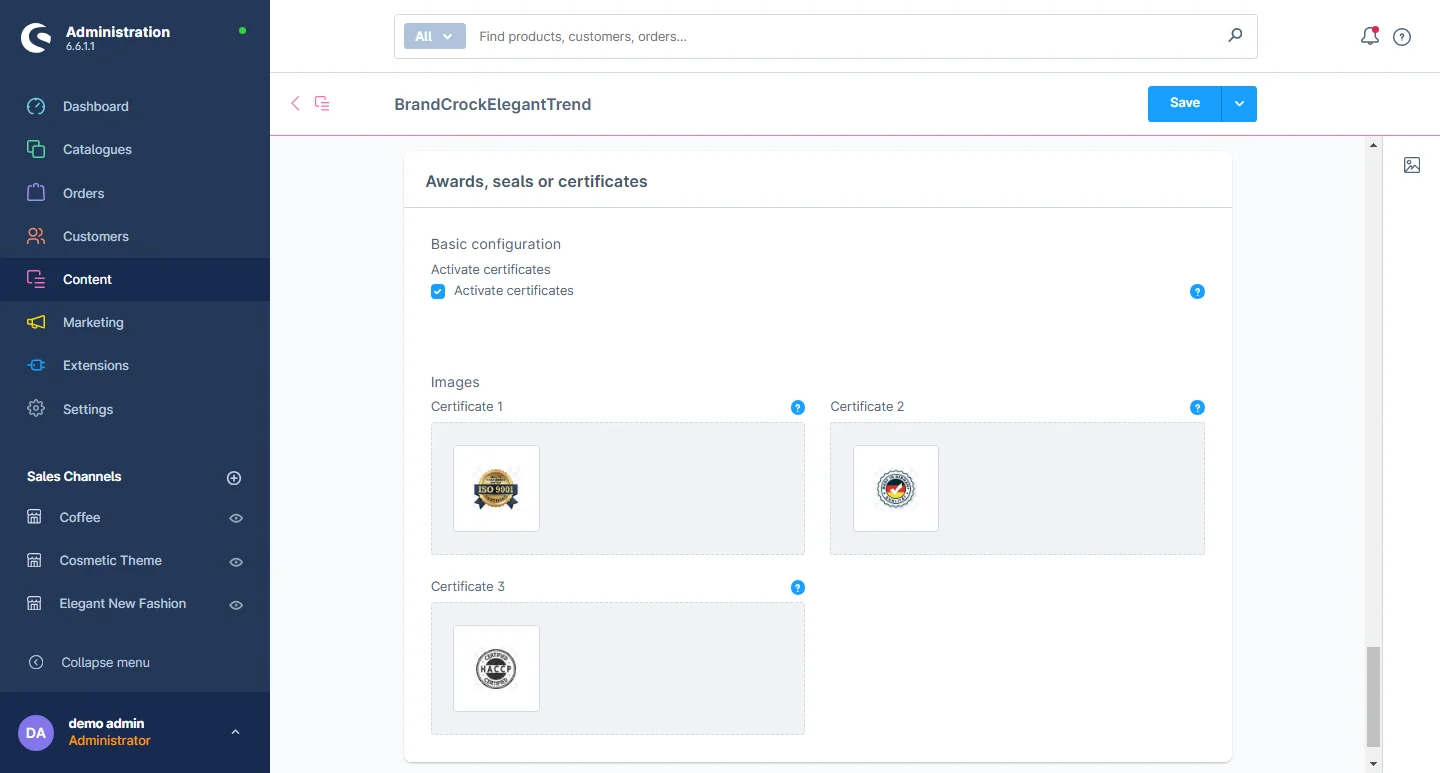
6- Awards, Seals, and Certifications: You have the flexibility to activate and deactivate certificates and upload multiple certificate images.