BrandCrock | Tor zur digitalen Marke

Installationsanleitung

Über BrandCrock GmbH

BrandCrock GmbH is a one-stop software solution provider for all your business needs, offering solutions to more than 15 countries worldwide. We create sales-oriented corporate websites, web-based applications, and web services. We are stationed in Munich, Germany, with other offices in Karachi and Chennai. BrandCrock GmbH is one of Germany’s leading and trusted offshore and outsourcing software solution providers for web designing and application development. Since 2015 we have been in information technology and software development, providing reliable and cost-effective solutions to individuals, business owners, start-ups, small to medium-sized companies (SMEs), online retailers, production companies, and Software and Design Agencies. BrandCrock is fulfilling a greater demand for software development at a reasonable cost for anyone interested in our professional skills, especially in the European and German markets. We have passionate teams and multi-talented individuals who are highly committed to their work. At BrandCrock, we achieve robust, reliable, high-quality IT solutions by practicing industry- proven methods cum standards in software development, project management, and quality assurance methodologies. For further information, please refer to our website https://www.brandcrock.com/de/

Theme Installation

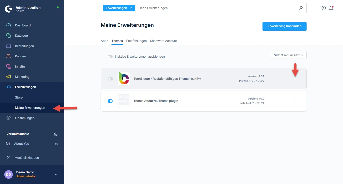
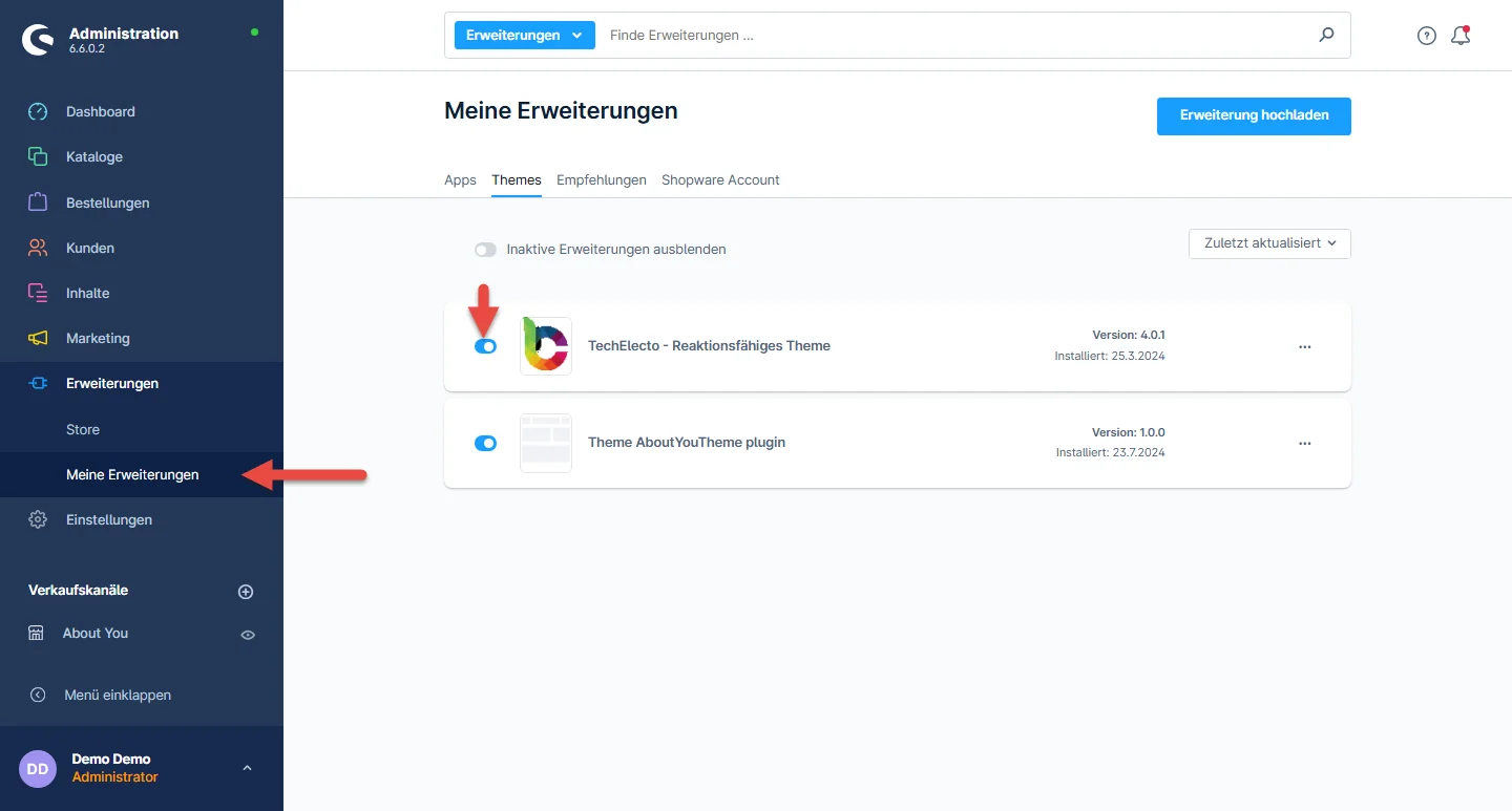
Schritt 1: After downloading the Electo Theme, login to shop backend and follow these steps to install the Electo Theme. Once logged in, navigate to the Extensions section. From the dropdown menu, select My extensions. Look for the Themes tab and click on it. Locate the Electo Theme from the list of available themes.

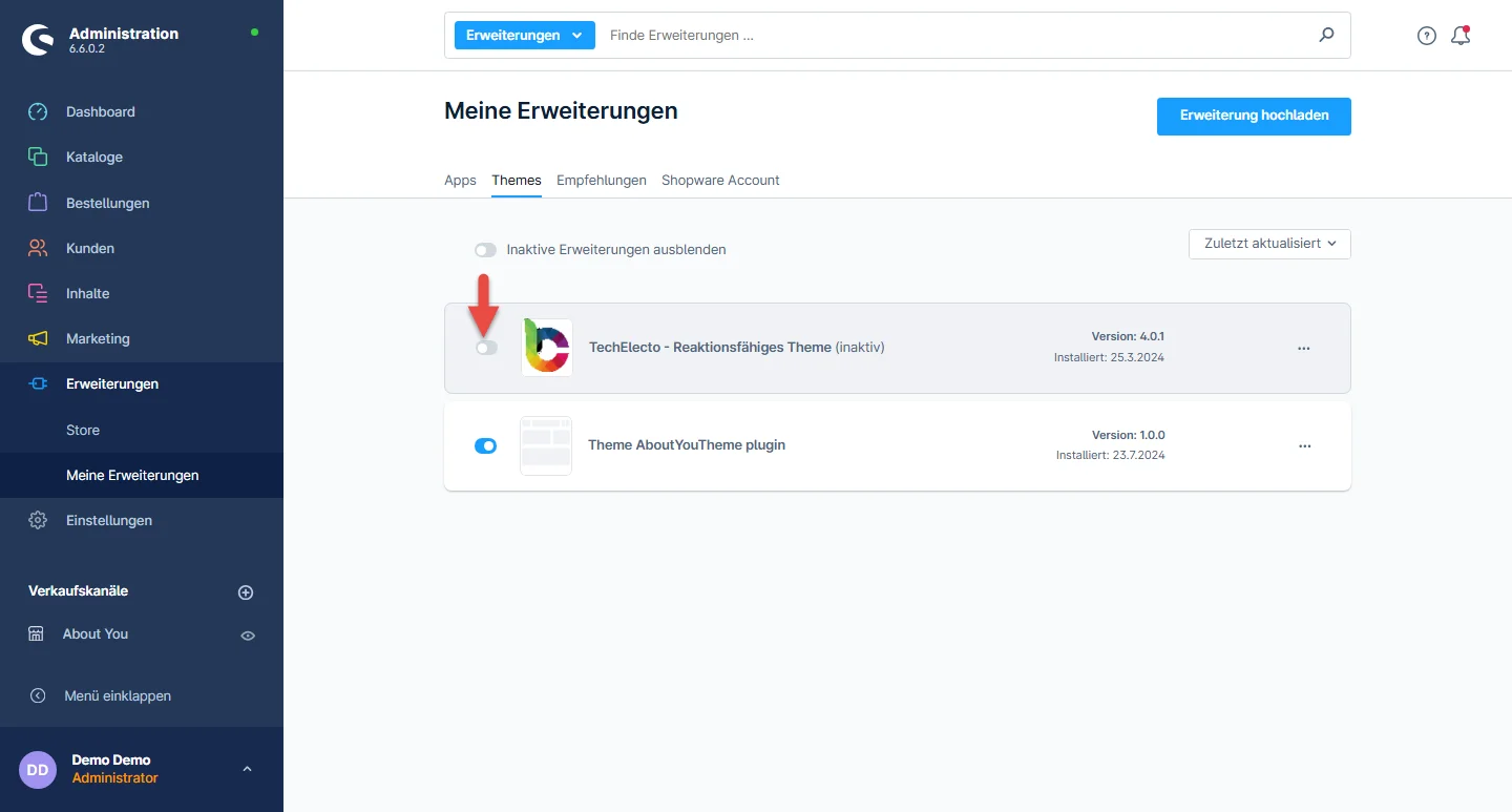
Schritt 2: Then, click on the toggle switch to enable the Electo Theme and activate it.

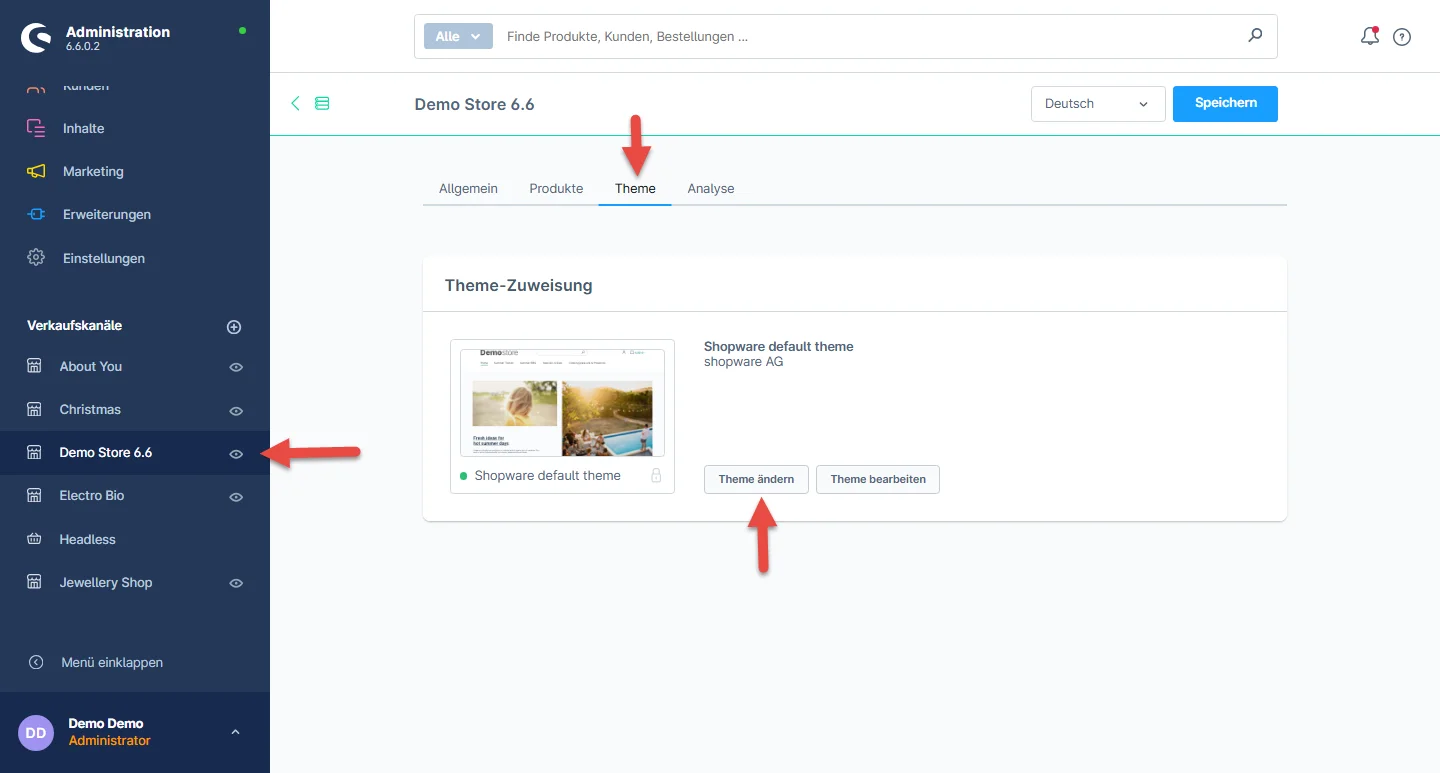
Schritt 3: By default, the Shopware theme is preselected. To change the theme, follow these steps: Navigate to Electo Theme in the menu. Select Theme  from the tab. Click on the Change Theme button.

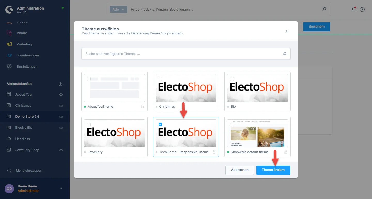
Schritt 4: Choose the Electo Theme option from the available themes. After selecting the theme, click on the Speichern Sie button to save changes.

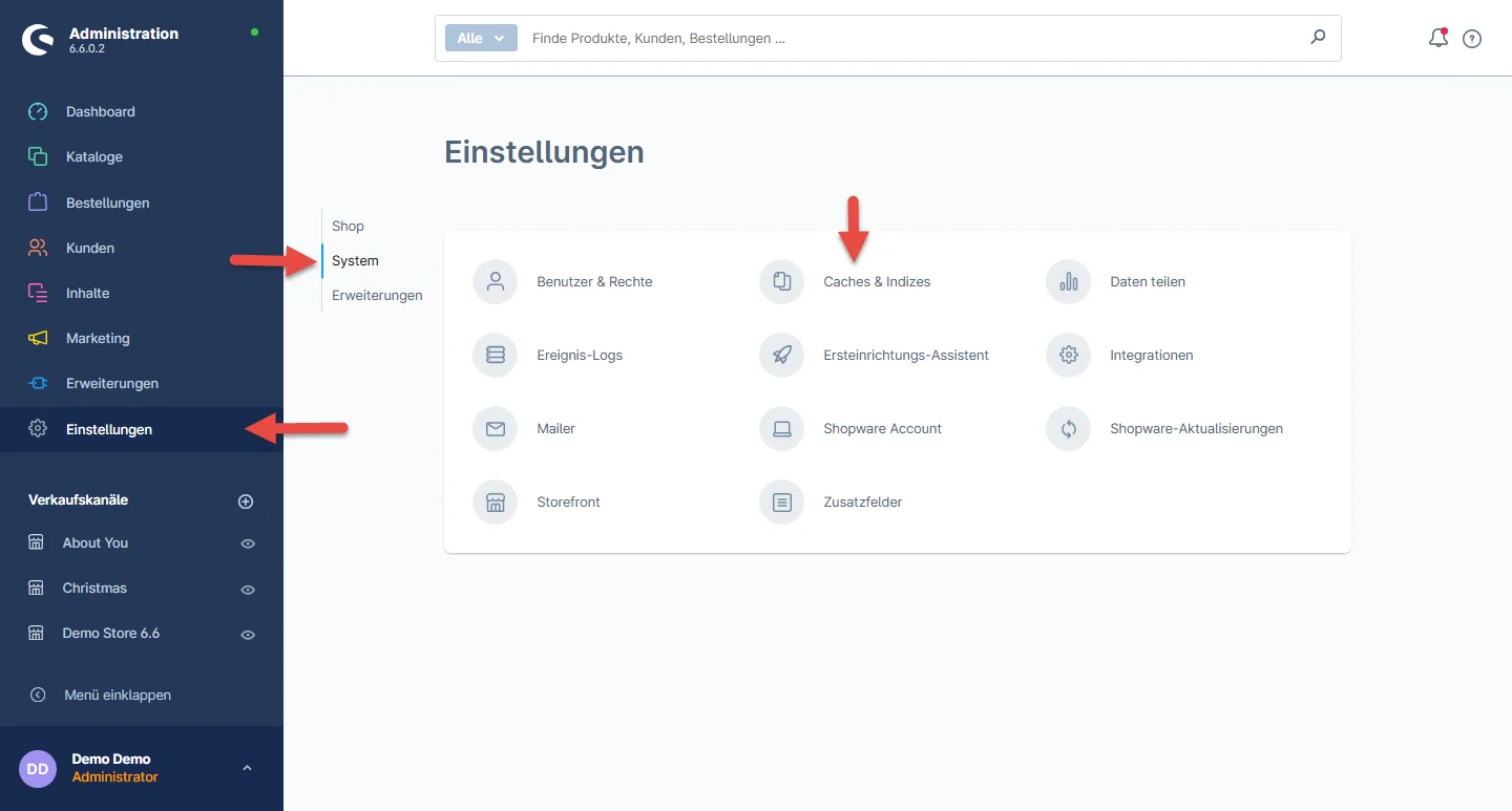
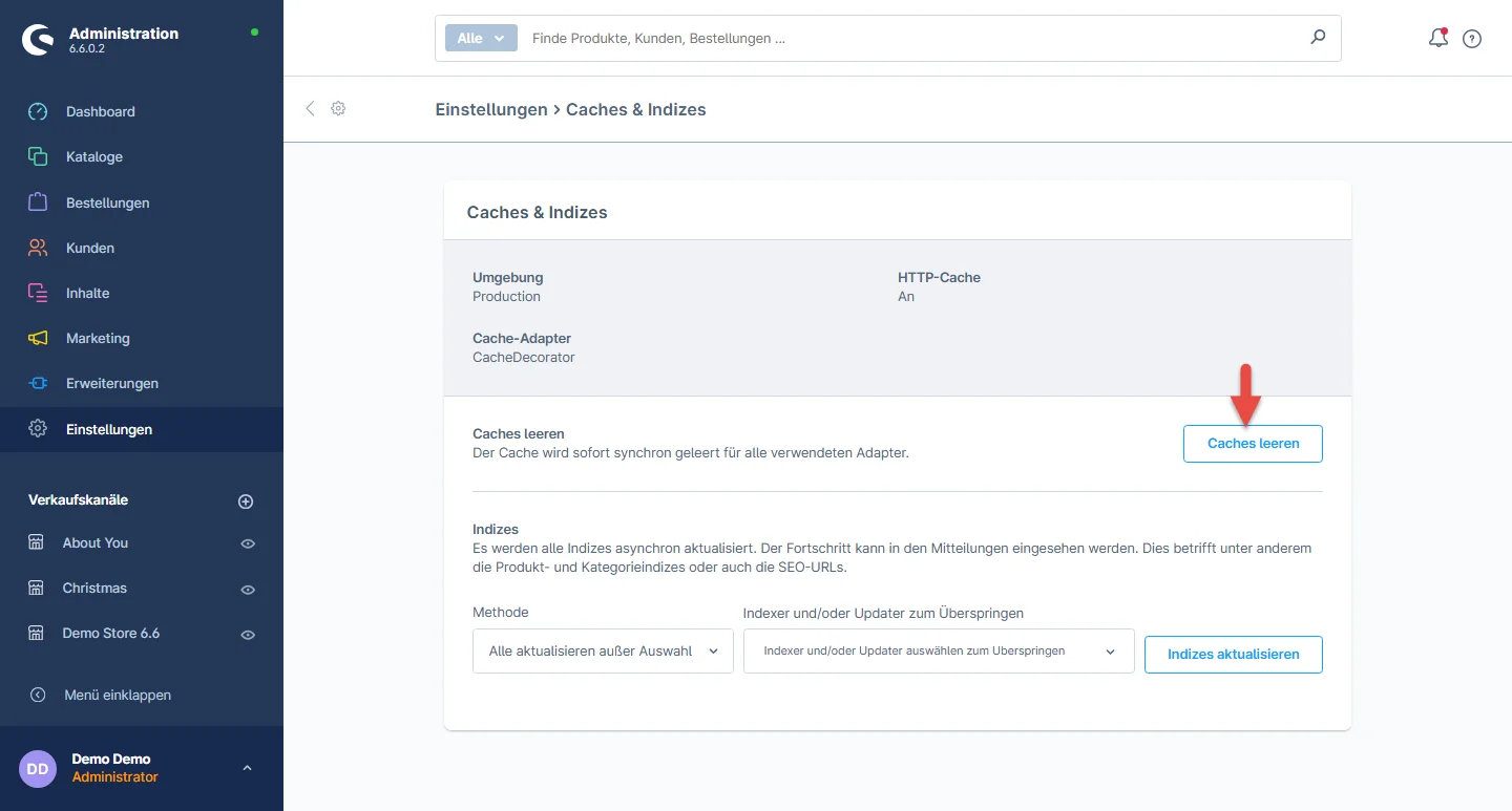
Schritt 5: Shop Cache must be clear Once the Electo Theme is activated, navigate to Settings > System > Caches

Schritt 6: Click Clear Caches

Theme-Deinstallation

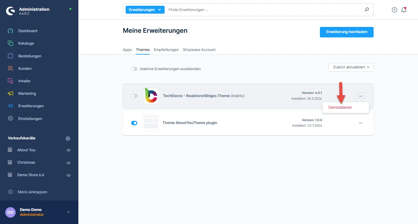
Um das Thema zu deinstallieren, müssen Sie es zunächst deaktivieren. Dies ist ein zweistufiger Prozess, der im Folgenden beschrieben wird

Schritt 1: To deactivate the Electo Theme, please follow these steps: Navigate to the Extensions section. From the dropdown menu, select My extensions. Look for the Themes tab and click on it. Locate the Electo Theme theme in the list. Click on the disable switch to deactivate the Electo Theme.

Schritt 2: Next, to click the uninstall button

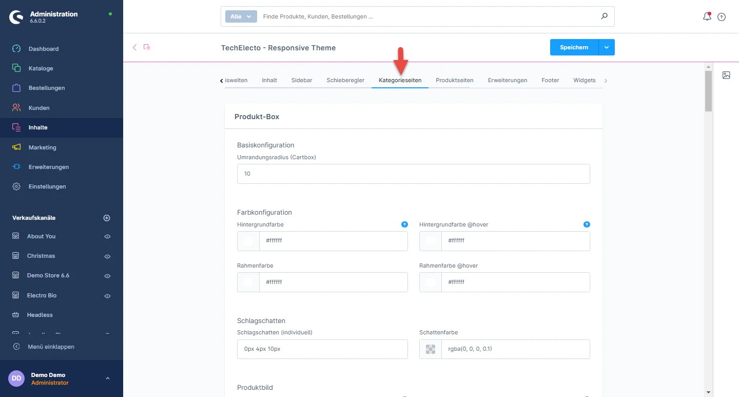
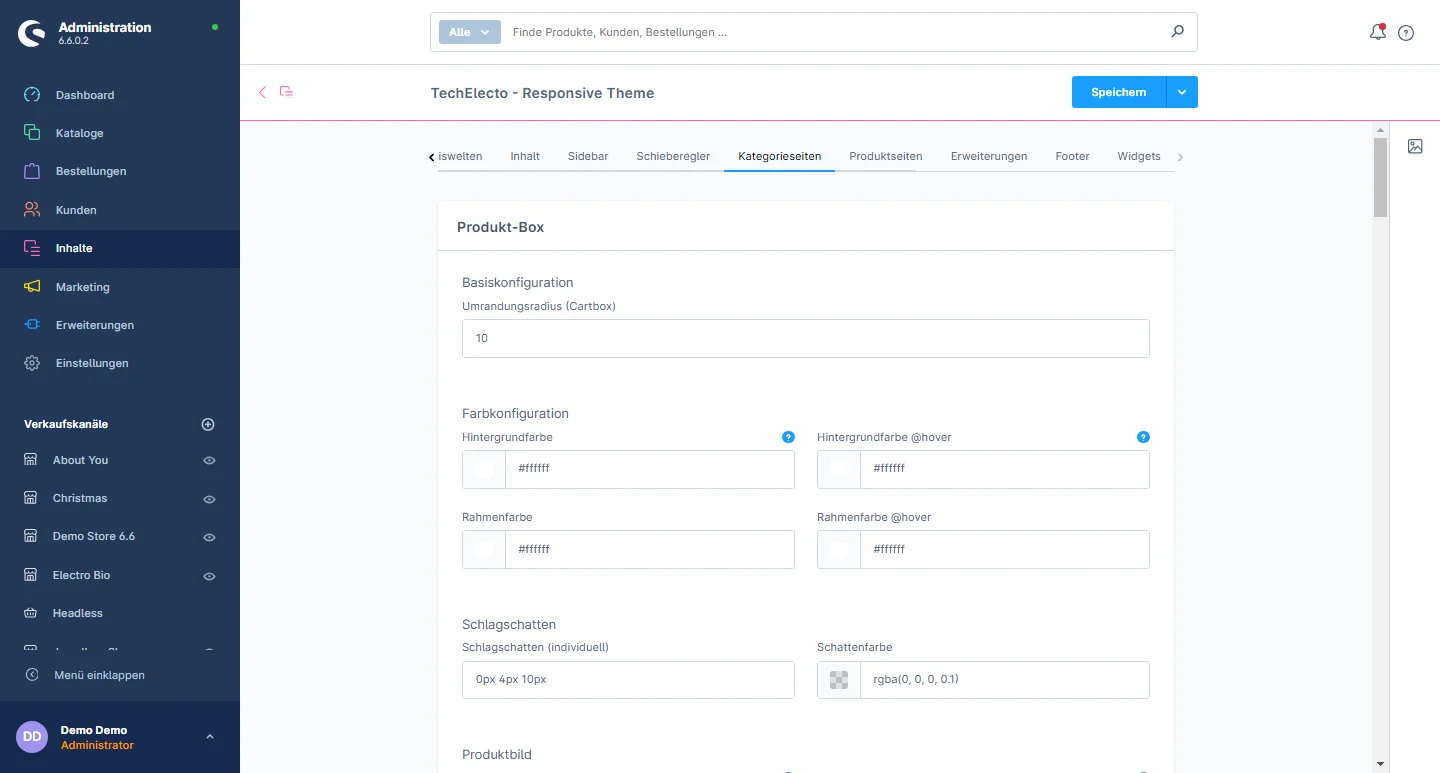
Category Pages Configuration

Lorem ipsum dolor sit amet, consectetuer adipiscing elit. Aenean commodo ligula eget dolor. Aenean massa. Cum sociis natoque penatibus

Lorem ipsum dolor sit amet, consectetuer adipiscing elit. Aenean commodo ligula eget dolor. Aenean massa. Cum sociis natoque penatibus

Lorem ipsum dolor sit amet, consectetuer adipiscing elit. Aenean commodo ligula eget dolor. Aenean massa. Cum sociis natoque penatibus

Lorem ipsum dolor sit amet, consectetuer adipiscing elit. Aenean commodo ligula eget dolor. Aenean massa. Cum sociis natoque penatibus

Lorem ipsum dolor sit amet, consectetuer adipiscing elit. Aenean commodo ligula eget dolor. Aenean massa. Cum sociis natoque penatibus

Lorem ipsum dolor sit amet, consectetuer adipiscing elit. Aenean commodo ligula eget dolor. Aenean massa. Cum sociis natoque penatibus

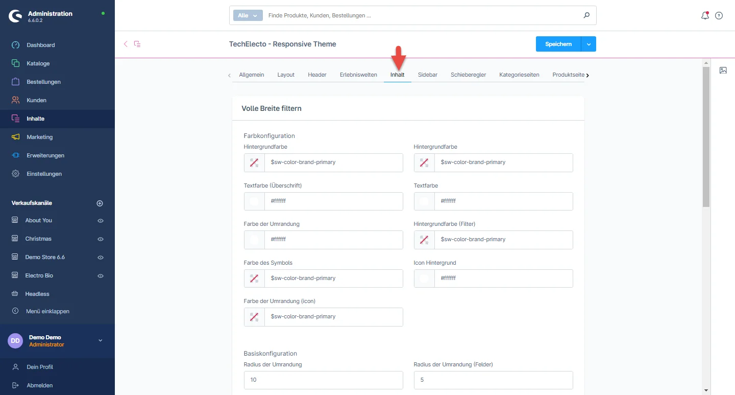
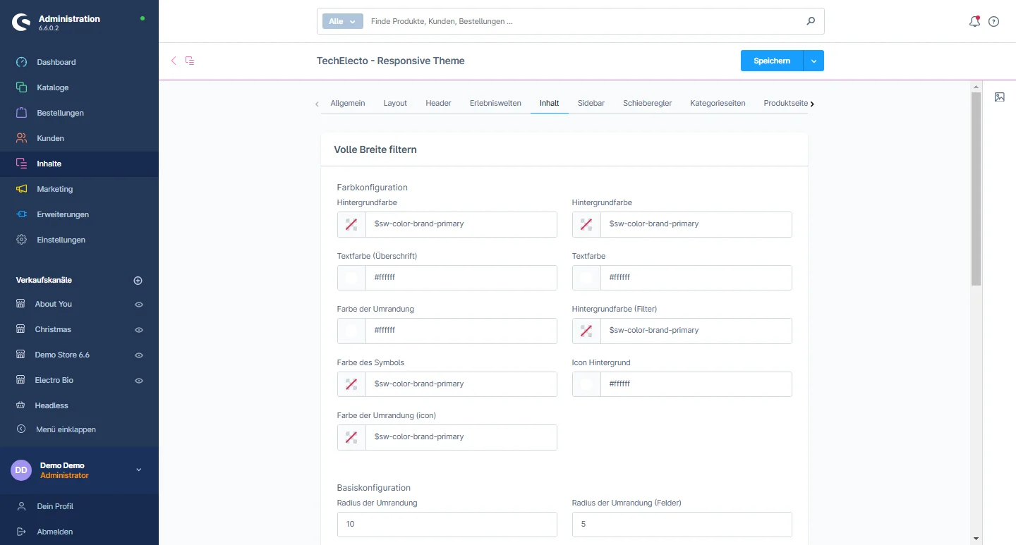
Content Configuration​

1- Gehe zum Content tab and select the header configuration

2- Filter Full Width: You can change the background color, text color of headline, text color, border color, filter border color, icon color, icon background, border color of icon, and change the border radius and border radius field.

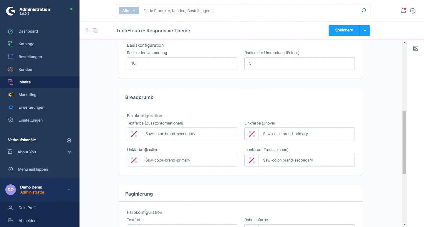
3- Breadcrumbs: You can change the text color, link color on hover, link color when active, and icon color

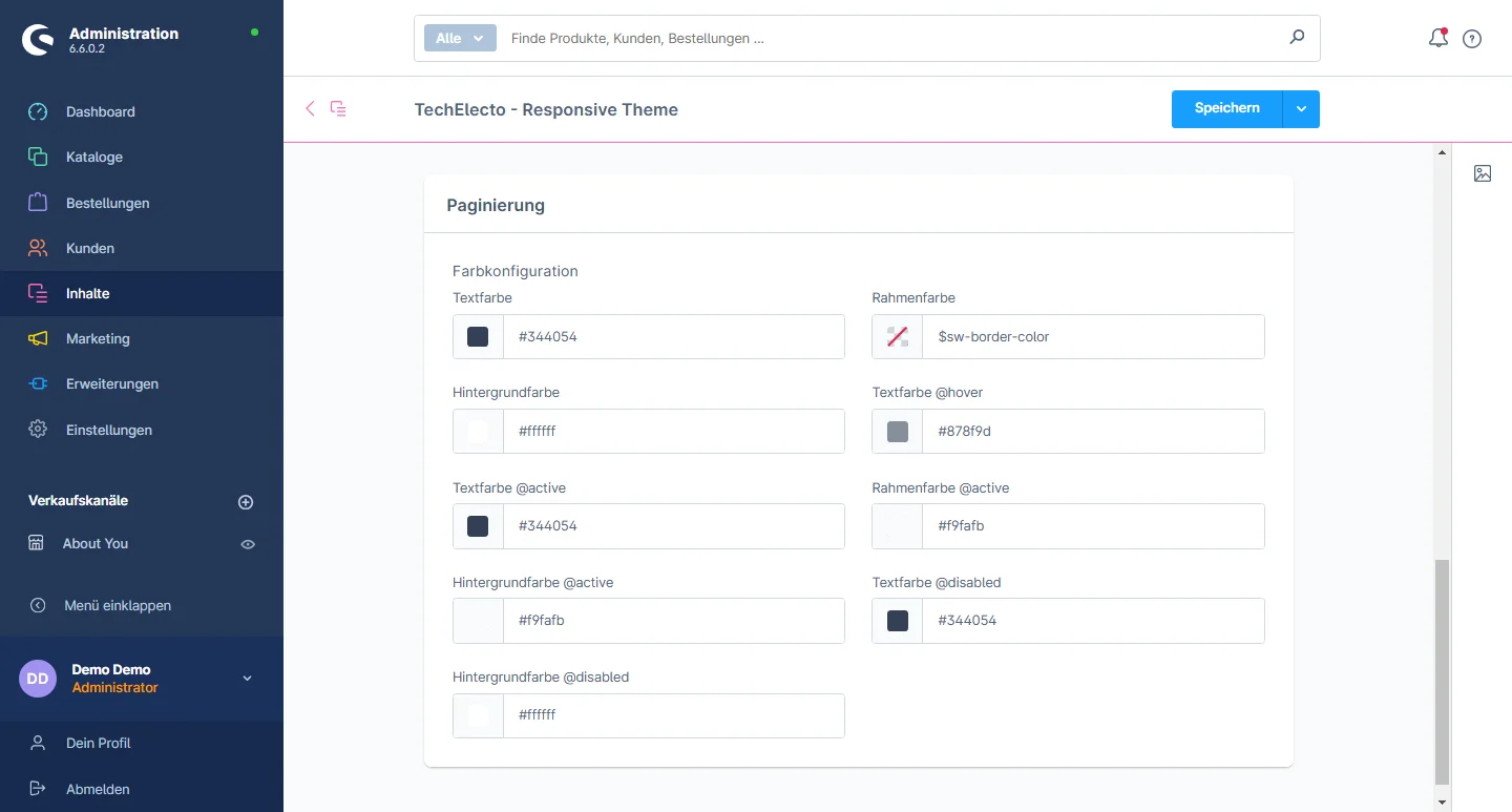
4- Pagination: You can change the text color, border color, background color, text color on hover, text color when active, border color when active, background color when active, text color when disabled, and background color when disabled.

Extensions Konfiguration

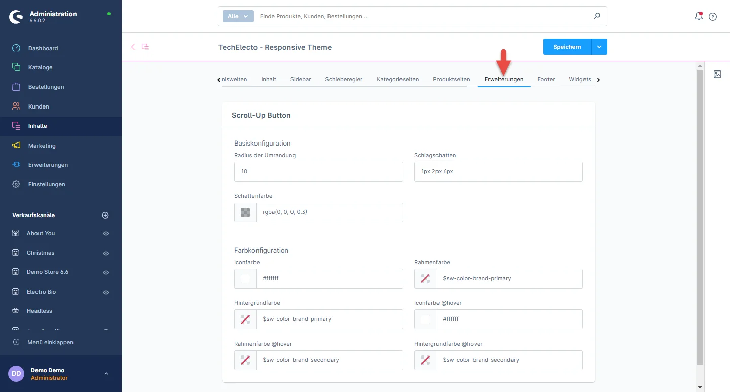
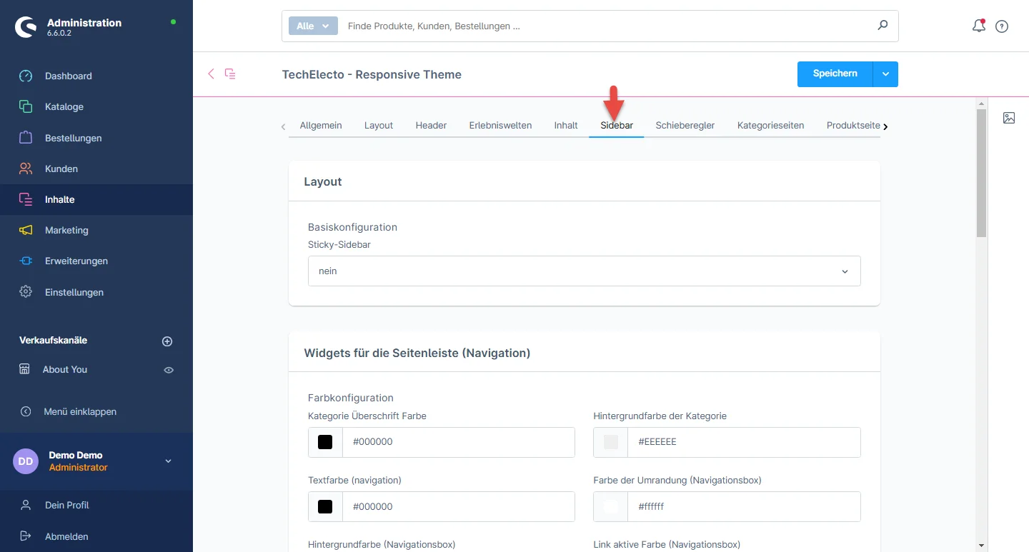
1- Gehe zum Extension tab and select the Extension configuration

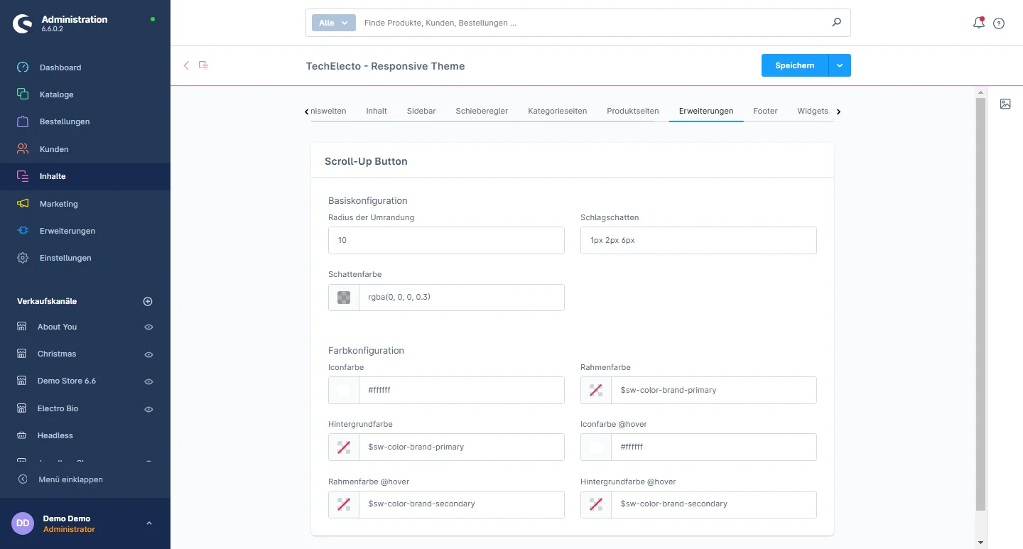
2- Scroll Up Button: You can configure the border radius, drop shadow, shadow color, icon color, frame color, background color, icon color on hover, border color on hover, and background color on hover for the scroll-up button.

Header-Konfiguration

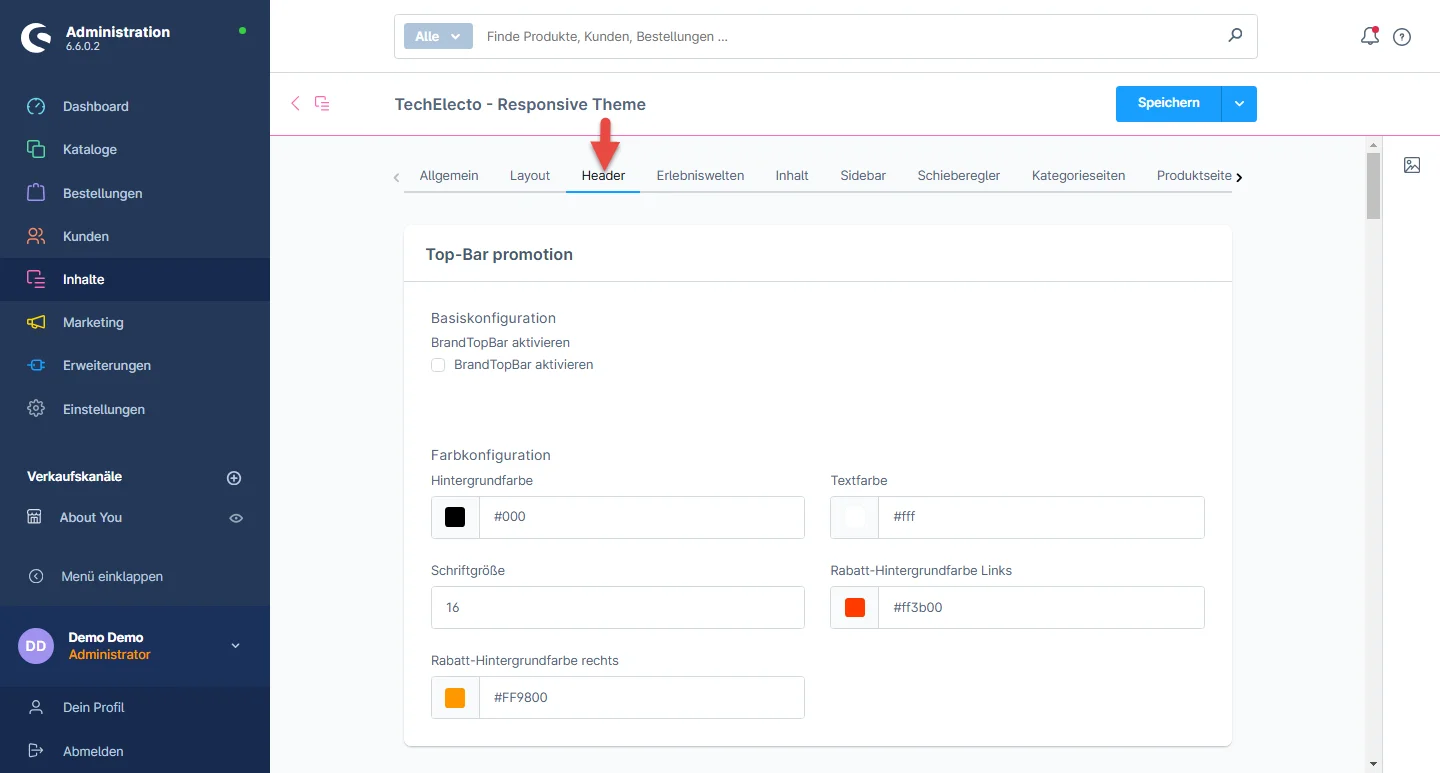
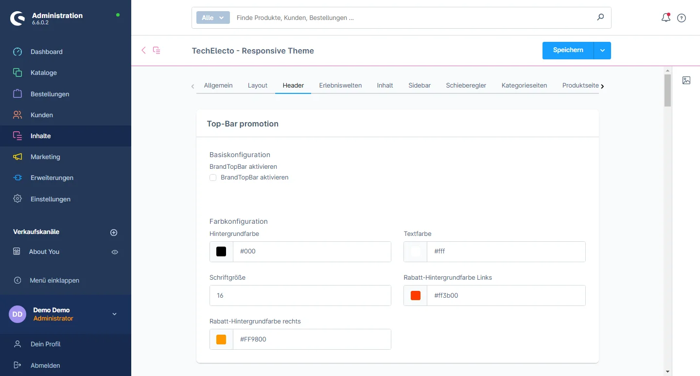
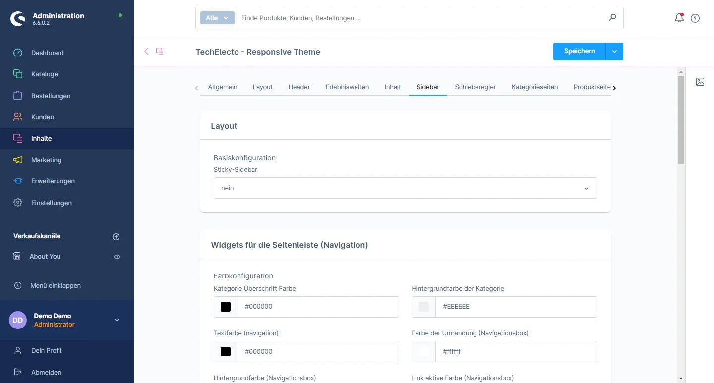
1- Gehen Sie zum Tab "Header" und wählen Sie die Header-Konfiguration aus

2- Top bar promotion: You have the flexibility to enable or disable options and customize the background color ,text color,font size, discount background color left and right

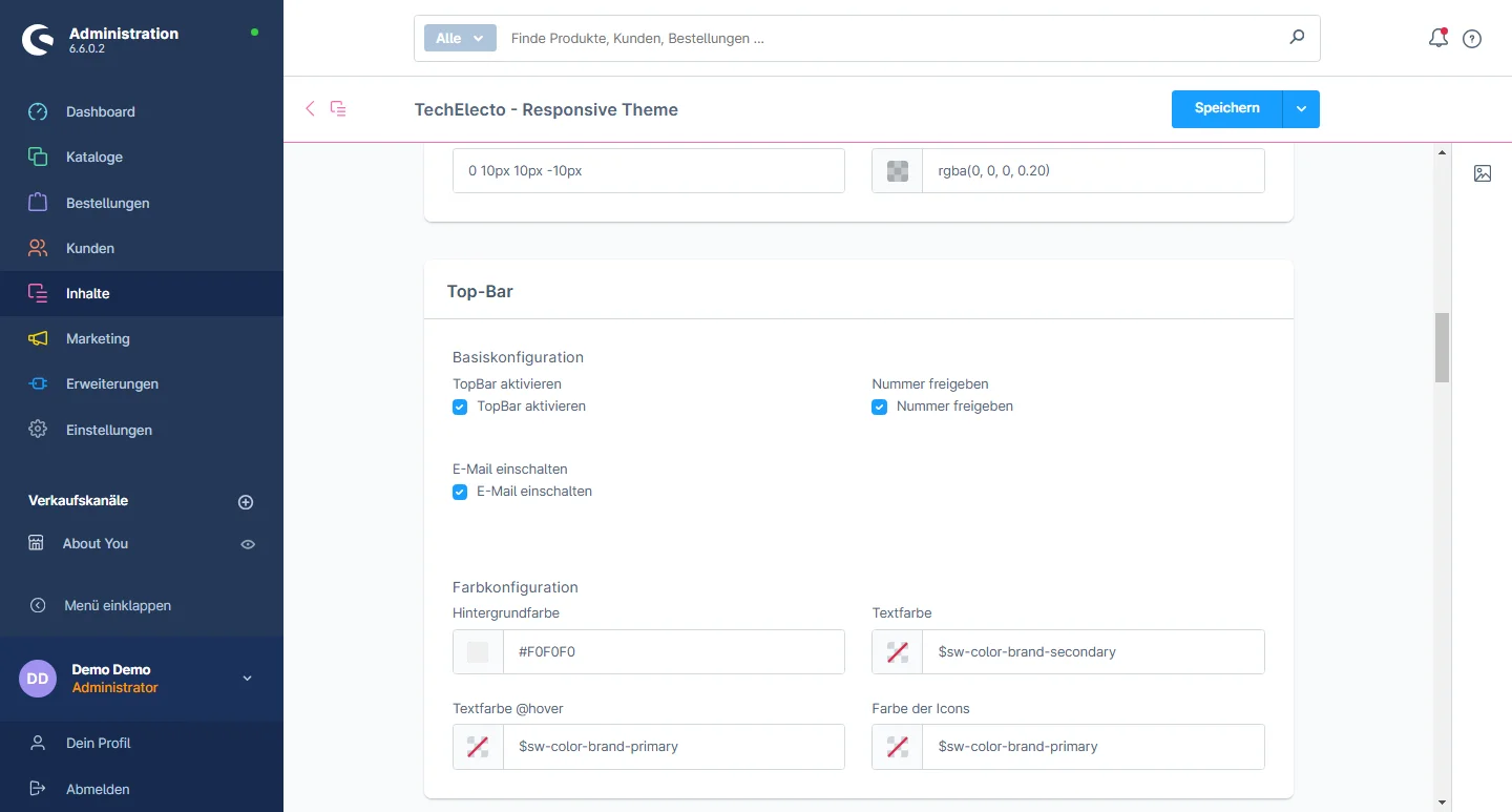
3- Top Bar: You have the flexibility to enable or disable options and customize the background color, text color, font size, discount background color on the left and right.

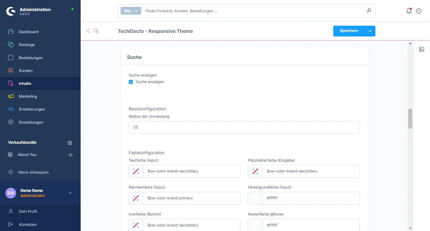
4- Search and Flyout Color: You have the flexibility to enable or disable options, customize text color, border color input, background color input, icon color on the button, icon color on hover, border color on the button, background color on the button hover, background color on the flyout search, border color on the flyout search, headline color on the flyout, and button color on the flyout.

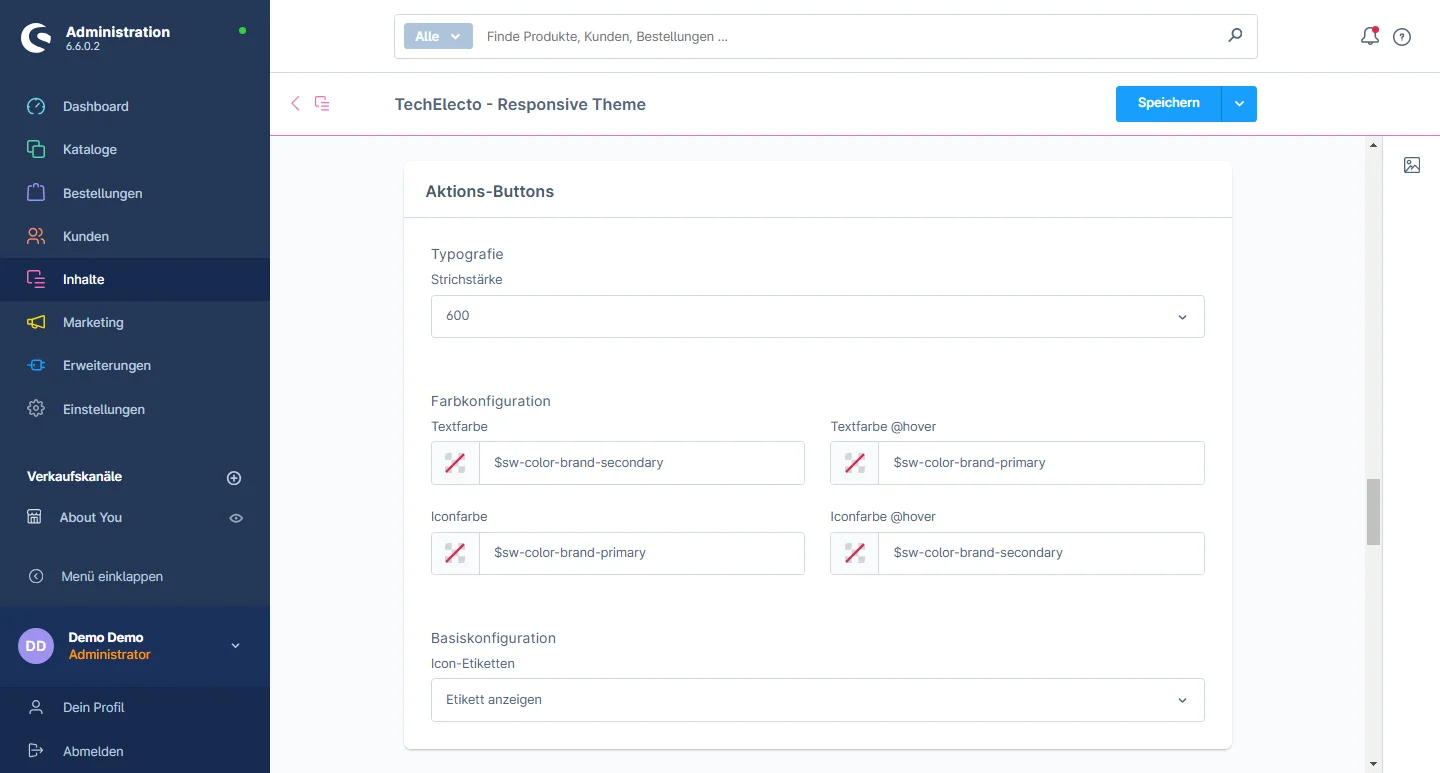
5- Action Button: You can modify the font weight, text color, text hover color, icon color, and icon color on hover.

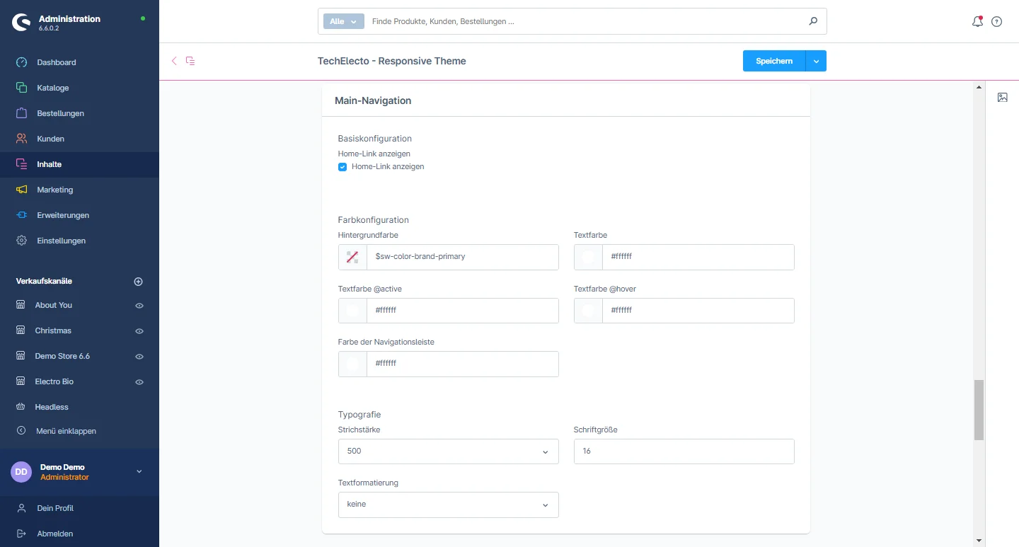
6- Main Navigation color: You have the flexibility to enable or disable options and customize the background color, text color, active text color, text hover color, navigation bar line color, and change the font size and text formatting.

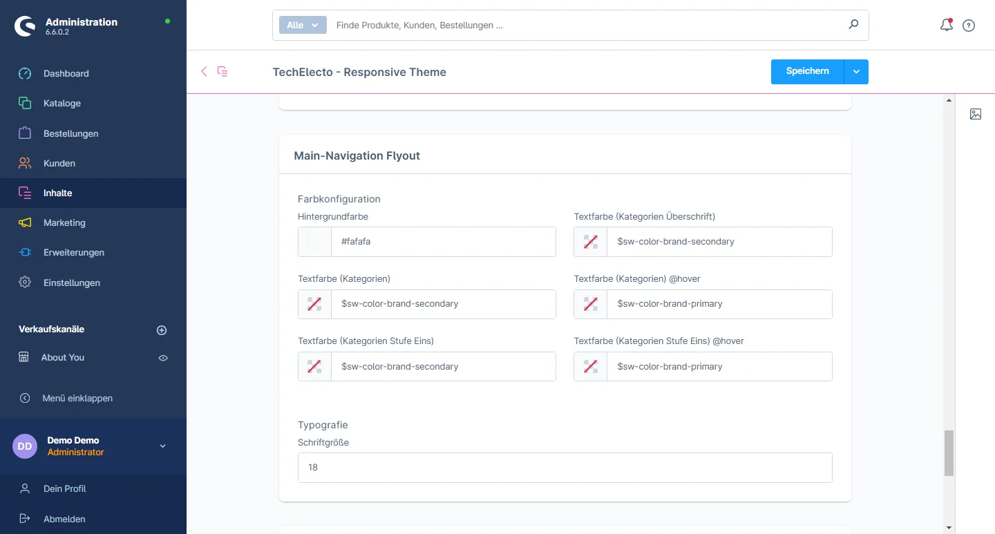
7- Main Navigation Flyout Color: You can modify the background color, category headline text color, category text color and hover color, text color for level one, hover color, and adjust the font size.

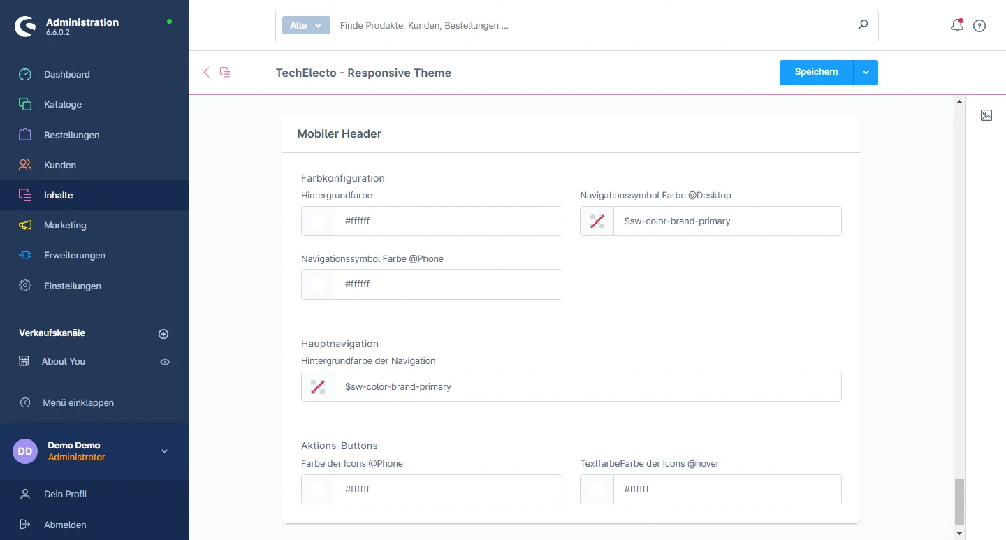
8- Responsive Header Color: You can change the background color, navigation icon color separately for desktop and mobile. Responsive Main Navigation: You can change the background color. Action button: You can change the icon color and hover color

Lorem ipsum dolor sit amet, consectetuer adipiscing elit. Aenean commodo ligula eget dolor. Aenean massa. Cum sociis natoque penatibus

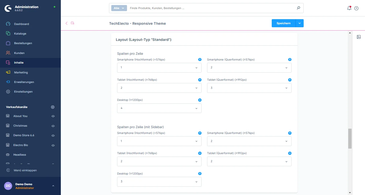
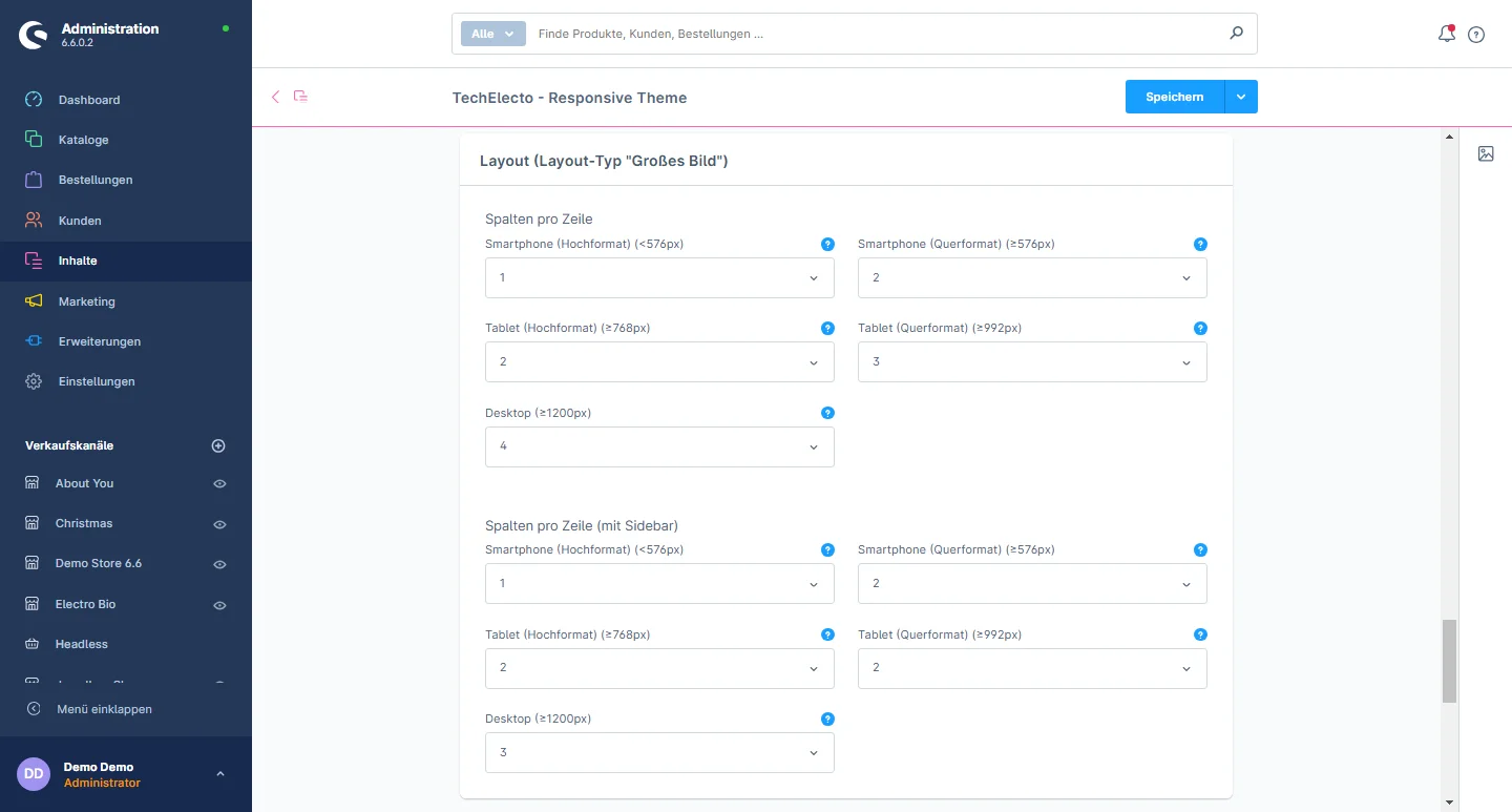
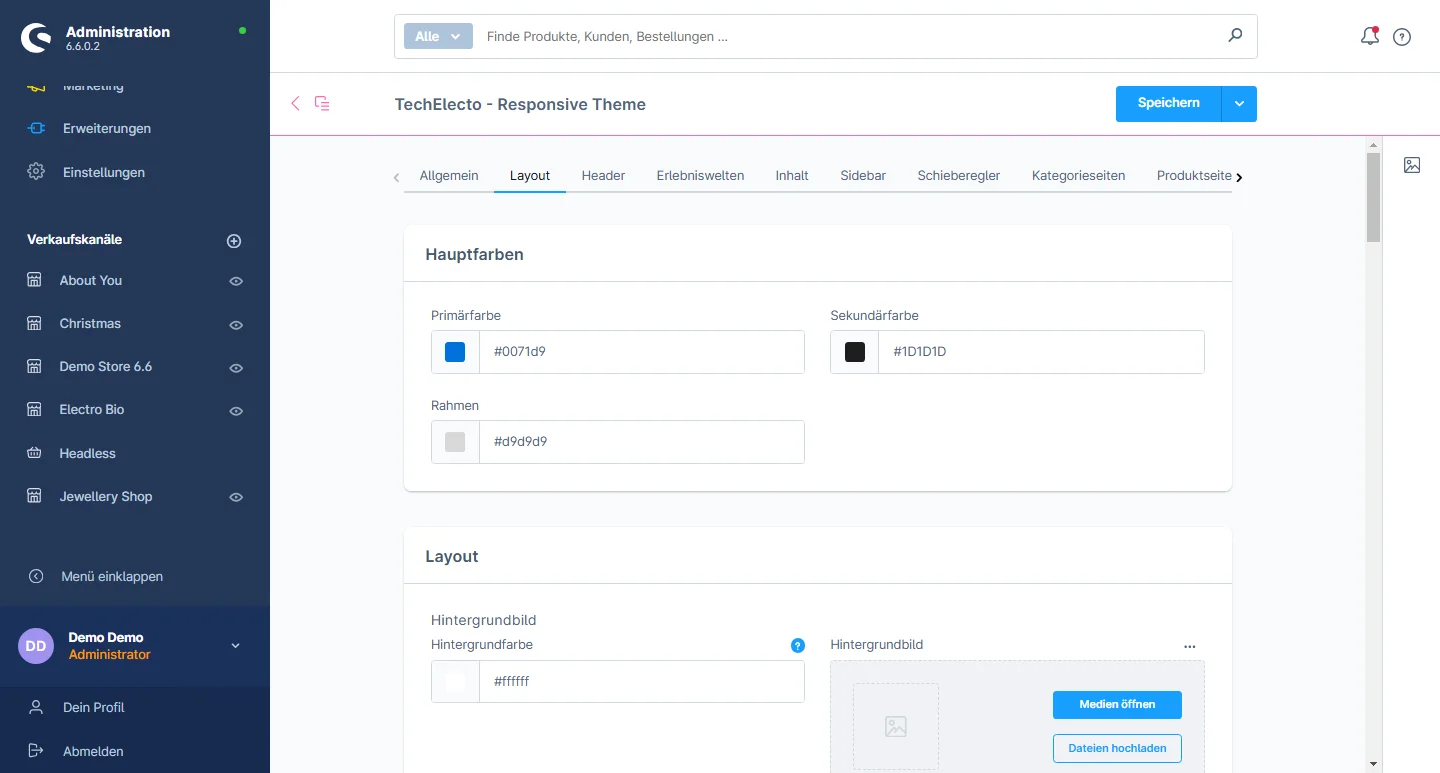
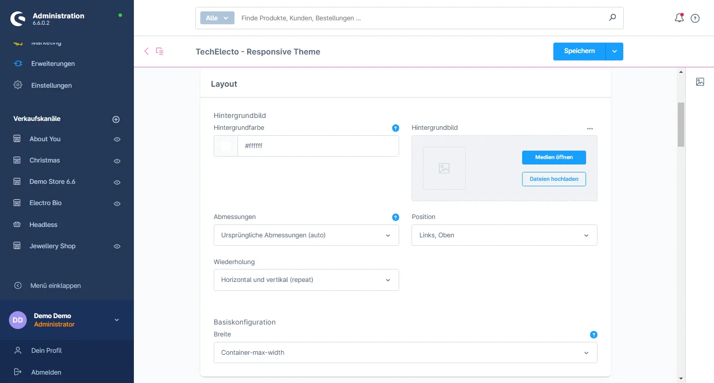
Layout Configuration

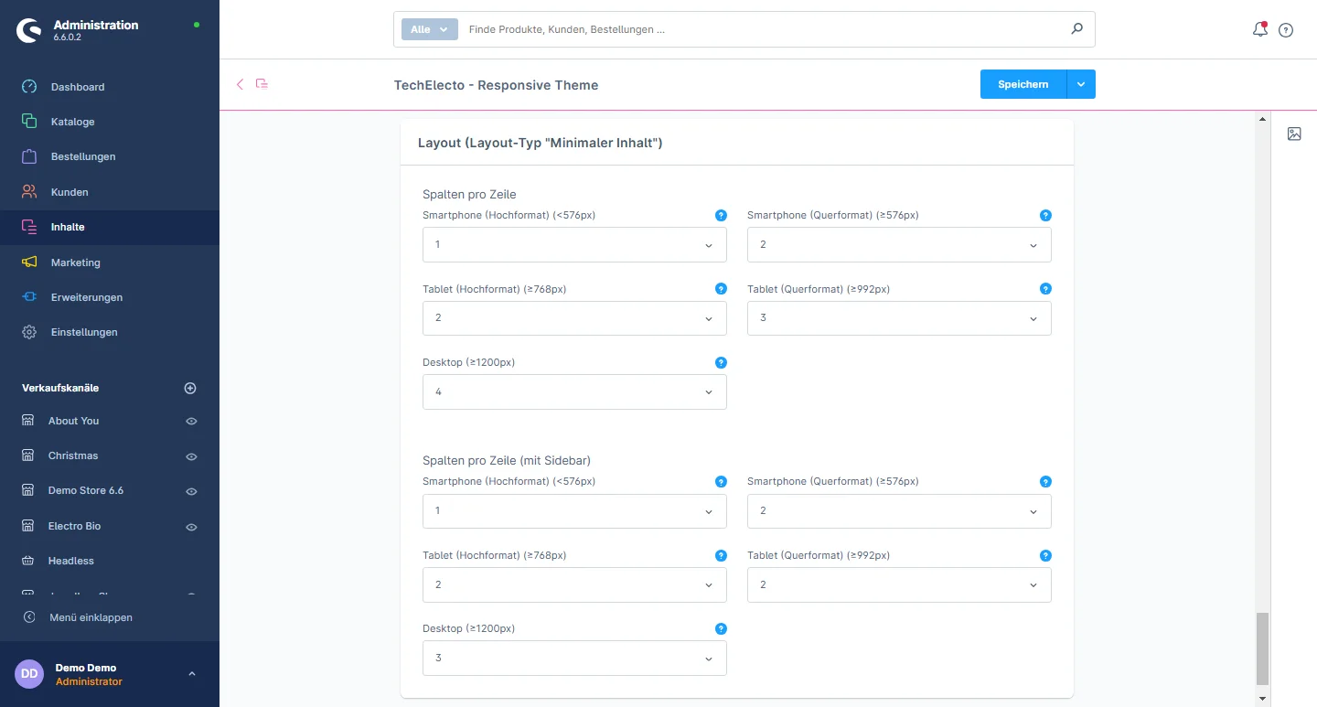
Lorem ipsum dolor sit amet, consectetuer adipiscing elit. Aenean commodo ligula eget dolor. Aenean massa. Cum sociis natoque penatibus

Lorem ipsum dolor sit amet, consectetuer adipiscing elit. Aenean commodo ligula eget dolor. Aenean massa. Cum sociis natoque penatibus

Lorem ipsum dolor sit amet, consectetuer adipiscing elit. Aenean commodo ligula eget dolor. Aenean massa. Cum sociis natoque penatibus

Lorem ipsum dolor sit amet, consectetuer adipiscing elit. Aenean commodo ligula eget dolor. Aenean massa. Cum sociis natoque penatibus

Lorem ipsum dolor sit amet, consectetuer adipiscing elit. Aenean commodo ligula eget dolor. Aenean massa. Cum sociis natoque penatibus

Lorem ipsum dolor sit amet, consectetuer adipiscing elit. Aenean commodo ligula eget dolor. Aenean massa. Cum sociis natoque penatibus

Lorem ipsum dolor sit amet, consectetuer adipiscing elit. Aenean commodo ligula eget dolor. Aenean massa. Cum sociis natoque penatibus

Lorem ipsum dolor sit amet, consectetuer adipiscing elit. Aenean commodo ligula eget dolor. Aenean massa. Cum sociis natoque penatibus

Lorem ipsum dolor sit amet, consectetuer adipiscing elit. Aenean commodo ligula eget dolor. Aenean massa. Cum sociis natoque penatibus

Lorem ipsum dolor sit amet, consectetuer adipiscing elit. Aenean commodo ligula eget dolor. Aenean massa. Cum sociis natoque penatibus

Product Pages Configuration

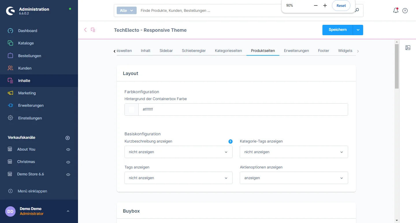
1- Gehe zum Product tab and select the product page configuration

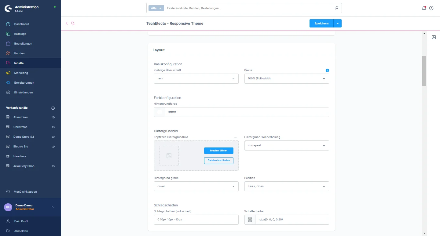
2- Layout: You can configure the background color of the container box.

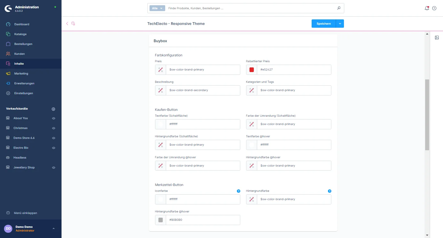
3- Buy Box: You can choose to display or hide the short description, category tags, show tags, and stock view option for the detail page. Additionally, you can customize the price color, discount price color, description color, category and tags color. You can also modify the notepad button icon color, background color, and hover background color.

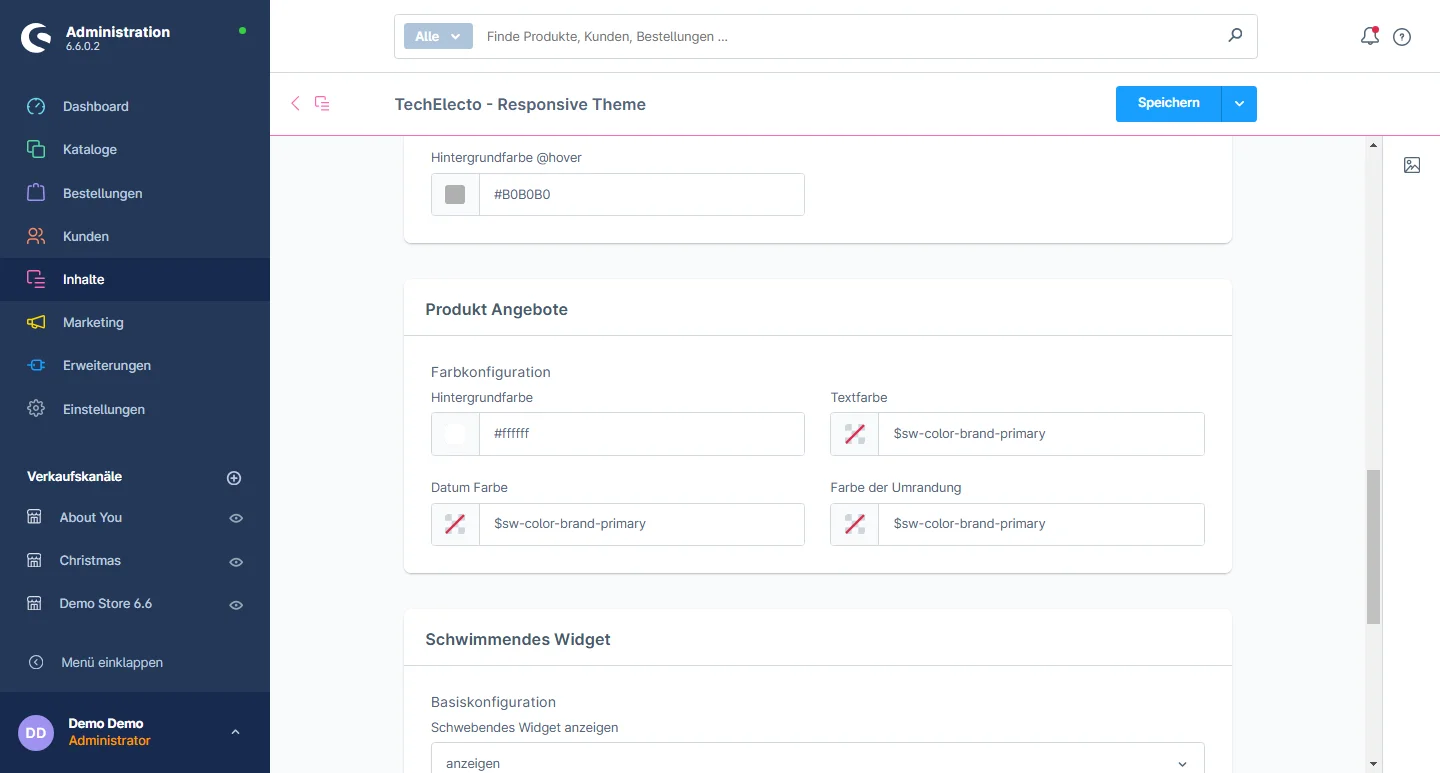
4- Product Page: You can change the background color, text color, date color, and border color for the product page.

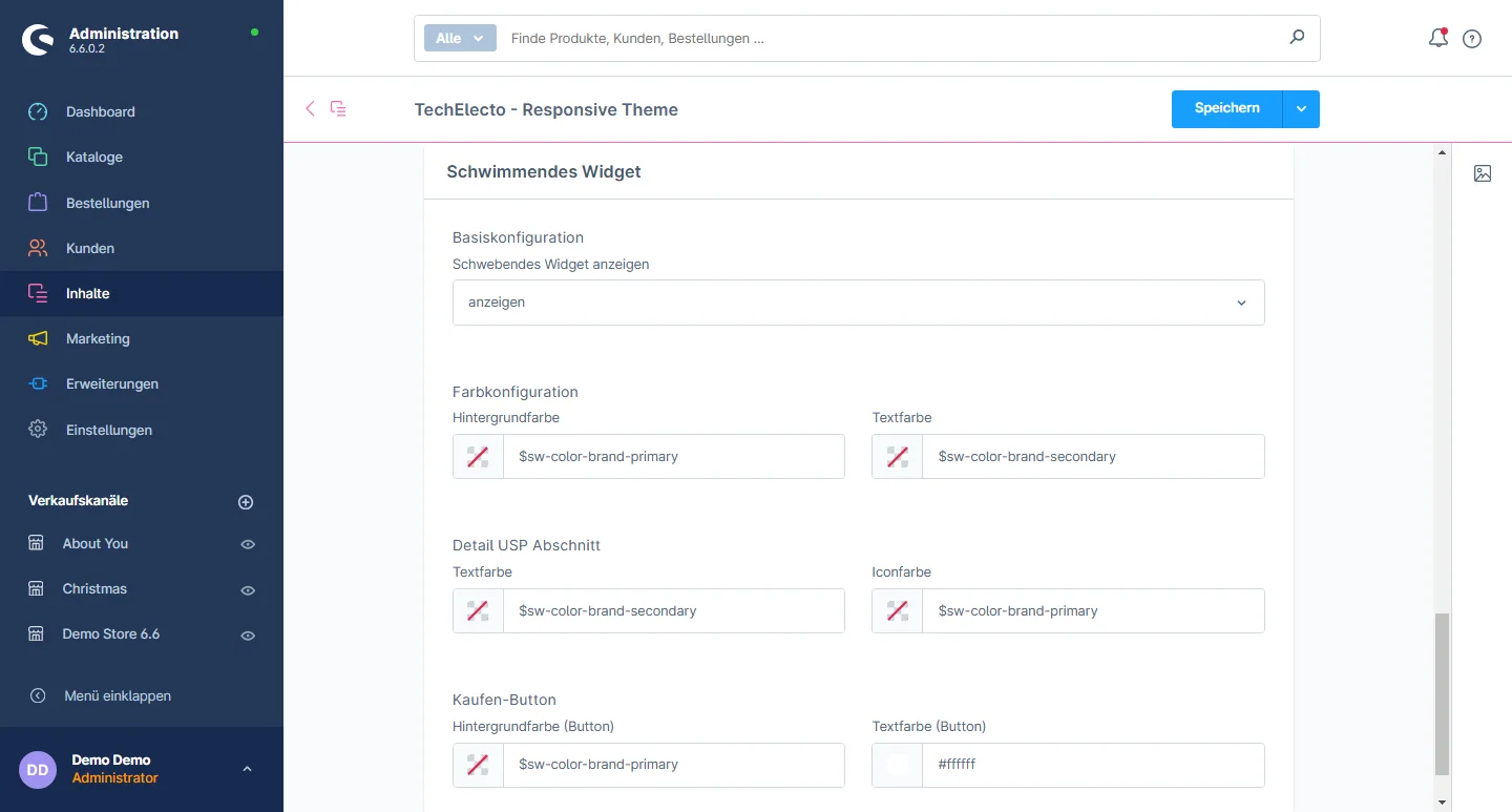
5- Floating widget: You have the option to show or hide the floating widget. You can also adjust the background color, text color, and modify the text color and icon color for the detail USP section. Additionally, you can set the background button color and text color for the buy button.

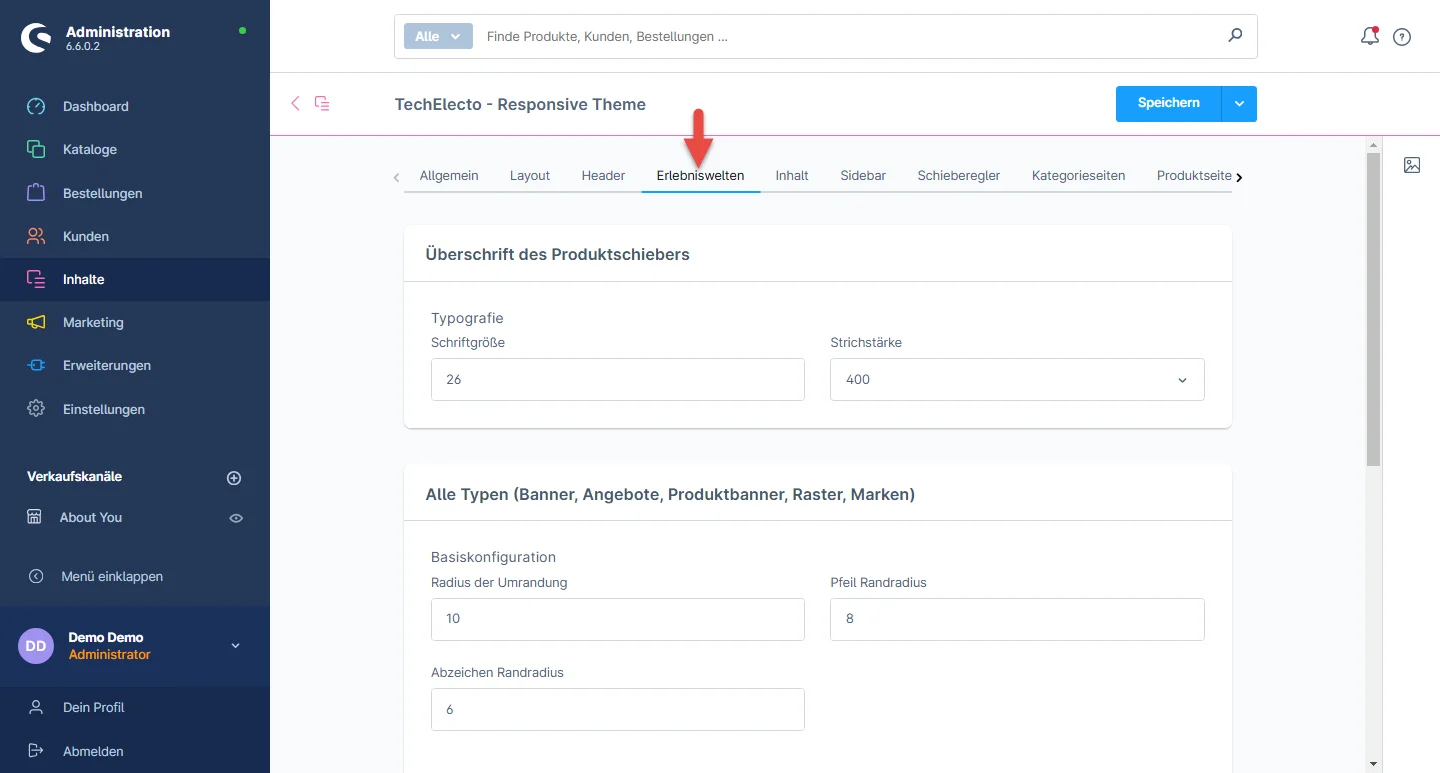
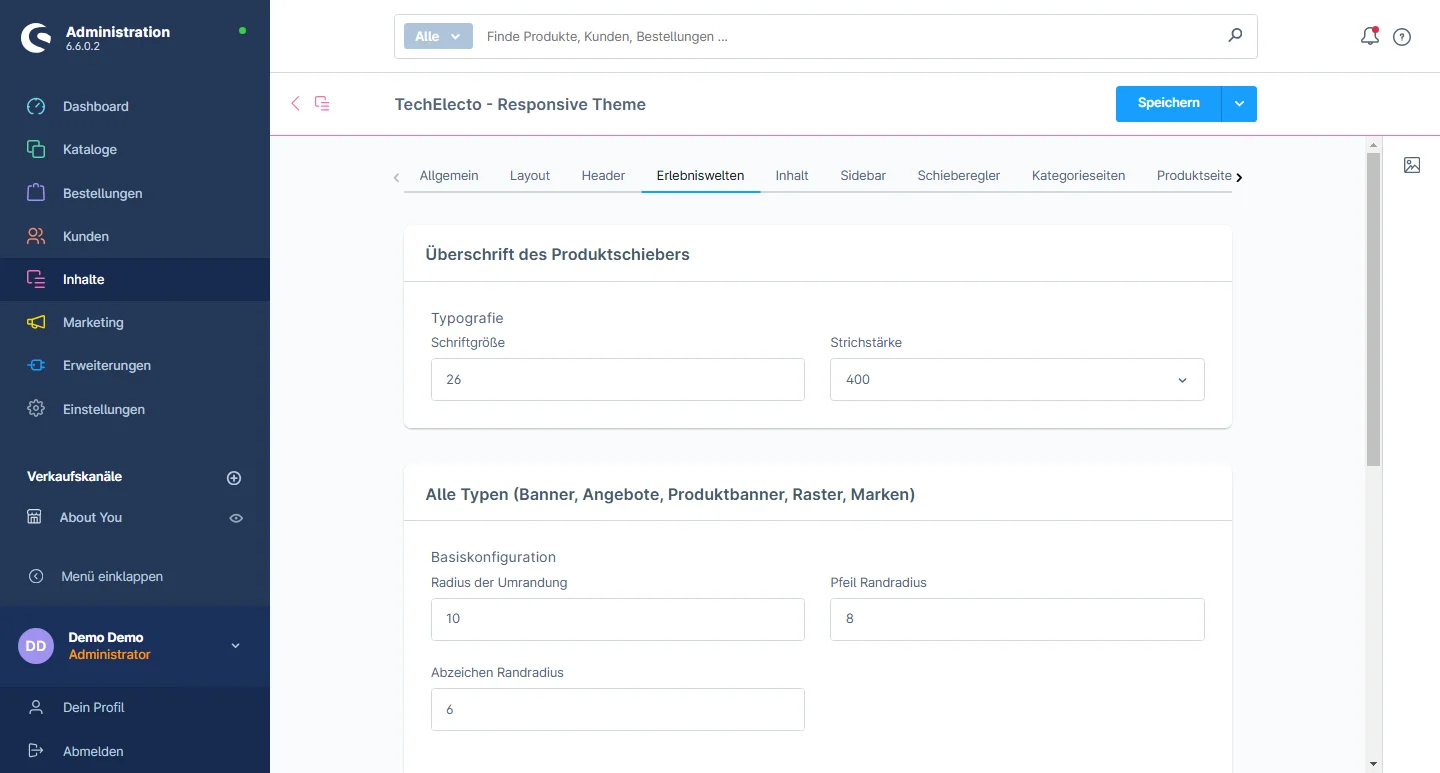
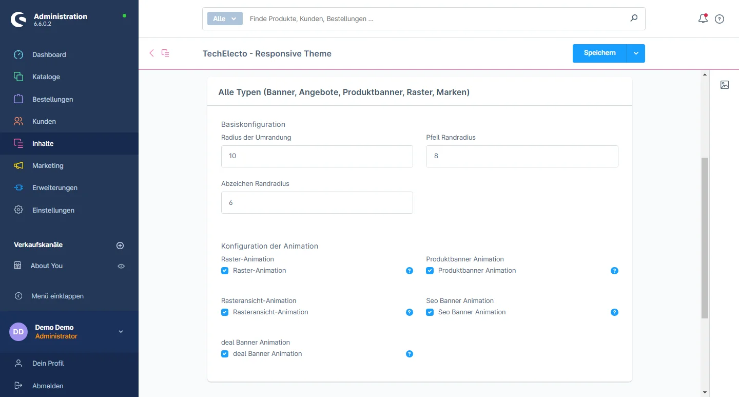
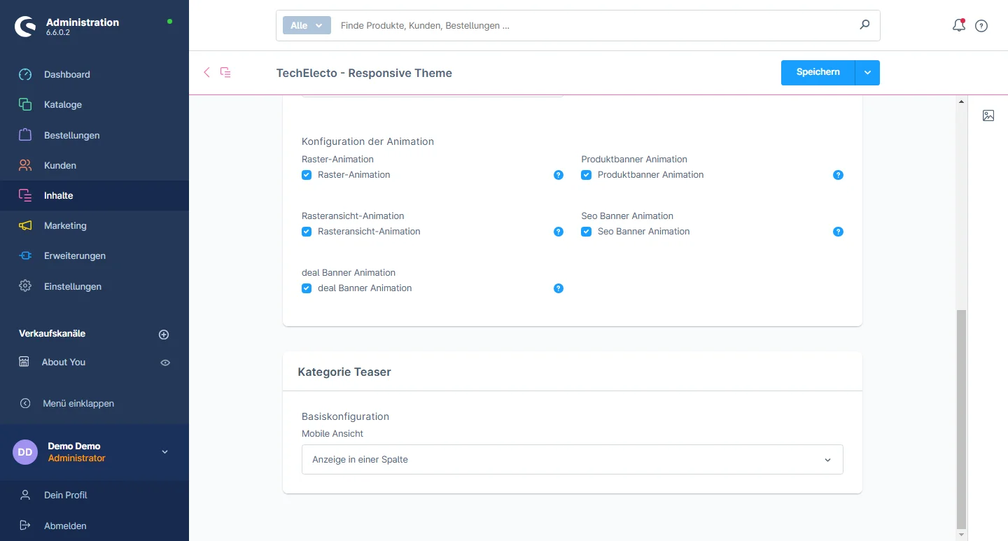
Shopping Experiences Configuration

Lorem ipsum dolor sit amet, consectetuer adipiscing elit. Aenean commodo ligula eget dolor. Aenean massa. Cum sociis natoque penatibus

Lorem ipsum dolor sit amet, consectetuer adipiscing elit. Aenean commodo ligula eget dolor. Aenean massa. Cum sociis natoque penatibus

Lorem ipsum dolor sit amet, consectetuer adipiscing elit. Aenean commodo ligula eget dolor. Aenean massa. Cum sociis natoque penatibus

Lorem ipsum dolor sit amet, consectetuer adipiscing elit. Aenean commodo ligula eget dolor. Aenean massa. Cum sociis natoque penatibus

Wie man die Einkaufswelt gestaltet

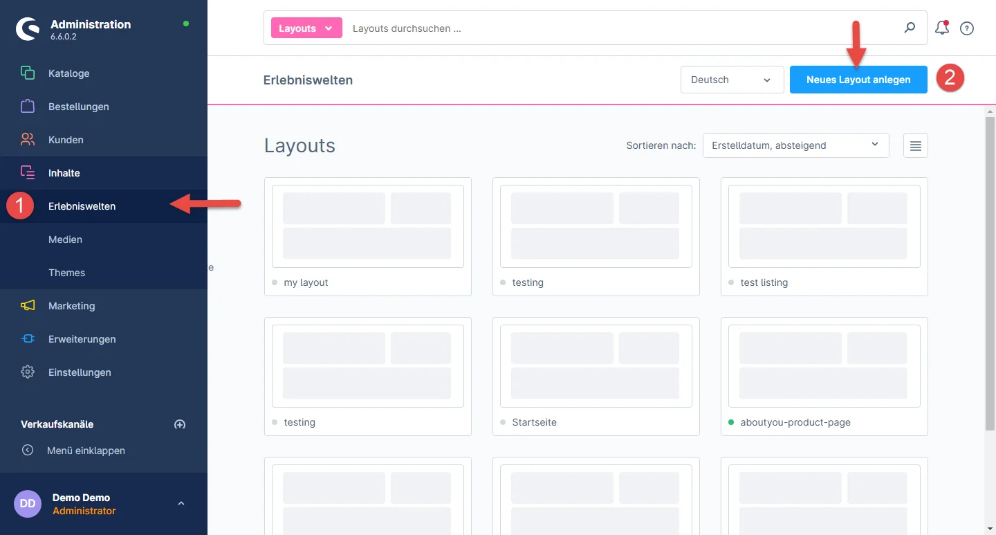
1- Gehen Sie im Administrations-Dashboard auf Einkaufserlebnis und klicken Sie auf die Schaltfläche Neues Layout erstellen.

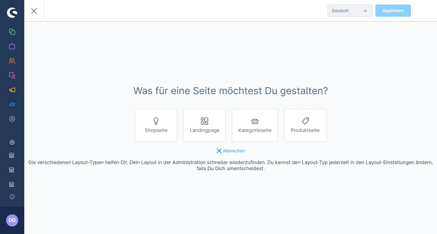
2- Select the landing page or any other layout type of your choice.

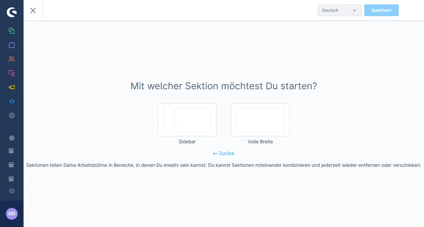
3- Wählen Sie den gewünschten Abschnittstyp aus.

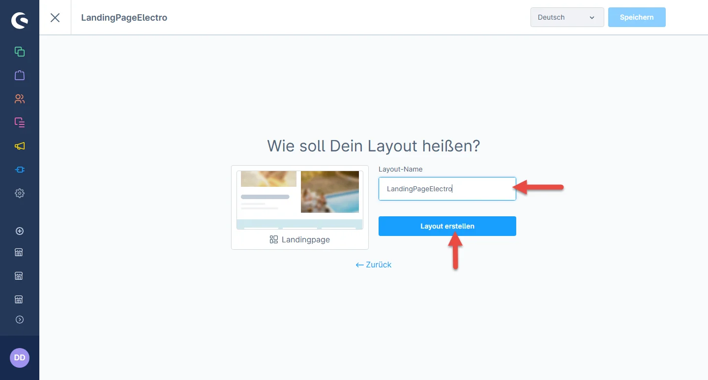
4- Legen Sie nun den Namen des Layouts fest und klicken Sie auf die Schaltfläche Layout erstellen.

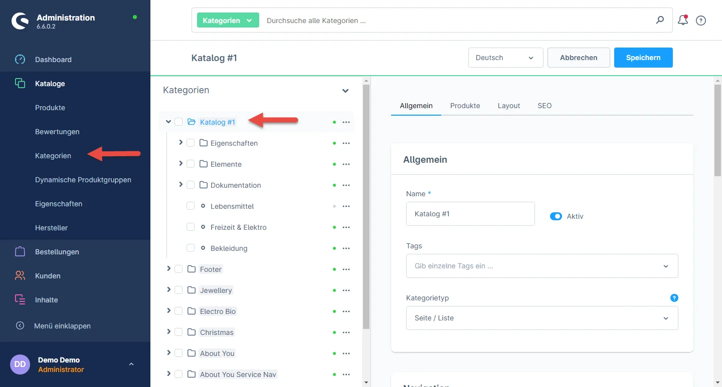
5- Nachdem Sie Ihr Layout erstellt haben, gehen Sie zu Catalogues > Categories und klicken Sie auf die Kategorie, der Sie das zuvor erstellte Layout zuweisen möchten.

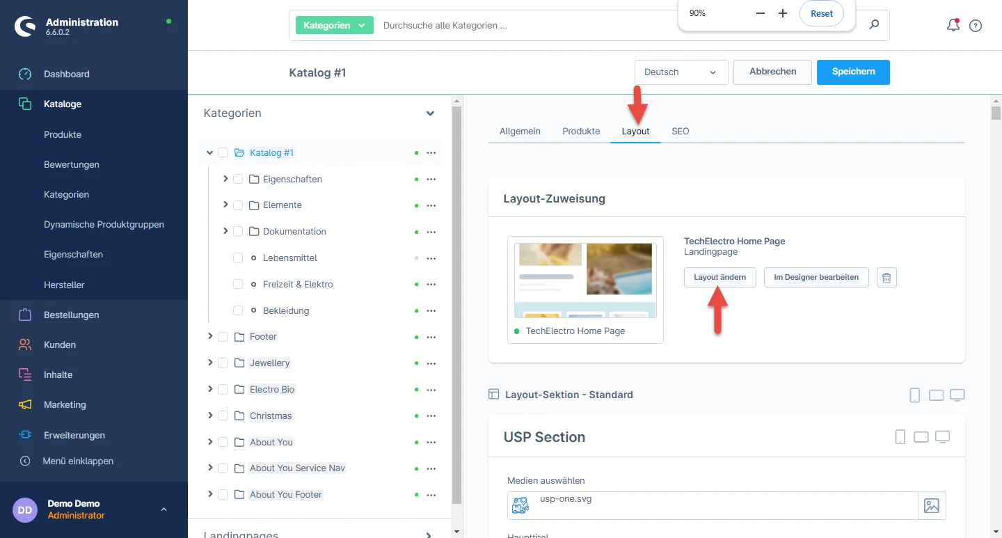
6- Now select the layout tab and click on the change layout button.

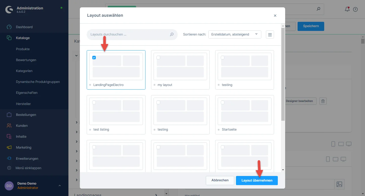
7- Wählen Sie das kürzlich erstellte Layout aus und klicken Sie auf die Speichern-Schaltfläche. Sie können auch nach dem Layout-Namen suchen, falls er anfangs nicht sichtbar ist.

8- Nachdem Sie das Layout zugewiesen haben, können Sie die Kategorieeinstellungen speichern.

Brand Slider Configuration

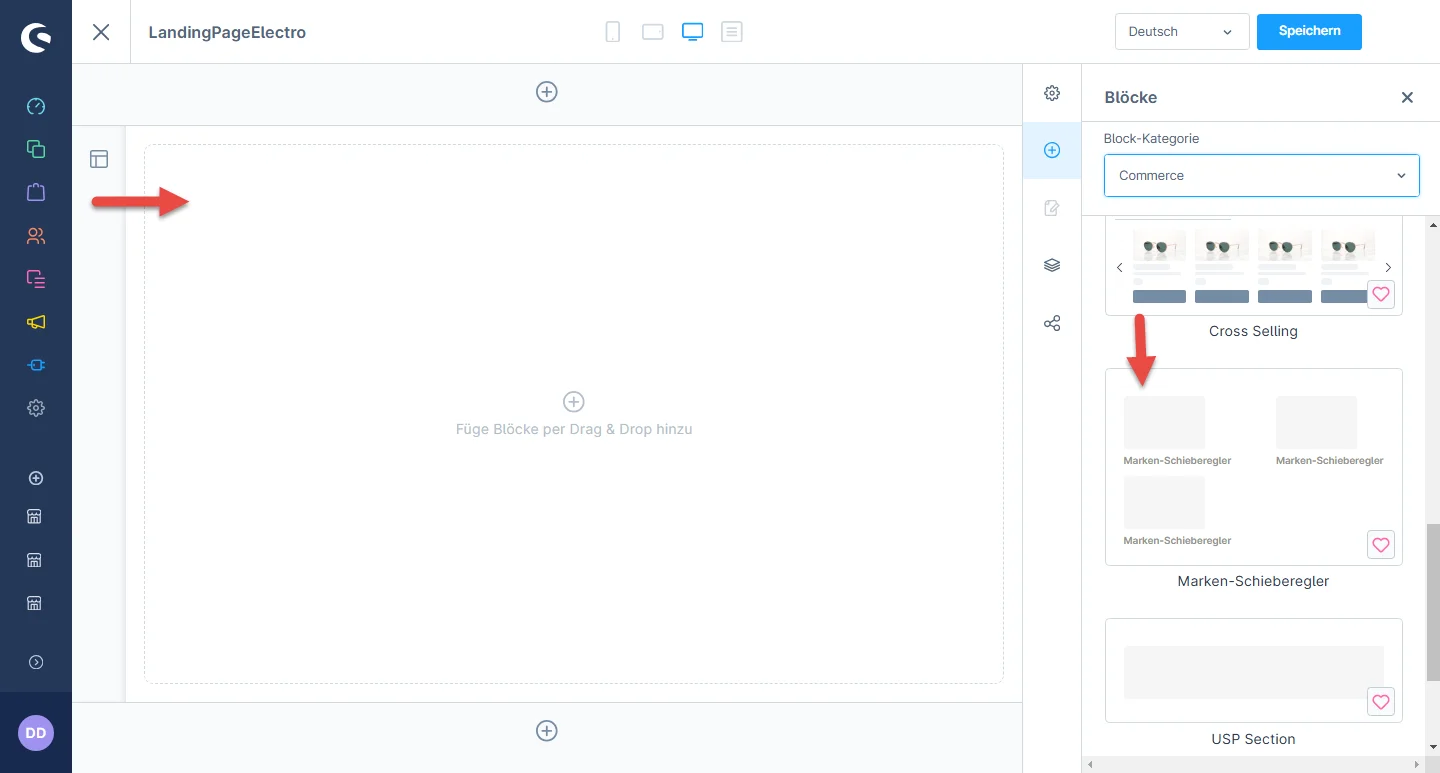
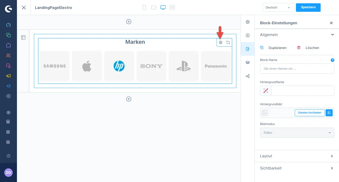
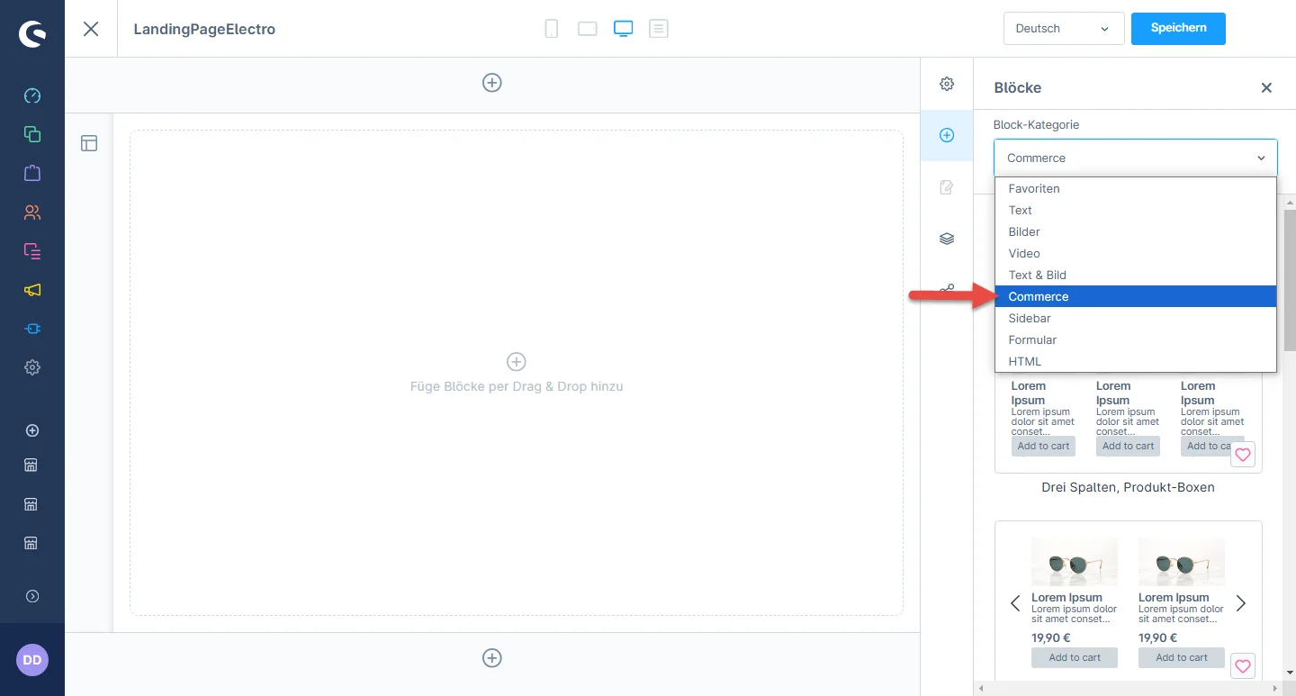
1- Einkaufserlebnis: navigate to the block category and select an Ecommerce from the dropdown menu.

2- Now drag the manufacturer slider element widgets to the desired location on the left side of the CMS section.

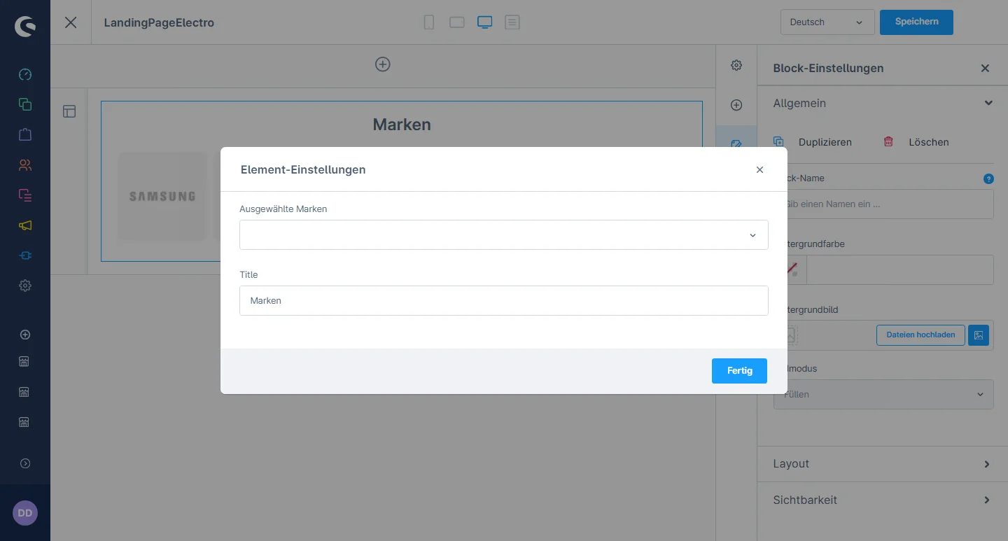
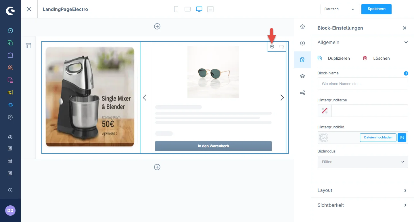
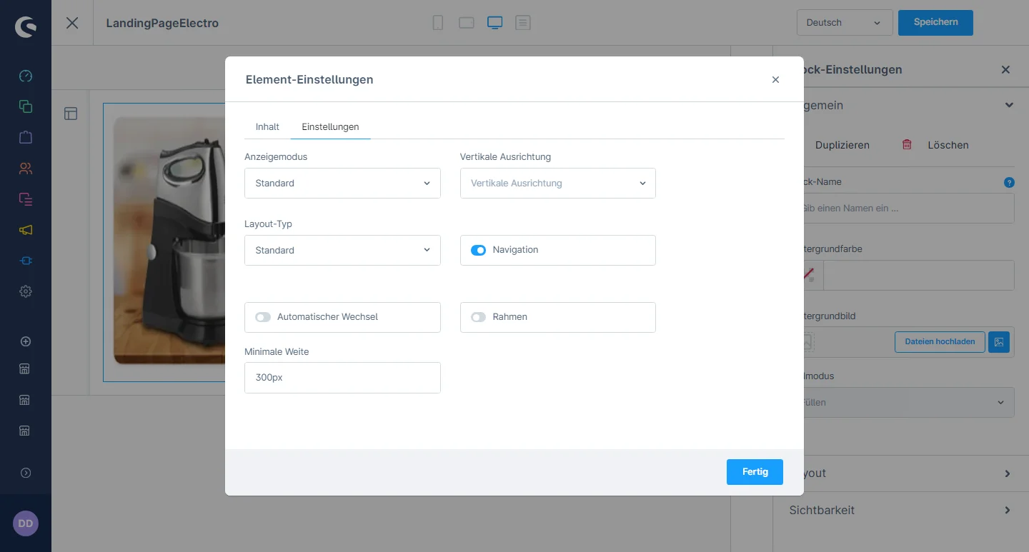
3- Nachdem Sie das Widget abgelegt haben, klicken Sie auf das Einstellungssymbol, um die Konfigurationen des Elements zu öffnen.

4- In the element configuration, you can choose the brand , and change the hover image color and title.

Category Grid Configuration

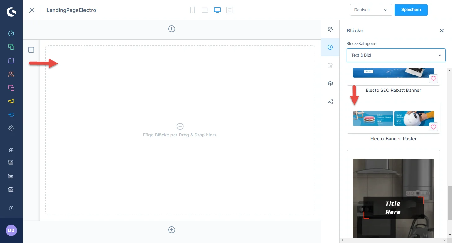
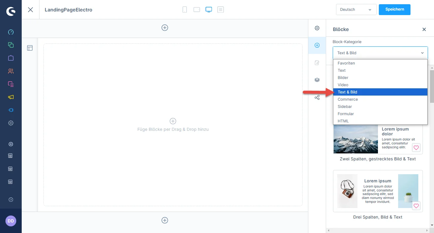
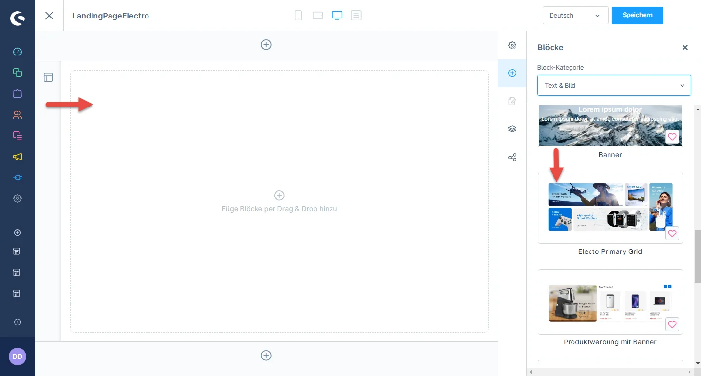
1- Einkaufserlebnisses, navigate to the block category and select a Text & Image from the dropdown menu.

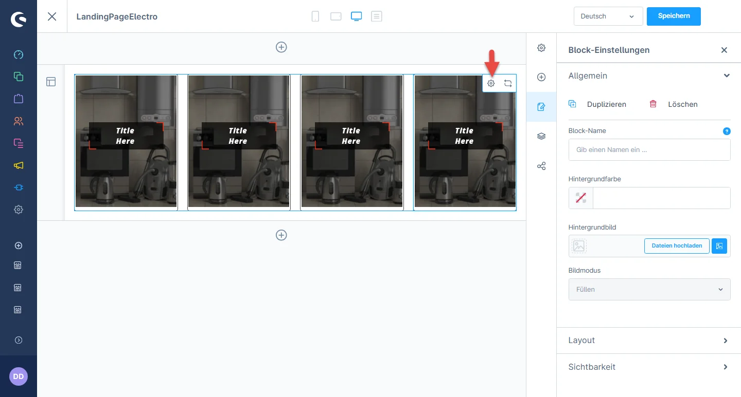
2- Now drag the category grid element widgets to the desired location on the left side of the CMS section.

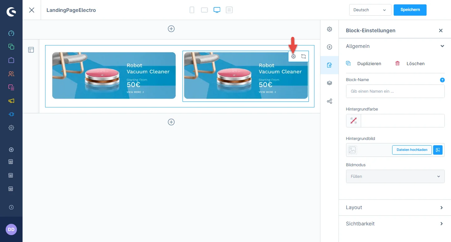
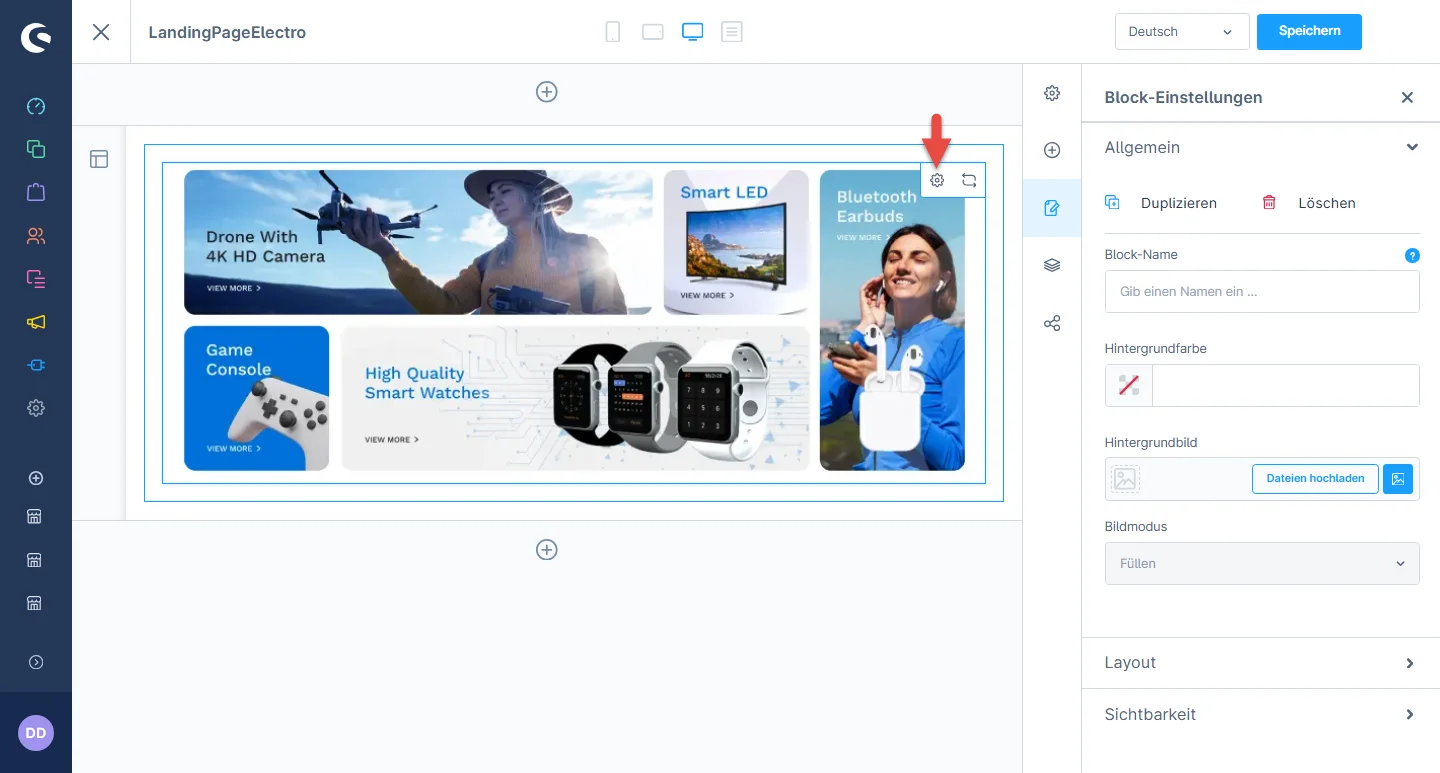
3- Nachdem Sie das Widget abgelegt haben, klicken Sie auf das Einstellungssymbol, um die Konfigurationen des Elements zu öffnen.

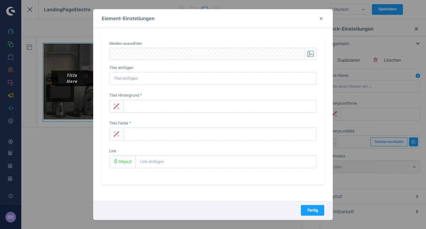
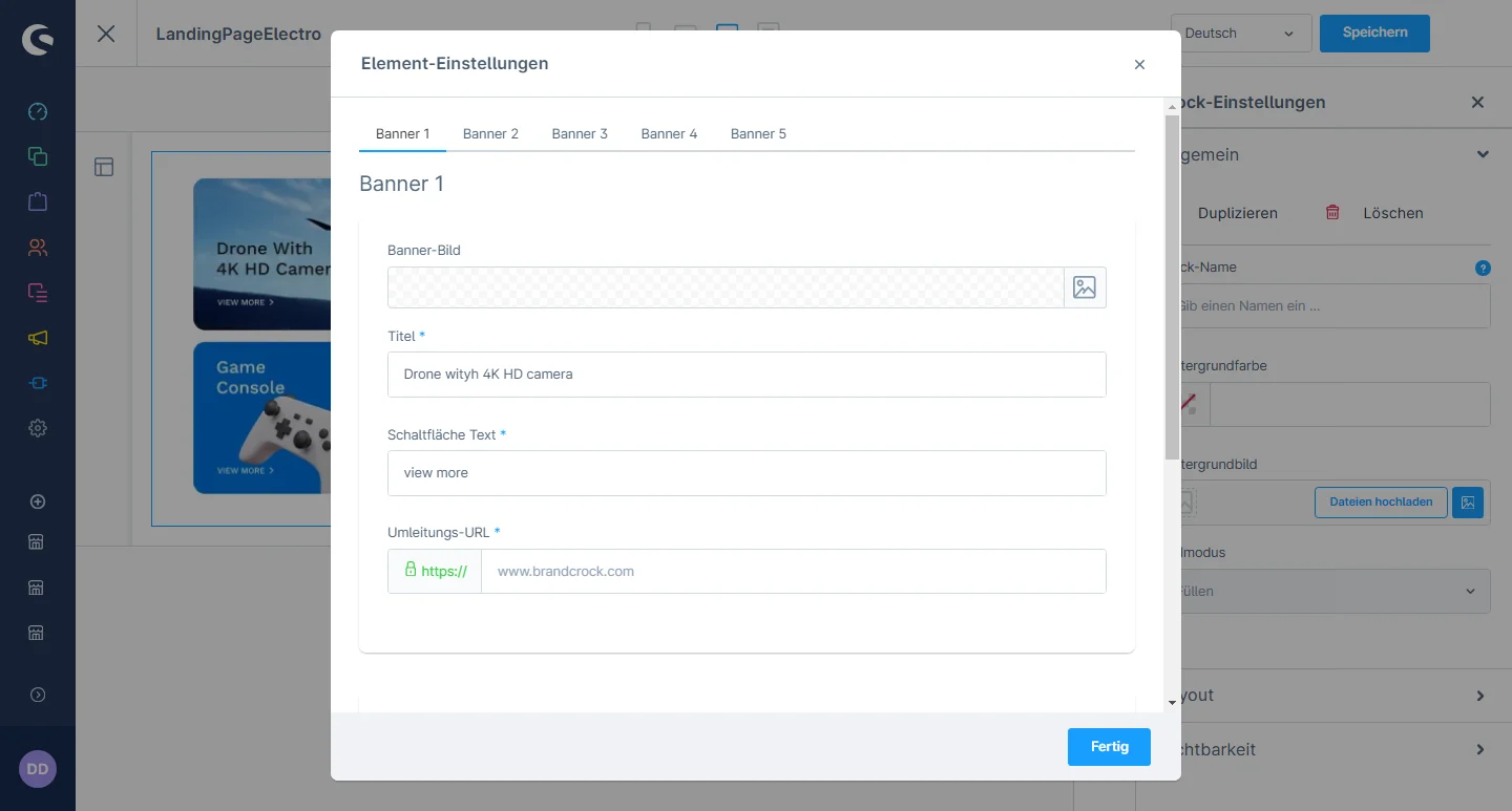
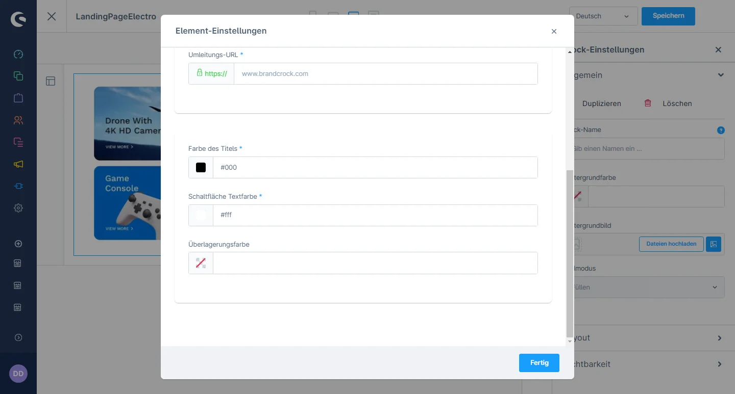
4- In the element configuration, you can change the image, title, button text, URL, and modify the title color and button text color.

Primary Grid Configuration

Lorem ipsum dolor sit amet, consectetuer adipiscing elit. Aenean commodo ligula eget dolor. Aenean massa. Cum sociis natoque penatibus

Lorem ipsum dolor sit amet, consectetuer adipiscing elit. Aenean commodo ligula eget dolor. Aenean massa. Cum sociis natoque penatibus

Lorem ipsum dolor sit amet, consectetuer adipiscing elit. Aenean commodo ligula eget dolor. Aenean massa. Cum sociis natoque penatibus

Lorem ipsum dolor sit amet, consectetuer adipiscing elit. Aenean commodo ligula eget dolor. Aenean massa. Cum sociis natoque penatibus

Lorem ipsum dolor sit amet, consectetuer adipiscing elit. Aenean commodo ligula eget dolor. Aenean massa. Cum sociis natoque penatibus

Product Countdown Section Configuration

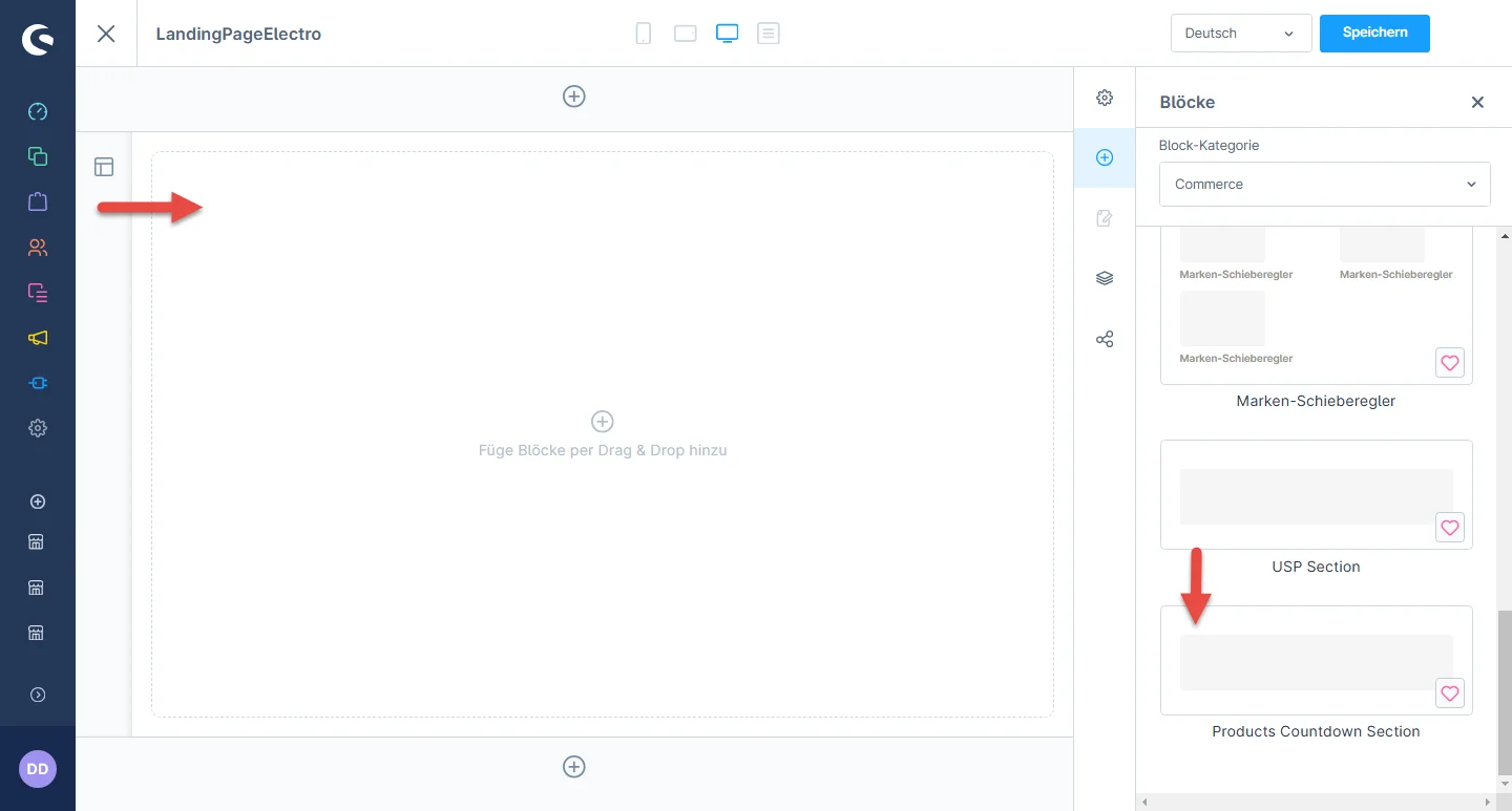
1- Einkaufserlebnis:, navigate to the block category and select an Ecommerce from the dropdown menu.

2- Now drag the product countdown element widgets to the desired location on the left side of the CMS section.

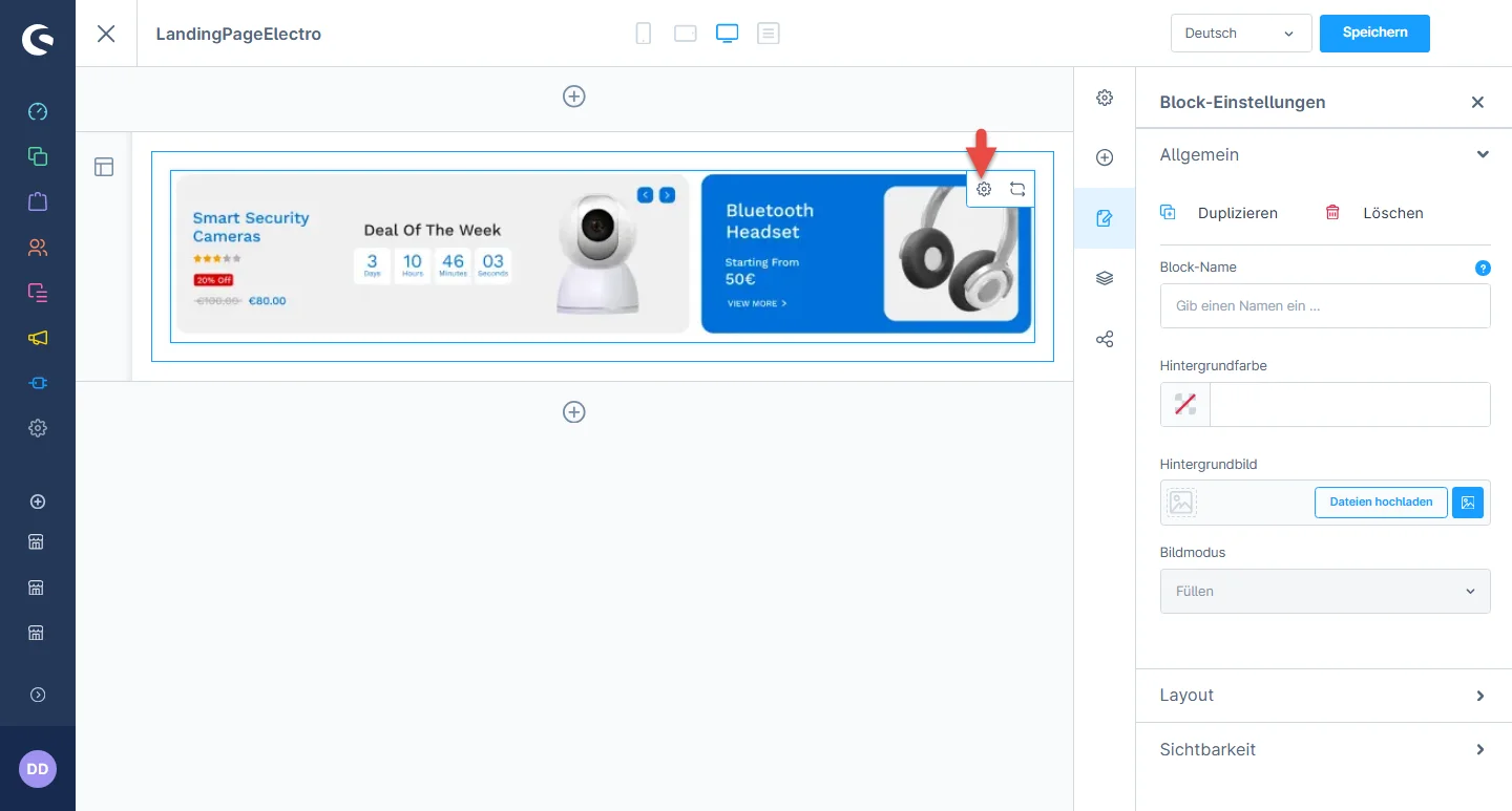
3- Nachdem Sie das Widget abgelegt haben, klicken Sie auf das Einstellungssymbol, um die Konfigurationen des Elements zu öffnen.

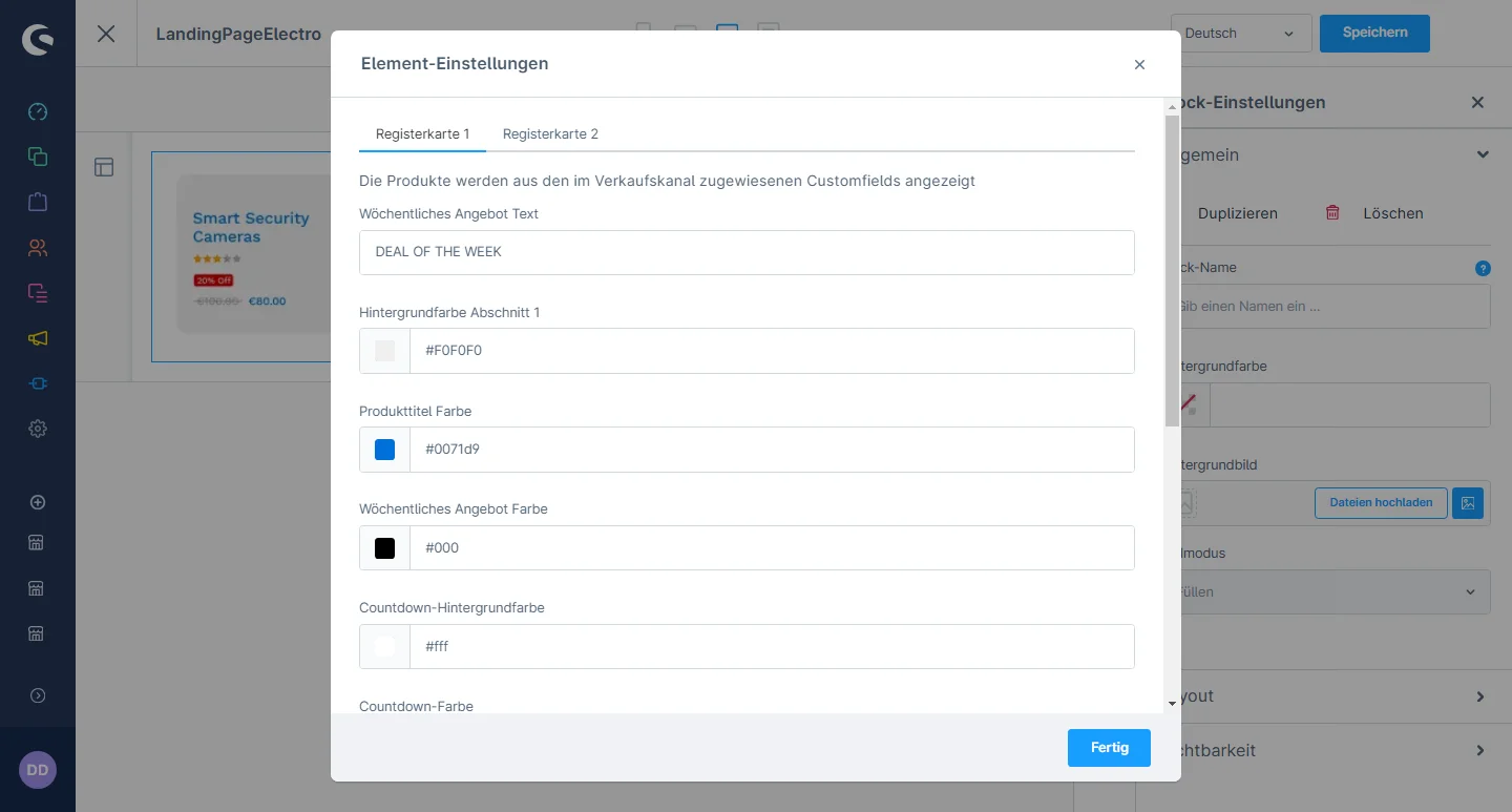
4- In the element configuration, you can add the deal text and change the background color, product title color, deal color, countdown background color, countdown color, price color, discount background color, and discount text color.

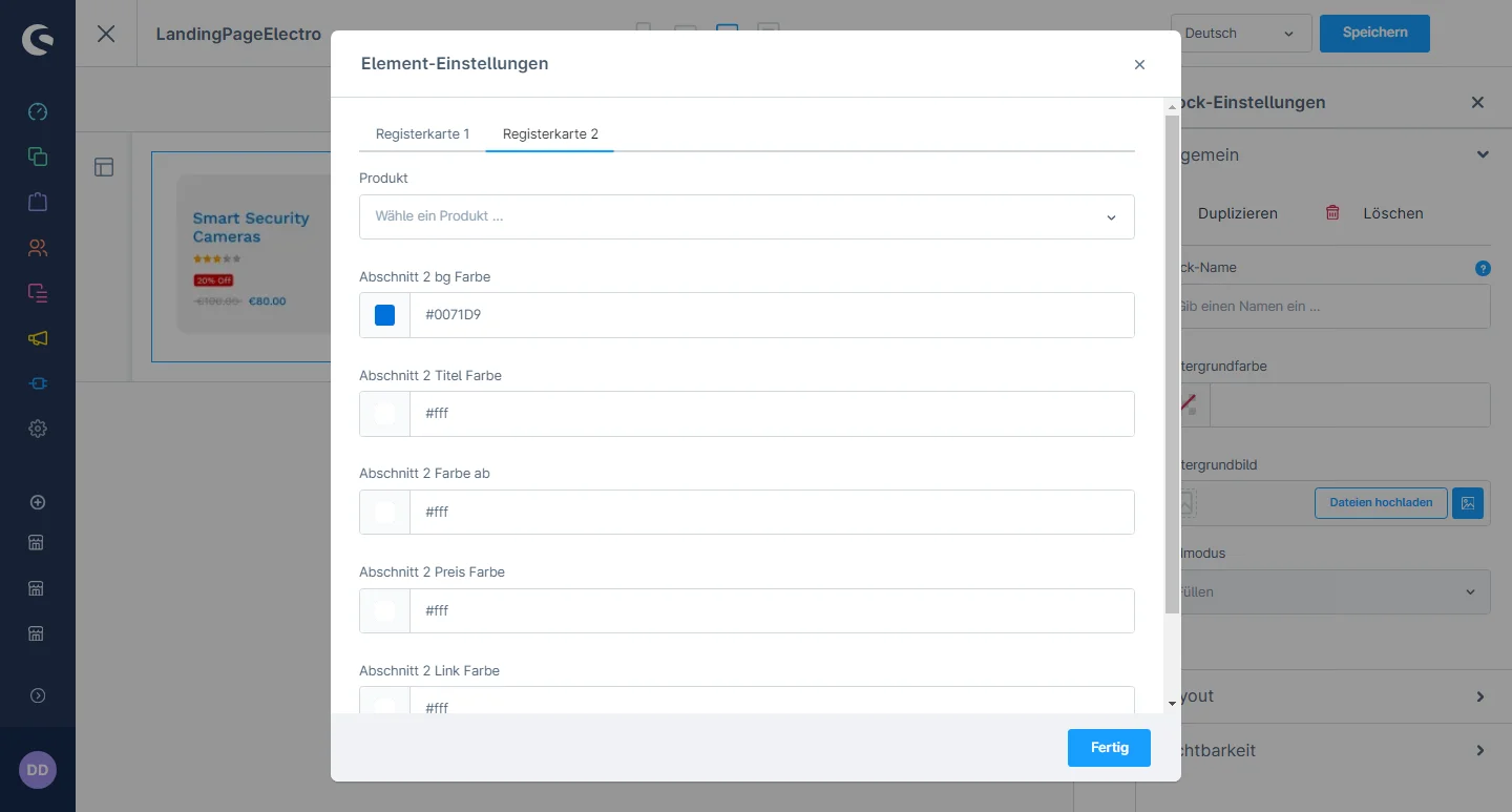
5- You can select the respective deal product and change the background color, title color, text color, price color, and link color.

Product Promotion with Banner Configuration

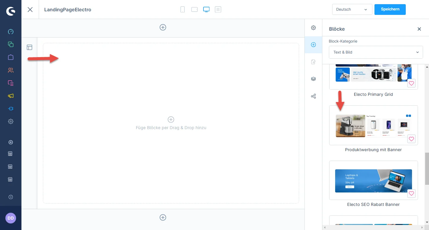
1- Einkaufserlebnis:, navigate to the block category and select an Text & Image from the dropdown menu.

2- Now drag the product promotion element widgets to the desired location on the left side of the CMS section.

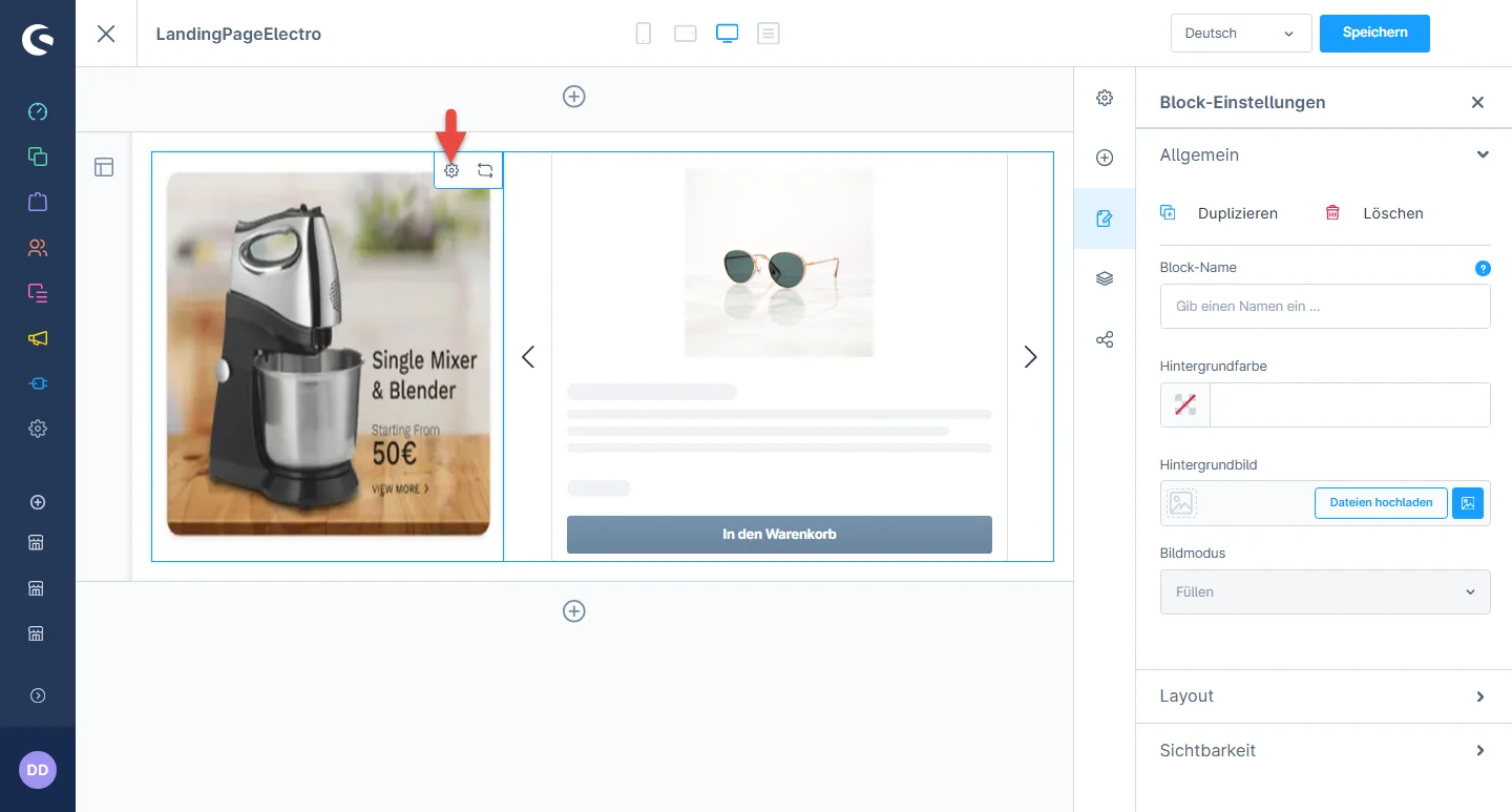
3- Nachdem Sie das Widget abgelegt haben, klicken Sie auf das Einstellungssymbol, um die Konfigurationen des Elements zu öffnen.

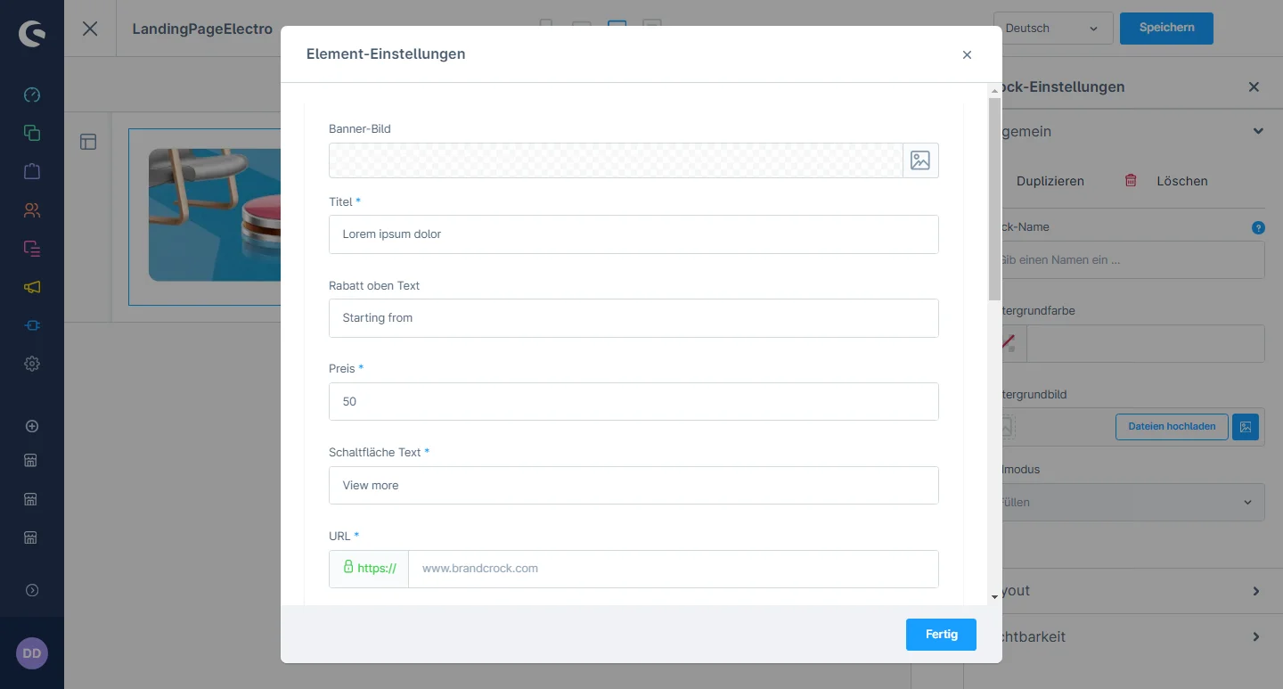
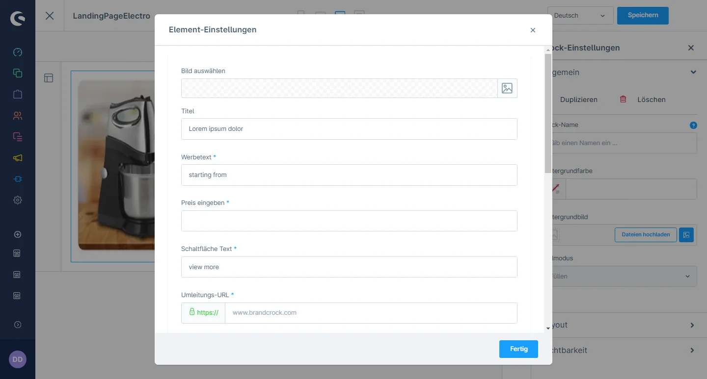
4- In the element configuration, you can change the image, tile, promotion text, price, button text and URL

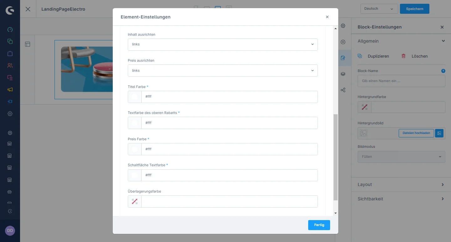
5- You can change the position of the banner and select the desired field to have a dropdown from left to right. Additionally, you can modify the title color, promotion text color, promotion price color, and button text color.

Lorem ipsum dolor sit amet, consectetuer adipiscing elit. Aenean commodo ligula eget dolor. Aenean massa. Cum sociis natoque penatibus

Lorem ipsum dolor sit amet, consectetuer adipiscing elit. Aenean commodo ligula eget dolor. Aenean massa. Cum sociis natoque penatibus

Lorem ipsum dolor sit amet, consectetuer adipiscing elit. Aenean commodo ligula eget dolor. Aenean massa. Cum sociis natoque penatibus

SEO Discount Banner Configuration

1- Einkaufserlebnis:, navigate to the block category and select an Text & Image from the dropdown menu.

2- Now drag the SEO discount banner slider element widgets to the desired location on the left side of the CMS section.

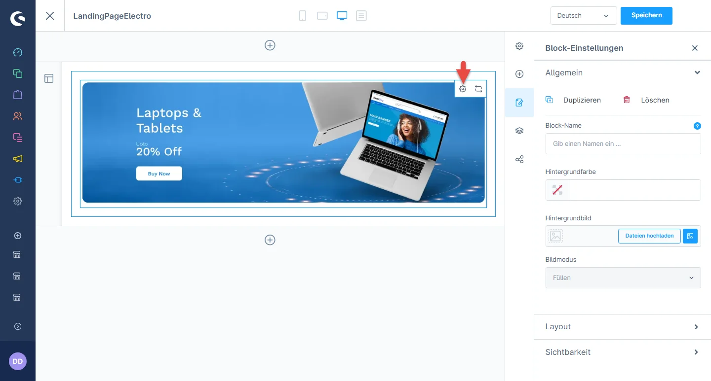
3- Nachdem Sie das Widget abgelegt haben, klicken Sie auf das Einstellungssymbol, um die Konfigurationen des Elements zu öffnen.

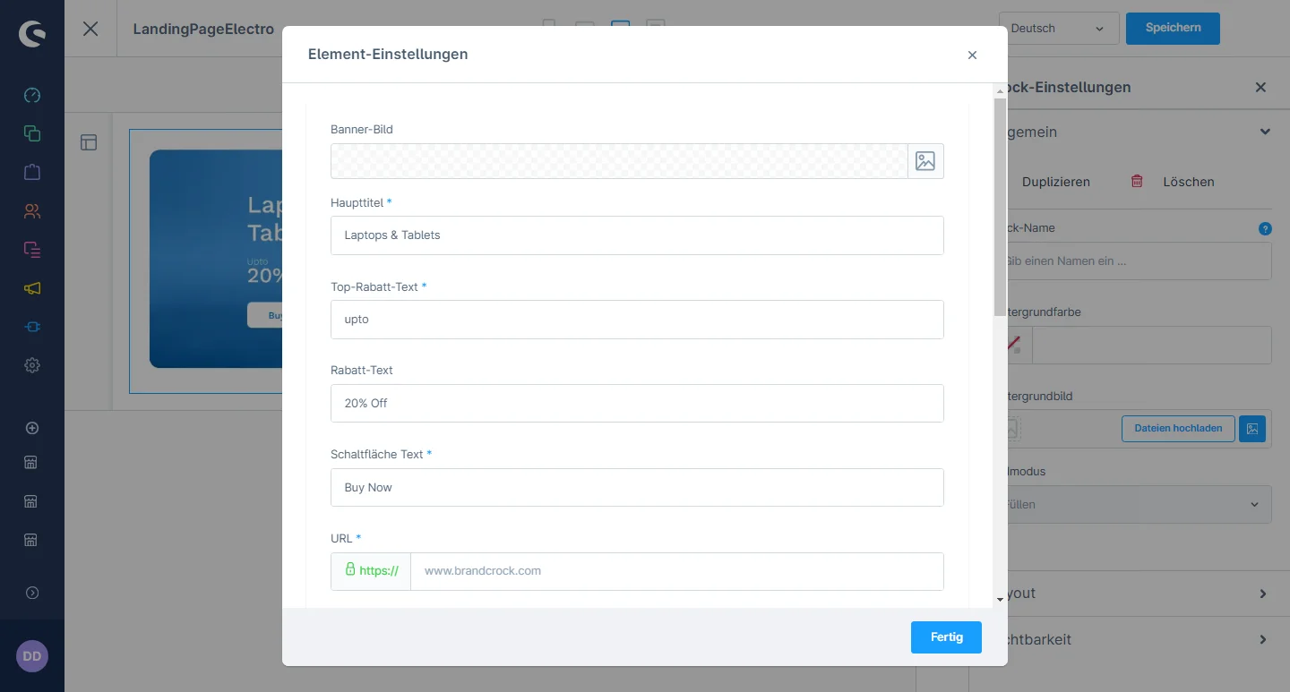
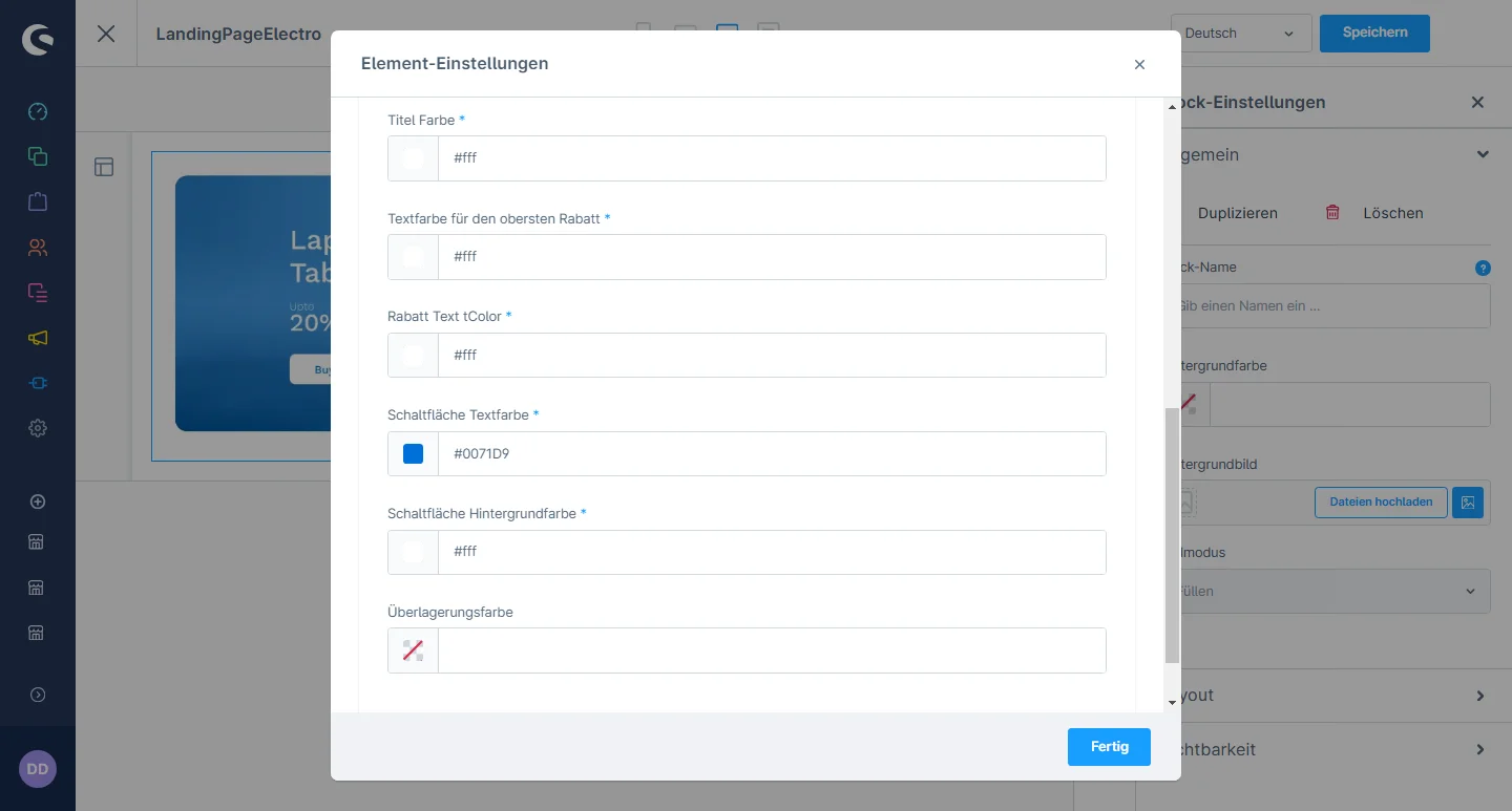
4- In the element configuration, you can change the image, tile, discount text, button text, and URL.

5- You can change the title color, top discount text color, discount text color, button color, and button background color.

Einzigartiges Verkaufsargument Bar

1- Einkaufserlebnis: navigate to the block category and select an Ecommerce from the dropdown menu.

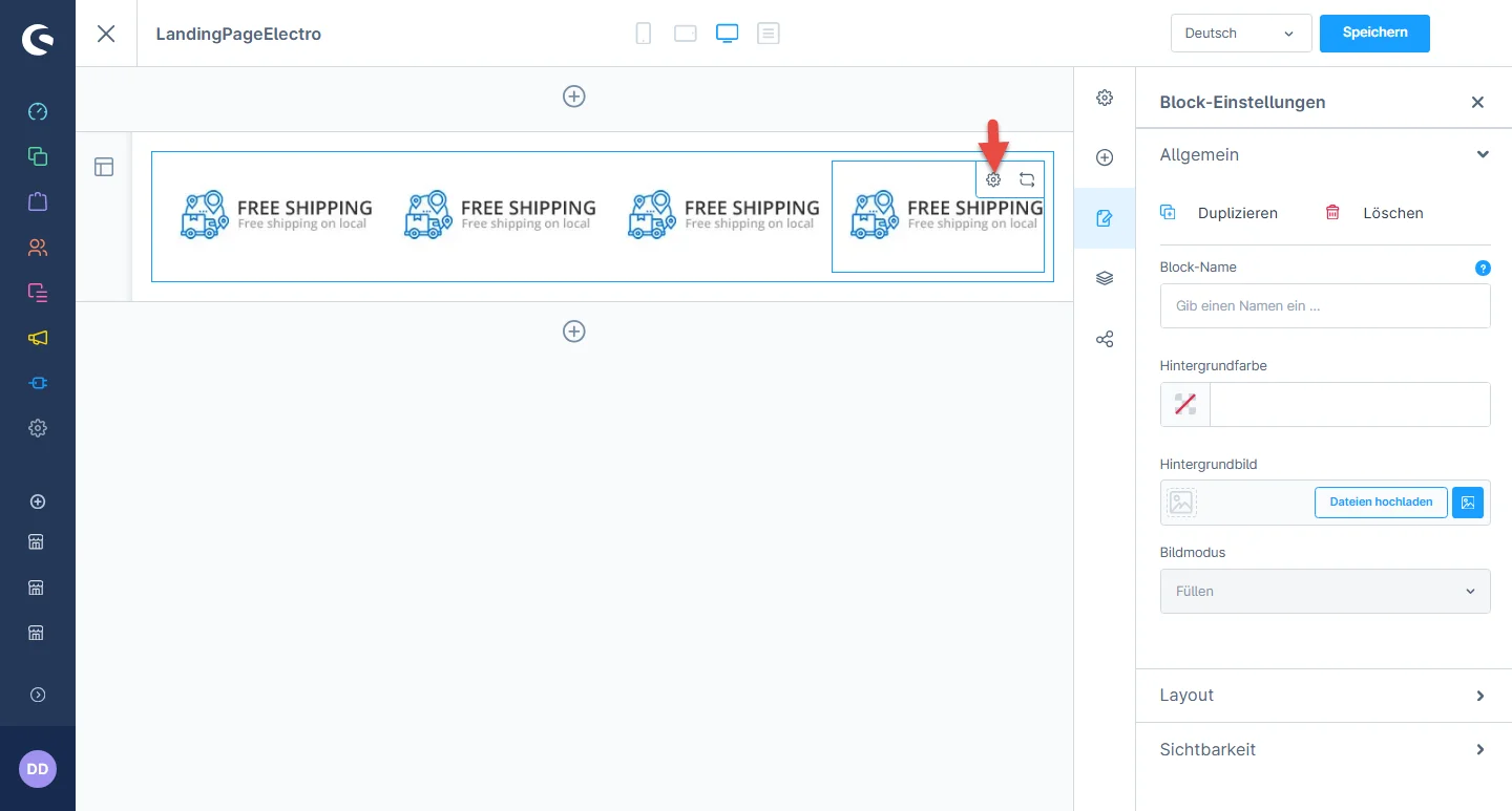
2- Now drag the USP slider element widgets to the desired location on the left side of the CMS section.

3- Nachdem Sie das Widget abgelegt haben, klicken Sie auf das Einstellungssymbol, um die Konfigurationen des Elements zu öffnen.

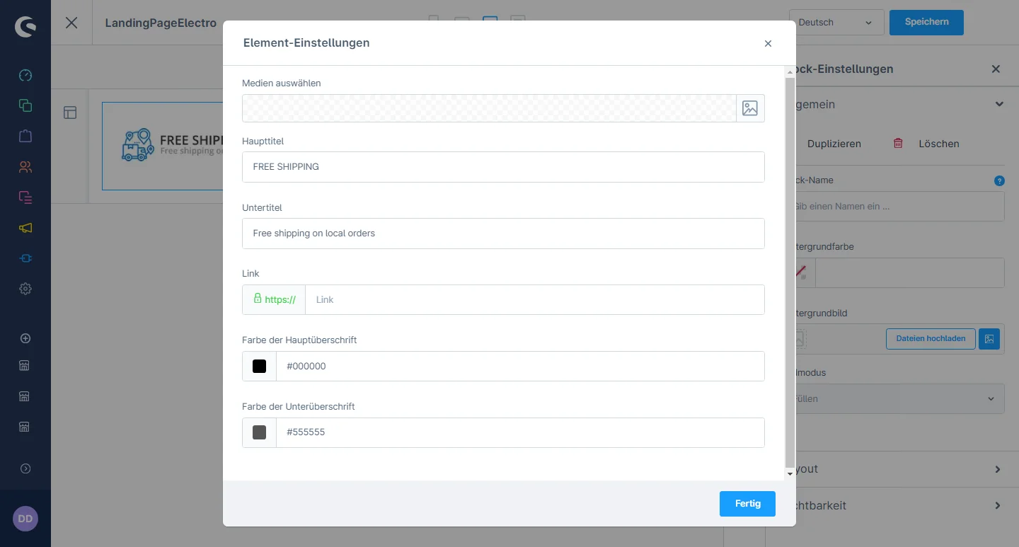
4- In the element configuration, you can select the image, heading, subheading, and URL. Additionally, you can change the color of the main heading and subheading.

Slider Configuration

1- Gehe zum Slider tab and select the slider configuration

2- Sliders: You have the flexibility to activate and deactivate the slider and set the full width of the container and the maximum width of the container.

Widgets Configuration

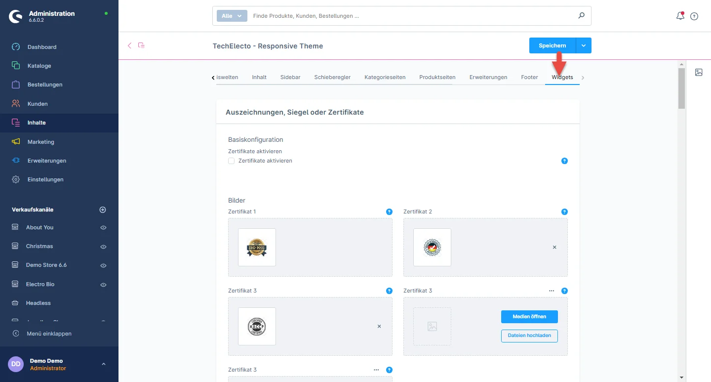
1- Gehe zum Widget tab and select the widget configuration

2- Awards, Seals, and Certifications: You have the flexibility to activate and deactivate certificates and upload multiple certificate images.

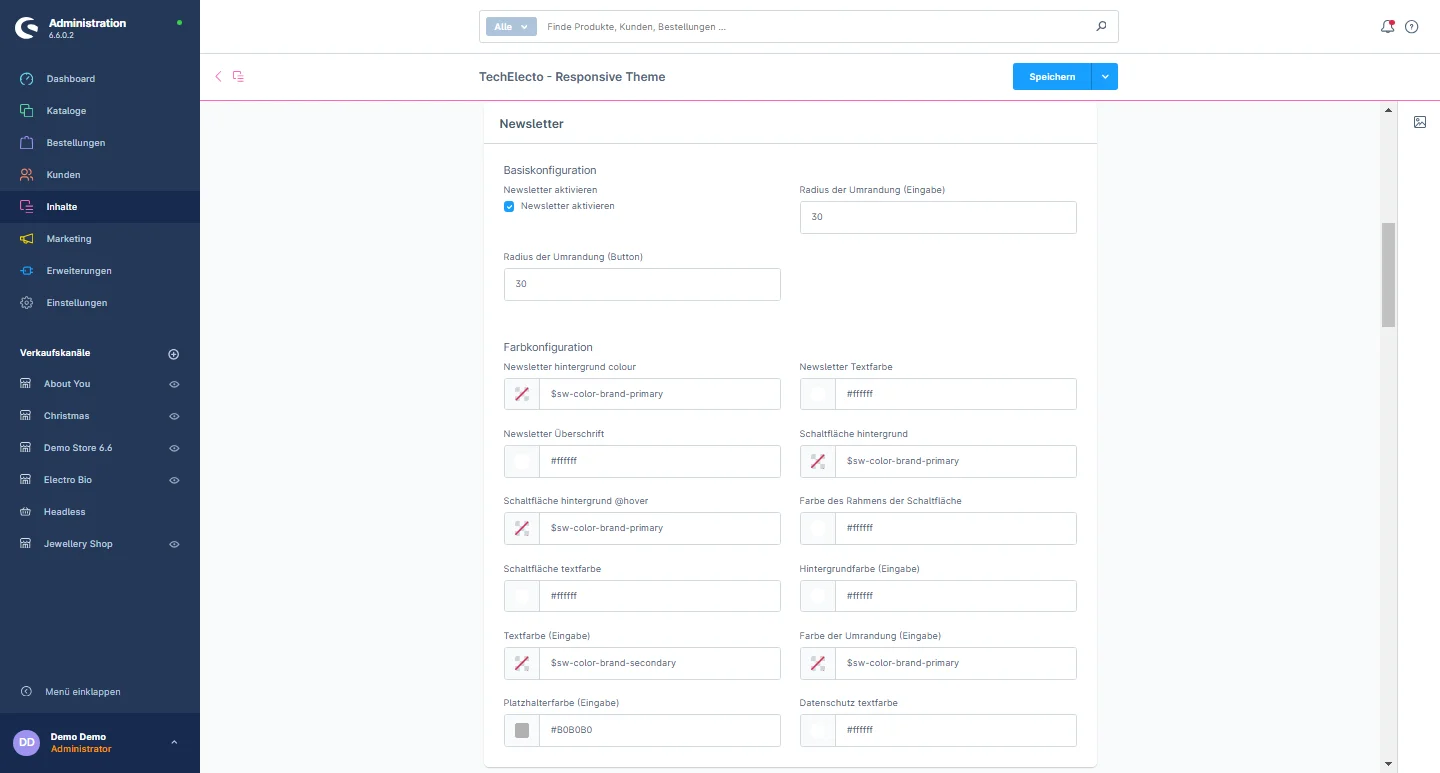
3- Newsletter: You have the flexibility to activate or deactivate certificates, as well as customize various elements including the border radius of the button, newsletter background color, newsletter text color, newsletter heading, button background color, button background color on hover, button border color, button text color, background color of input fields, text color of input fields, border color of input fields, placeholder text color in input fields, and the color of privacy text.

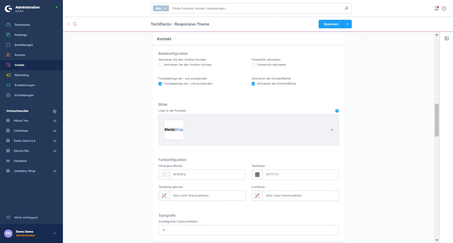
4- Contact: You can change the footer logo, background color, text color, text hover color, icon color, and adjust the font size to suit your preferences.

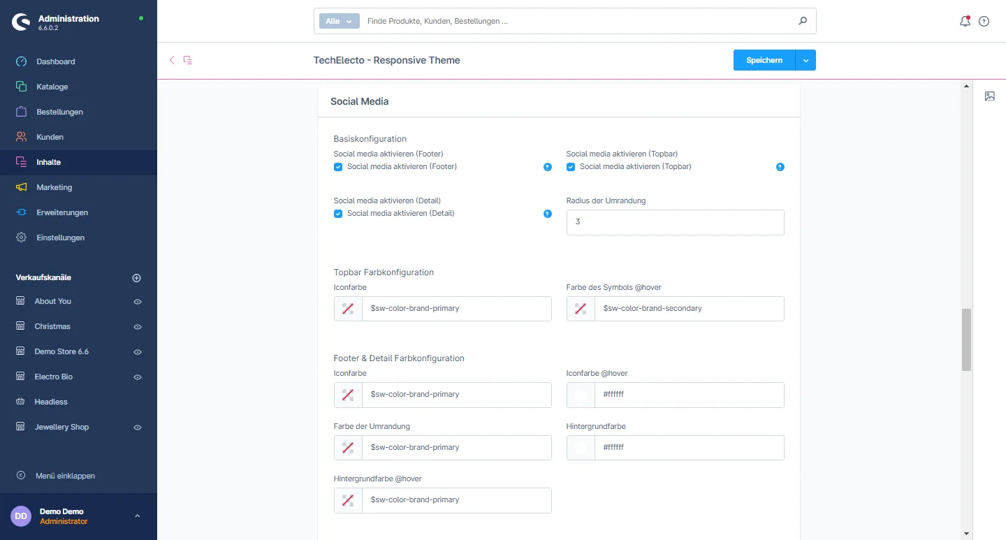
5- Social Media: You have the flexibility to enable or disable the social media elements in the footer, top bar, and detail page. You can also customize various aspects, such as the top bar icon color, icon color on hover, footer and detail page icon color, icon color on hover, border color, background color, background color on hover, and add different social media URLs.

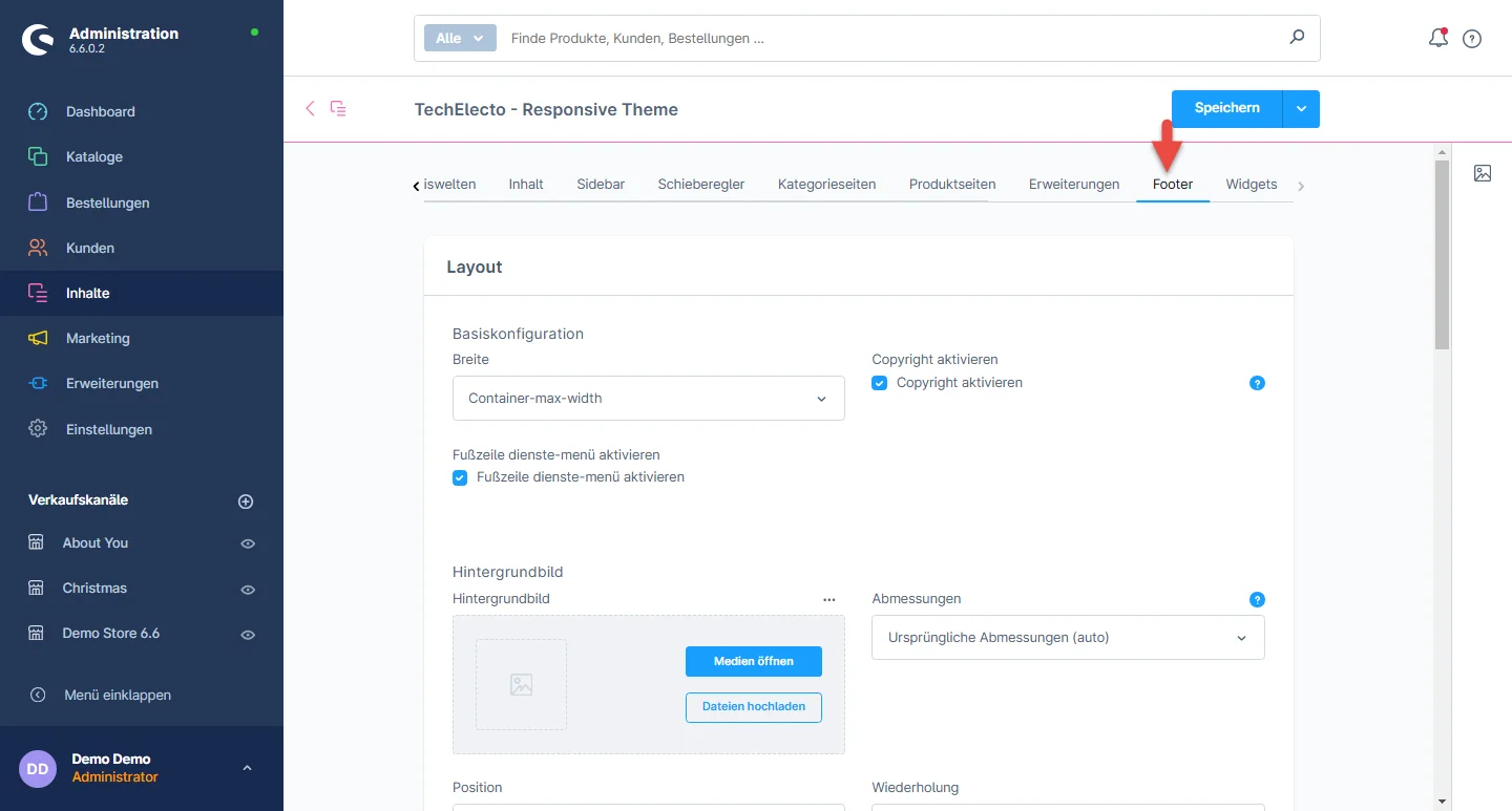
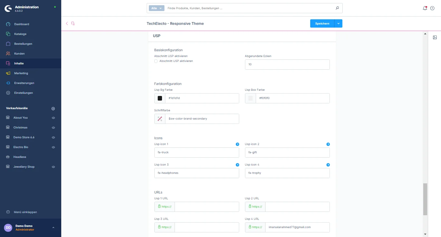
6- USP: You have the flexibility to activate or deactivate the USP section in the footer. Additionally, you can customize the border radius, USP background color, USP box color, font color, and add Bootstrap classes to modify the icon. You can also set the URL as needed.
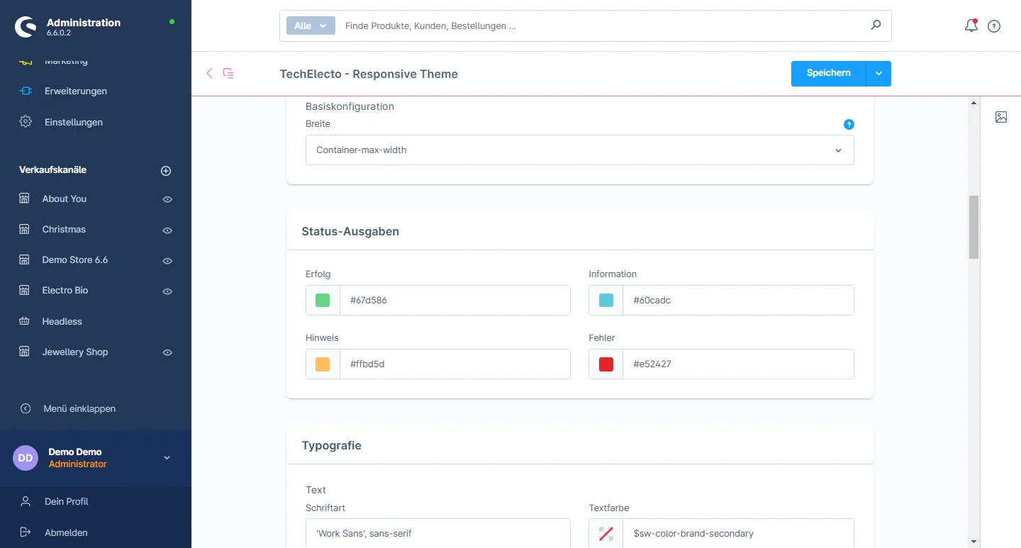
7- Instagram: You have the flexibility to enable or disable Instagram integration and input the Instagram token. You can also adjust the overlay color as desired.

Nach oben scrollen